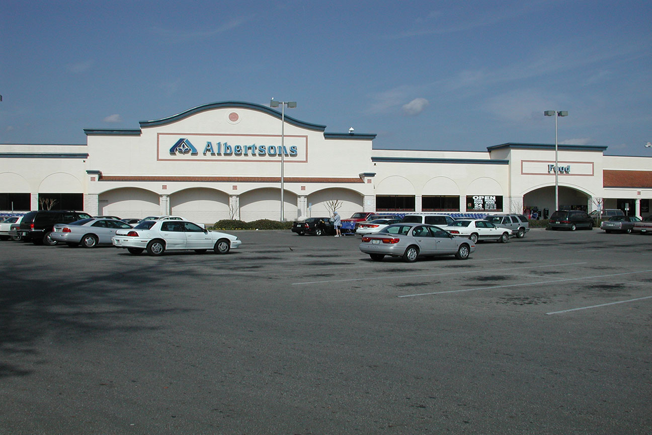
Albertsons #4389 / Publix #1312
3930 SW Archer Road, Gainesville, FL - Butler Plaza West

|
| Today's post is a presentation of Alachua County retail |
Well, what a summer this has been! The Winn-Dixie to Aldi conversions are coming in hot, Big Lots announced a massive closure wave of 293 stores (including 25 Florida locations) as the company teeters on the verge of bankruptcy, we lost two notable Publix stores for rebuilds (the ex-Food World #356 in Lakeland and former Albertsons #4312/Publix #1322 in St. Petersburg), and Conn's Home Plus went bankrupt, taking down their recent purchase of Florida-based Badcock Home Furnishings in the flames with them. All that being said, does anyone have any good news to share with me, as I can use some right now! Anyway, it's been a very eventful few months for Floridian retail, (probably one of the busiest news-wise in quite some time!) and in the coming weeks I'll touch on some of those current events in more detail. For now though, we'll get the second half of the year started on AFB with another former Albertsons store. Before we begin, I should also mention that I will not be the only one here with you today covering former Albertsons #4389. In addition to his supplemental coverage of nearby Publix #680 on My Florida Retail, I have the Sing Oil Blogger here with me as well with some additional photos and commentary about this former Albertsons store (which he visited alongside Publix #680). I'll let Sing take over the introduction from here to explain a little more about what's to come today:
Thanks for the intro, AFB! I've always been intrigued by the idea of doing a collaborative post with you but have never quite figured out how to execute it. In the past, we've had success with our dual coverage of stores like former Albertsons #4413 / Publix #1331 in Fort Myers and Publix #172 in Naples (which still to my knowledge has maintained its vintage Kiwi / Classy Market 1.0 interior); likewise, I hope y'all will enjoy today's post for a change! Since I still don't know the best way to illustrate the proverbial "passing of the mic," I'll format my paragraphs as I typically do with justified text and use a different font to indicate when I'm "speaking".
Anyhow, this summer has indeed been a busy one for retail news. Despite me never planning to feature a Badcock & More furniture store on the blog, I will forever have the "makes it easy" jingle emblazoned in my memory. I still think that the biggest news for me, though, was following the trickle of Southeastern Grocers locations set to make the conversion to Aldi stores. A lot of things still remain unclear; however, it does seem that the German grocer is paying little attention to the holistic nature of a given Winn-Dixie or Harveys supermarket and is instead focusing most of its effort on the raw real estate. After all, we've found that all converted stores thus far are several miles from an existing Aldi and range from not having remodeled in 30 years to having a full remodel last year. Heck, Aldi is even killing off a higher-end Transformational store in Mobile and a flagship Down Down store in Tampa! I hate to admit that I was a bit naïve in some of my initial predictions, but I like to think of that as a healthy dose of optimism.
The thing is, you didn't come here to hear me and AFB ramble on about Die Rindfleisch Leute, you came here because this is the Albertsons Florida Blog. So, let's give you what you came for and see how Albertsons was kicked out of The Swamp. Deal?

|
| Photo courtesy of YonWooRetail2 |
Having already established the brand in Gainesville's original retail district on the north side of town in 1976, Albertsons began to see opportunity for a second Gainesville location come the early 1990's in the growing neighborhoods on the southwestern side of town near Interstate 75. Albertsons would become one of the earlier tenants of the Butler retail development, opening on June 24, 1992, anchoring the Butler West portion of the shopping center alongside Gainesville's first Target store.

|
| Photo courtesy of YonWooRetail2 |
Owned by the Butler family, the Butler retail development would end up becoming the predominant retail district in Gainesville as the 1990's wore into the 2000's, with the complex eventually growing into a 267 acre conglomeration of big box shopping centers along Archer Road near its interchange with Interstate 75. Even with this area becoming the predominant retail district in town,
the original Gainesville Albertsons store, #4314 on the north side of town, ended up outliving #4389 by 3 years.

|
| Photo courtesy of YonWooRetail2 |
Albertsons #4389 was a fairly average "Superstore" design Albertsons from the early 1990's. The arched facade, two vestibules, blue trim - this is about as early 1990's Albertsons as you can get. During its 16 years in business, this store sported the company's Blue and Gray Market decor inside, complimenting the store's overall 1990's aesthetic.

|
| Photo courtesy of YonWooRetail2 |
While the older store on the north side of town ended up outliving its younger sibling on Archer Road, store #4389 was certainly not a flop by any means. #4389 was one of the 49 Albertsons stores sold to Publix in 2008, and the batch of stores Publix bought that year were some of Albertsons better locations throughout the state from what I've been told (as Publix isn't the type of company that will take another's bottom of the barrel locations).
Off the top of my head, there are only three acquired Publix stores that turned out to be flops: former Albertsons #4315 / planned Publix #1323 in Tallahassee, former Albertsons #4734 / Publix #164 in Nashville, TN, and former Bi-Lo / Publix #1162 in Murfreesboro, TN. The former never opened since Publix already had a relatively new store across the street and canceled plans to open a GreenWise Market in the space while the latter two must have just been bad locations in a new market. Needless to say, Publix typically does a good job with either cherry picking stores to acquire or dragging out their demise as long as they are turning some sort of profit.

|
| Photo courtesy of YonWooRetail2 |
Albertsons closed this store on August 30, 2008, following the sale of the building to Publix, with this store reopening as Publix #1312 on May 14, 2009. With its opening delayed into 2009, Publix gave this store a slightly nicer Classy Market 2.0 remodel that included the faux terrazzo floors (instead of the usual
Tetris tiles) and the new Publix-issued lighting. Publix #1312 later remodeled to Sienna/Classy Market 3.0 in the mid-2010's, and then to Evergreen in 2021.
Publix's arrival at the Butler West retail complex created another one of the famous situations where Publix operates two stores practically next door to each other. Due to how sprawling the Butler retail complex is, both Publix stores are actually part of the Butler complex, with the Publixsons here in the Butler West portion of the center, and 400 yards east of here is Publix #680 at the Esplanade at Butler Plaza. Ever since 2009 that's been the case, and Publix is showing no signs of letting either store go. As I mentioned before, the Sing Oil Blogger will have additional coverage of Publix #680
on My Florida Retail, where you can learn all about that store's past and the few oddities it contains today.

Shortly before Publixsons #1312's Evergreen remodel, the entire shopping center received a facade update. While the general aesthetic of the exterior was kept the same, the old Albertsons building did have its front arches squared off and the curved stucco turned into a stairstep design. Even with the modifications, it's still obvious that this building used to be an Albertsons.
The entire shopping center had a wavy design to match the Albertsons building (
even the Target!) when it was first built, all of which was squared off the in facade update. The update wasn't terrible, but I much prefer the original design of the shopping center, as the wavy design had a little more character.
After we pick up a sack of firewood, it's time to enter the store through the right side vestibule. As usual, Publix replaced Albertsons' original swinging doors with sliding ones, giving these side-facing vestibules the aesthetic of something you see at one of Publix's
early 1990's stores.
Welcome to Publixsons, where shopping is a pleasure at your store. Stepping into the right side vestibule, we have an Evergreen welcome sign mounted on top of some
CM 2.0-era green tiles, this relic (ironically) one of the largest swatches of green in the entire store now! These tiles are one of the few obvious relics from this store's original decor left in the building, however, some pieces of its Sienna/CM 3.0 decor may still be floating around too, as we'll see coming up.
Turning the corner out of the vestibule, we enter the BOGO bargain bin land, followed by the floral island. Behind that we see the grand aisle running along the right side of the building.
It's always hard to judge a store from an ultra-wide lens; however, it seems like #1312 does suffer from some of the familiar problems of Publix not knowing how to fill the extra space in the store. At least we have a few deli displays to occupy the space.
Speaking of the delicatessen . . .
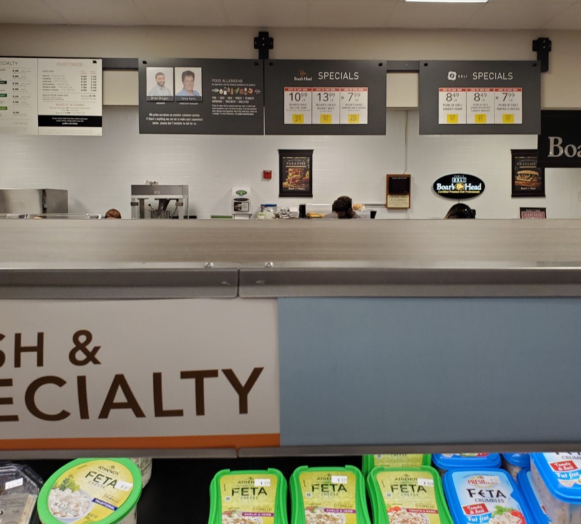
The front right corner of the building is home to the deli, which following store's 3rd remodel as a Publix, still retains its squared-off design from Albertsons.
It's honestly surprising to see how stark this space looks with Evergreen compared to how colorful it was a few short years ago. I guess that's what happens when you paint all of the walls off white and cover the tile with white vinyl.
At least the deli special signs got a nice upgrade – I took this shot to highlight how Publix has been diligent about adding the new signage bars during Evergreen remodels. Meanwhile, they neglected to swap out the Sienna-era specialty cheese signs in the foreground.
Continuing along from the deli, the bakery follows that department on the building's right side wall. The bakery never received the
rounded lower ceiling common in many of Publix's later remodels to these buildings, and like the deli, retained the Albertsons design.
Behind the bakery counter, the tiles from the previous Invigorate/Classy Market 2.0 decor remain, providing a splash of color (and a bit of a jarring clash) with all the gray paint now in this building. With the white ceiling appearing gray from the dim lighting, the gray faux terrazzo, and the gray wall paint, that tile, the wood produce stands, and those few plants are all that's left to remind us that color does exist in this world!
Why didn't Publix bother to cover these tiles with white vinyl?
The back right corner of the store is home to the produce department, complete with some of Publix's neatly stocked rows of produce on the tables.
Similar to the plants, at least the colorful fruits and vegetables provide a nice splash of color amidst the sea of grey. This store also held on to its light grain wooden produce fixtures from Sienna which helps to break up the space.
Over time, Publix's Evergreen produce sign has evolved. The original Evergreen produce sign can be seen here, this square-shaped sign with a wood grain-esque backing pattern. The current iteration of the produce sign is a gray circle (
like the one in #680 next door), eliminating another slight pop of color contrast that once existed in this decor.
The selection of Bulk Foods was pushed toward the back of the produce department, near the transition between produce and the meat coolers. Also appearing in the background is one of the typical Evergreen stock photo collages, one of the places where the "green" in Evergreen makes its appearance.

I know banana prices seem to come up often as a discussion point, and it's known that Publix's typical price of bananas is on the higher end of the spectrum at 69 cents a pound at most stores (although zooming in on the photo, the sign actually says 65 cents a pound - a discount for the college students I suppose?). Anyway, I brought this up because I stopped at a Publix for bananas a few weeks ago, and they were clearly signed 69 cents a pound like normal. After I paid for them, I looked at the receipt and noticed the bananas actually rang up at 57 cents a pound - I wasn't expecting that! I remember when Lucky's was around, they used to price their bananas low, and Publix stores near a Lucky's all magically lowered their price of bananas to 57 cents a pound once that chain began to grow. I hadn't seen 57 cents a pound bananas at Publix since Lucky's imploded, so that was an unexpected surprise.

Meanwhile, I guess plums must have been on sale when I stopped in #1312; I just have no clue how much they cost! I can tell you that the acoustic tiles around the air vents look a bit dusty compared to Publix' typical maintenance standards . . .
Returning to the front of the grand aisle, we get ourselves a glimpse of the front end and the customer service desk.
It's interesting how much brighter the front end of the store looks through my camera lens compared to AFB's. Here we also find one of the two sections of store to actually receive green paint off to the left. At least Publix decided to keep the circa 2008 green tile in place on the front wall!
Following the service desk, here's a look across the store's front end, complete with the classic Albertsons superstore raised ceiling and mezzanine windows. For a better idea of what the mezzanine level looks like in one of these stores, be sure to check out
this fun post where we actually get a tour of that typically employees-only area.
I'm still slightly jealous that AFB got to see that.
Publix's lower ceiling over the service desk looks a bit strange placed in the middle of the raised ceiling, as it created a weird effect! The service desk would have been located along the front wall when Albertsons was here, although I'm unsure if the desk was moved to the island upon this store's opening in 2009, or if that move happened during the Sienna/CM 3.0 remodel instead.
As typical in these older Albertsons buildings, Publix has the dual front actionways in this store. The photo above looks across the inner actionway across the front of the main grocery aisles, with the short aisles that abut the check lanes located to my left.
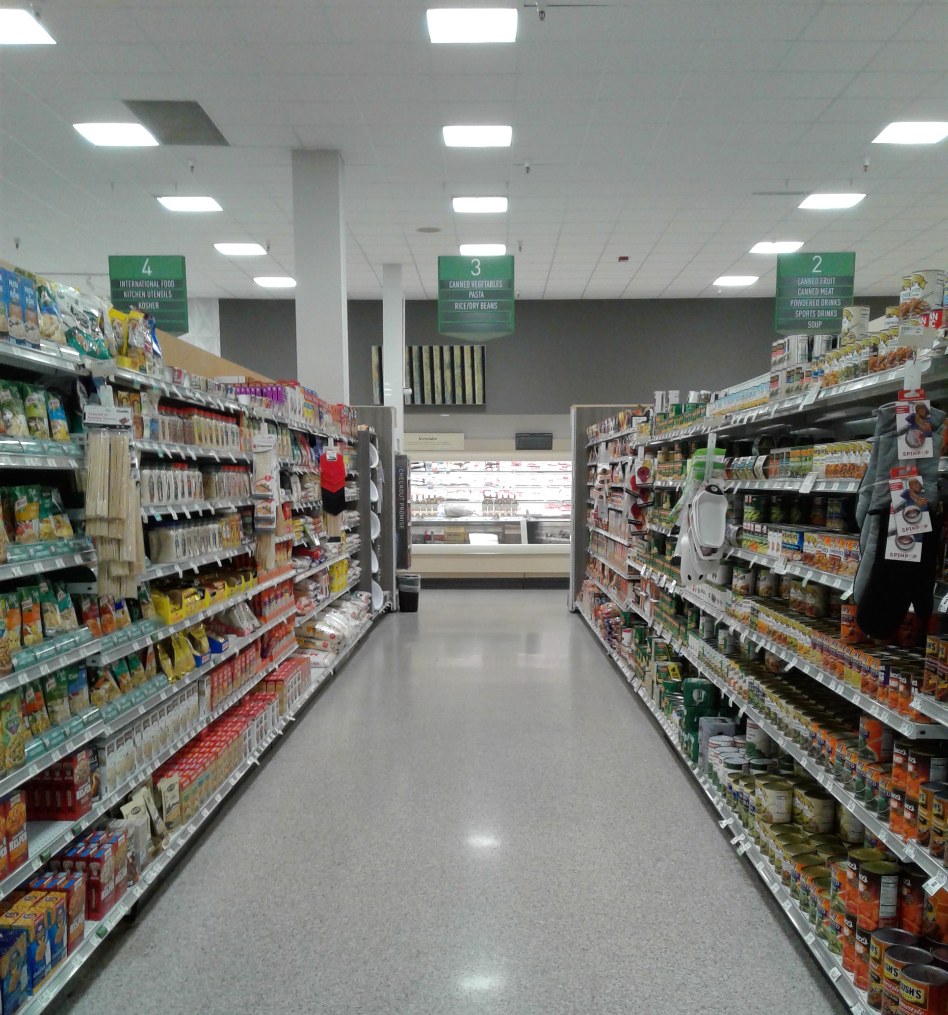
Entering the grocery aisles, we find the spaghetti dinner supplies at the beginning of aisle 3...
…however, if you're more in the mood for rice and beans instead, take a few more steps down aisle 3 and look no further!
And if you are in the mood for a nice, Calorie free treat, the endcap to my left has just the solution . . .
I really do appreciate how Publix installed that small photo of green slats to break up the monotony of the back wall – slow clap for this store's design team. The fact that Publix didn't even add Evergreen's signature green paint band makes the space feel odd; it truly is Evergrey!
This brings me to my next theory: since this Albertsons received a blatantly cheap remodel to Evergreen, I wonder what its long term chances for survival are. Heck, it even makes #582's implementation look like it has personality (even if that personality is of the unattractive type).
I think the fact of the matter is that #1312 cannibalizes #680's sales which results in the latter continually getting cheap remodels. This is all while Publix has the longer-term plan to knock down the old Albertsons in favor of a new store, which means management doesn't want to spend the money to make it look nice. I don't foresee #680 outright closing, but I also don't see it as being a very high volume store. Of course, all of this comes from a Georgian who has only been to these stores once (or twice) and is just making assumptions based on some two year old photographs.
On the other hand, friend of The Albertsons Florida Blog YonWoo Retail mentioned that #680 used to be the better performing location of the pair since it had a bus stop out front for a route the UF students used to frequent. However, at some point the bus stop was switched to #1312 instead, and that store became the busier location as all the student traffic migrated to that location. Who knows if this still stands, but it is an interesting tidbit nonetheless.
The meat and seafood counter is located in the same spot as it was when Albertsons was here, just changing from its original Blue and Gray Market decor to just plain gray decor today.
The meat coolers extend to the edge of the meat and seafood service counter, after which the coolers on the back wall switch to dairy, which we'll see in a little bit.
Relish and savor the fact you're shopping at one of Florida's Publixsons stores...
…and enjoy some breakfast foods in aisle 5.
. . . Or how about you spice things up on aisle 6. I have to admit that I was wandering around this store while waiting on a friend who was driving into town. That kind of trip usually devolves to me pointing out random items I never pay attention to when shopping for food to eat. I ended up on the condiment aisle, when I likely said, "look at how the 'Florida Local' icon has evolved from the Sienna design language to that of Evergreen." If you zoom in, you can see where the orange and brown tags were printed as late as early-2021, while the green and grey ones are from the second half of that year onward. It's interesting to see a microcosm of the larger, much more jarring design transition. Evergreen may have made its debut in 2019, but it wasn't until 2022 that it seemed to hit a critical mass (which is also how long it took me to see the package for the first time).

Entering aisle 7, we find the first of the frozen foods aisles. Like a typical Superstore Albertsons, frozen foods are located in the center of the sales floor, much like you'd find in a modern Publix as well.
During my visit to this store in late 2021, there was still a little piece of the past hanging around in the seafood department - the CM 3.0/Sienna Sushi sign!
That sign was just long gone like a thief in the night by the time I made it to Gainesville. Instead, we find ourselves graced by the presence of another sushi signage bar . . .
. . . and a misaligned sushi sign centered over a narrow walkway next to the lobster motel. I may think that the new signage is a bit bland, but it looks much better than leaving the old yellow Sienna one in place.
And I'm happy to know the Sienna sign was eventually replaced, as at least the new one matches the rest of the decor.
Leaving the Seafood counter, here's a look at the remainder of the store's back wall, home to the dairy department. Dairy runs into the back left corner and turns along the left wall, along which it goes about halfway down the last aisle.
Aisle 8 is the second frozen food aisle, completing the selection of frozen foods in this store.
Coming out of frozen foods, here's another look across the inner front actionway. The remainder of the grocery aisles are located to my right, with the short aisles to my left home to the health and beauty and pharmaceutical products.
I'll be the first to admit that the layout of these Publixsons is pretty hard to visualize if you've never seen one for yourself. I know I was thrown off when I realized that Publix could fit a normal-length aisle in the back of the store, install a center cut-through aisle, and then place a 1/3-lenth aisle up front before you make it to the checkouts.
The aisles to the right are the same pharmaceutical ones AFB mentioned above, just looking in the opposite direction down the center cut-through. To make things even more bizarre, Publix takes the opposite approach to Kroger and neglects to number any of them!
Here's a look down one of those short aisles (13.5?) taken from the absolute front of the store. We can see how the aisle markers are set back to line up with the center cut-through, and how the short aisles seemingly don't quite line up with the main grocery aisles.
The purpose of these last two pictures, though, was to highlight the contrast between the colorful Sienna category markers and the grey ones from Evergreen. I'm honestly surprised that the yellow one for "lotions" and the green ones for baby products survived the remodel, but it seems like this store only received one new sign for each category when it really needed up to five for categories like "baby diapers".
Following frozen foods, the next aisle, aisle 9, is home to a different kind of chilled product - beer. So appropriately for a college town store, the beer and wine aisle is a grand double-wide aisle, as I'm sure that extra space comes in handy on a busy afternoon before a game!
Also appropriate for this aisle is a custom (bootleg looking, in my opinion) sign advertising the varieties of kegs available for purchase. While I've never seen a sign remotely close to this in another Publix, the things that really stuck out were the old Publix logos in either of the top corners. I also presume you'd have to go to the liquor store next door to get the keg? Only in a college town!
Note: this picture cuts off the line that says, "Craft and Import Kegs Available Upon Request."
Since when is ginger ale a storm essential?
Publix must have misplaced that sign - I believe it was intended to be placed in front of the actual beer!
I'm sorry, now I feel like I've been on the snarky train for the last bit. On a positive note, the friend I was waiting on showed up right around the time I took this photo and somehow knew that I'd be on the beer aisle (despite the fact that I didn't buy any alcohol here).
I also just realized that AFB and I visited this store relatively close to each other because all of the banners hanging over the aisles were the same!
Returning to the back wall, here's one more look at the meat and seafood aisles as we continue to move further toward the left side of the store.
Cheese fills the space between the seafood department and the milk cooler, while an island freezer of turkeys and a lonely bin of popsicles occupy the rear aisle. I vividly remember how empty this part of the store felt!
There was no shortage of Takis here in the snack aisle - it looks like there were two shelf sections of them for sale here!
From health and beauty, here's a look across the inner actionway toward aisle 11.
Also appropriate for a college town Publix, a University of Florida spirit section could be found in aisle 11. There was plenty of Gator pride merch you could pick up alongside your tailgating supplies before heading off to a game at
The Swamp! (And of course, aisle 12, always striving for the limelight, had to crash my photo as well!)
Looking over all the Gator pride items, I spotted this piece of the Crimson Tide trying to sneak in amongst the sea of orange and blue - not sure how well these bags will sell in Gainesville!
As much as we all love aisle 12, it looks like I skipped over that aisle and went straight over to aisle 13, home to pet supplies.
This store has 16 aisles total, with the photo above looking down aisle 16. In this aisle we find the remainder of dairy on the right, with the PB&J supplies to my left. (PB&J sandwiches paired with milk is probably a bit more traditional, I suppose, than the
PB&J and wine combo we sometimes find at Publixsons stores). However, in addition to all that, there's one other category of products available in this aisle...
…greeting cards. Instead of placing them in one of the short aisles in the front actionway (like is most common in these Publixsons stores), greeting cards ended up over here on the left wall between the dairy coolers and the pharmacy. What's most interesting about this set-up is the stock photo Publix placed above the greeting cards, which I've never seen before (as greeting cards don't often end up along a wall like this). That picture of leaves seems kind of random to pair with greeting cards, but it breaks up the blank space on the wall well enough.
The stock photo, which I believe to be of eucalyptus leaves, is typically only found in the pharmacy section or over the HBC aisles (like in #1306). The blue "Waterscape" paint on the wall is also the traditional pharmacy wall color for Evergreen. I suppose other pharmacies, like Walgreens & CVS, often carry a large supply of greeting cards.
Leaving the greeting cards, we now find the pharmacy located in the front left corner of the building. While still in the same location that Albertsons would have had it, Publix completely rebuilt this space to match their usual pharmacy prototype; the reconstruction of this area most likely occurred during the CM 2.0/Invigorate remodel prior to this store's opening.
Turning away from the pharmacy, here's one last look down the inner part of the front actionway as we prepare to leave...
…followed by this nice overview of the front part of the actionway, looking across the store's check lanes underneath the raised ceiling...
. . . and a similar overview including the promotional displays near the left entrance. Fun fact: did you know the large island fixture with the bottled water opens up to provide ample storage for gondola shelving pieces in the middle?
What do you say, let's check out the self-checkouts.
Back outside, here's another look across the store's facade, as seen from the left side vestibule we just existed from.
Off at the other end of the shopping center, here's a quick look at the Butler West Target store. Target's facade was also squared-off, although Target's new facade predates the renovation to the rest of the shopping center by a few years, as Target's exterior work coincided with this store's P17 remodel in 2017. I didn't bother going inside the Target while I was here due to time, but it's a pretty typical early 1990's Target store remodeled to the company's grayscale P17 decor. You can see more photos of the Target
here if you're interested. Having remodeled to P17 in 2017, this was one of the first Target stores in Florida to sport the company's grayscale decor.
From Target, here's another look back toward the Publixsons: the actual target of today's post.
The attached liquor store is located on the right side of the Publixsons building, tucked between the right side entrance and the Florida Lottery's Gainesville District Office (the place where people go to claim their big money winning tickets - if only I had to stop in there in addition to the Publixsons while I was here!).
Here's one final look at old #4389's modernized facade before we finish off this post with some satellite images, starting off with some Bird's Eye aerial images courtesy of Bing Maps:
Front
Right Side
Back
Left Side
And now for some historic aerial images, courtesy of Google Earth and historicaerials.com:
Former Albertsons #4389 - 2023 - Here we see the entirety of the Butler West Shopping Center, just a small portion of the overall Butler complex (which includes all the stores to the right of and behind this complex -
it's a pretty big shopping center in whole).
It's crazy to see all of the solar panels mounted to the roofs of the other stores, all while Publix has none. Not that I have an opinion either way – I just wonder why Publix was the odd man out.
Former Albertsons #4389 - 2018
Albertsons #4389 - 2007
Albertsons #4389 - 1995
Future Albertsons #4389 - 1984 - It appears a small mobile home park was removed to make room for Butler West.
As was mentioned earlier, the Gainesville Publixsons is only 400 yards away from Publix #680, the map above showing the close proximity of the two stores. Our time in this part of Gainesville isn't over though, as you can
jump over to MFR to read the Sing Oil Blogger's coverage of Publix #680, completing our Southwestern Gainesville Publix journey!
I'd also like to thank the Sing Oil Blogger for his contributions to this post today, and hopefully you enjoyed his insight into Publixsons #4389 as well. I'll let Sing finish out this post with any final thoughts he may want to make:
I'd like to thank AFB for letting me tag along! While this store may not be the most exciting Publixsons in the land, it still has quite a few points of interest on top of the fact that it is a block away from an existing store. I hope you enjoyed today's post, and make sure to check out the MFR piece as well.
 |
Photo Courtesy of Publix
|
Be sure to return to AFB in two weeks for more, as we'll pick up again next time with a post about some of those current events in the Floridian supermarket scene!
So until the next post & until next time,
The Albertsons Florida Blogger & The Sing Oil Blogger


Sing Oil: "...I hope y'all will enjoy today's post for a change!"
ReplyDeleteI'm not sure what Sing Oil is trying to say here! I think everyone likes the AFB-Sing Oil double coverage posts. I will say that I might have to have some words with Sing Oil if he continues to take retail photos in portrait mode, lol, but otherwise I think there is universal appreciation for these posts.
Now, don't confuse my criticism of nEvergreen for criticism of the posts! So, with that, looking at the modern state of this Publixsons, I can understand AFB's rather despondent mood at the beginning of the post! I quite like the 1980s Taco Bell shape of the facades at the Albertsons and the other stores in the shopping center. It kind of reminds me of the Alamo! Remember the Alamo! Remember the Albertsons! I guess all we can do is remember the Albertsons now that the rounded facades have been squared off. It might be hip to be square, but not here!
Of course, any criticism of the exterior is minor compared to the nEvergreen disaster going on in the inside! Having read this post, and the MFR post, I will say that the Publixsons does look more appealing to me than #680 in nEvergreen, but that should not be taken as a compliment! I think the drop ceiling does help here. While this store does have some exposed pipes and such, it is not nearly as bad as what is at #680. The Publixsons looks more 'finished' and I do like that. Of course, I guess none of that will matter if this store meets the wrecking ball soon as is speculated!
The higher ceiling over the front end and the security catwalk windows does remind me of a classic Safeway even if it is also a classic Albertsons feature. I'm glad it has survived. I'm not sure what to make of the UFO customer service area though!
I'm glad that Sing mentioned the white balance differences in AFB and Sing Oil's photos because I really noticed that in that bananas photo (always my favorite photos, of course!). I wonder if the difference in white balance can be explained by AI. Perhaps AFB's phone sensed that AFB really wished he was at Albertsons and gave more depressing looking white balance as compared to Sing Oil who was okay with being at a Publix? Well, we can only guess, but I wouldn't blame AFB's phone for selecting a gloomy white balance! Really, Sing Oil's photos only make this store look only a tad bit more cheerier.
Speaking of bananas, I bought some from Randall's today and I noticed a similar pricing difference between what was marked and what was rung up. Randall's recently switched from per banana pricing back to weighed prices. The sign said 59 cents/lb., but they rung up at 55 cents/lb. (I had a digital coupon which made them 47 cents/lb.). I also noticed the same thing once at Kroger in 2022, but given the pricing fluctuation in 2022, I chalked that up to being a fluke. Maybe what I saw that Randall's and what AFB saw at Publix is intentional though?
This might be a first, Sing Oil comparing Kroger to Publix and preferring the Kroger way! To be fair, that Retail Retell photo doesn't look like any Kroger I know of! That Kroger actually looks pretty good!
I'm sure you two know about my recent trip and in addition to multiple trips to Shaw's and a visit to Hannaford for a Sweetbay-like experience, I also visited a totally grey-and-black Market 32: https://maps.app.goo.gl/nfWqkCp6SktQ1NgC6
Yep, grey and black walls, grey ceiling tiles, and grey vinyl floor tiles! I can't really say how this compares to nEvergreen, but from what I thought about the photos before my visit and what I feel after my visit to the Market 32, I think the entirely grey look is nicer than nEvergreen. The colors at Market 32, combined with the lighting and accent colors, has a sharp, modern look. It did make the store feel smaller than it probably was, but it didn't feel dull or dark like an early Lifestyle store. Unfortunately, I can't say anything positive about what nEvergreen appears to look like here and at #680!
Considering this Publixsons lacked the green stripe on the walls that other stores tend to get, this Publixsons was truly an Evergray overload! While there are times when Evergreen can look presentable, this Publixsons was one of the cheaper Evergreen installs for sure, and really made this store look pretty dull, especially compared to the photos on Google showing the old décor in place. The drop ceiling does help make Evergreen a little more presentable though, as the white tiles help balance all the gray. Even though the façade update and the Evergreen remodel weren’t directly coordinated, they both made this store look much duller inside and out, going from a fun Publixsons to a much more boring supermarket. Remember the Albertsons, and remember when grocery stores were fun!
DeleteThe security catwalks were a pretty popular trend in supermarkets in the 1980’s and 1990’s – even newbuild Publix stores at the time had a variant of those, but not as pronounced at this Albertsons version was.
The white balance difference between my photos and Sing Oil’s has a much simpler explanation than AI – Sing Oil just has a much fancier (and newer) phone than me! My phone’s camera is pretty basic and doesn’t do any of the corrections that newer phones handle, so my photos will come across with that “vintage” aesthetic, which works well for photographing old supermarkets, I suppose!
I don’t know if Randall’s and Publix were intentionally trying to pass off deals on bananas to shoppers, or if an employee just hadn’t gotten around to updating the signs yet, but it is strange. (However, bananas for less than 60 cents a pound at Publix is strange enough as it is!) I didn’t know Randall’s was selling bananas individually, as that’s usually just a thing as stores that don’t have scales on the registers do (like Trader Joe’s and P-Fresh Target stores).
As someone who has seen both the Market 32 décor and nEvergreen in person, I have to agree with your assessment that Market 32’s décor looks much better in use. Market 32’s décor has a little more color pop to it and more 3D and wall accents than Evergreen does. Market 32’s décor does come off as classier too, although Market 32’s stores also tend to come across as a little bit dimmer than an Evergreen Publix, and the dim (but not too dim lighting) makes the store feel fancier.
I honestly haven't set foot in this store since June of 2021. I had no idea that the Evergreen that was being installed in this store would ok so bland and crummy! Between the Butler family's desire to modify this Plaza to Publix themselve coming up with a Grayscale decor package, this place has lost all appeal for me.
ReplyDeleteI can't speak for what business is like here now (because I'm not in the distributing business anymore), but neighboring store #680 was always busier. Of course, that could have been partially because of the size difference, which is huge! These two stores definitely siphon business off of each other, but that does not bother Publix, as long as they can keep grabbing a little bit of business that Target, Walmart, or Aldi wouldn't get.
Actually, my favorite Publix in Gainesville is #735 (Springhill Commons). I have always liked the facade of that store, plus its not as insanely busy as some of other stores in town.
I have actually come up with nick names for all of Gainesville's Publixes.
#537 "parknride lix" (by my house),
#1784 "Fratlix",
#1560 "UF Lix"
# 795 "hood lix"
#1312 "Alb lix"
#680 "small lix"
#306 "old lix"
#1376 "Millhopper lix"
#435 "Hunter lix"
#735 "geriatric lix"
#1038 "student n family lix"
#1111 "snob lix"
#527 "SW gnv lix"
Correction: #527 is "Tower lix"
DeleteWow, I didn't realize how many Pubs Gainesville has! It looks like I've only visited 3 myself (and I bet you can guess two of them).
Delete@YonWoo - I’m surprised you haven’t been in this store in so long! Being one of the former Albertsons locations in town, I thought you’d come over this way every so often just to relive the Albertsons days.
DeleteI wouldn’t be surprised if #1312 and #680 cannibalize each other a bit, but smaller stores can certainly come across as busier due to their more compact nature! They do seem to co-exist perfectly fine though, as both seem to have their own appeals to the people of Gainesville.
I guess with a name like “geriatric lix”, #735 has a much slower pace compared to some of the stores closer to town! Being a slower store on the edge of town, I can see how #735 has a better shopping appeal, rather than dealing with craziness at a store like “Fratlix” or “hood lix”. Going through those Gainesville stores, I can see how all those names fit those stores!
@Sing Oil - Yep, Publix knows how to cram a lot of stores into a town that size!
I suppose one bright spot in retail is that the Kroger/Albertsons merger wasn't consummated and is being held up, losing allies and gaining more retractors (Ohio AG and friends aside). But assuming that the merger falls through, what then?
ReplyDeleteTrue – that was good news, but I hear now that Kroger is trying to pull some legal games of their own to try to push this merger through in whatever way possible. I don’t know if Kroger’s legal games will work or not, but we can only hope they don’t…
DeleteWelcome back from summer break! Thanks for the photo link as well. The switch of the bus stop impacting which store is more profitable certainly is interesting, but also makes a lot of sense. Much more sense than having two stores so close together! I also think the squaring off of the facades turned out much better for the Target than it did for this store.
ReplyDeleteThanks, and you’re welcome! With these two stores so close to each other, any small factor (like the bus stop) can make a big difference in which one ends up as the busier of the two. I also agree the square-off Target façade looks much better than what happened to the Publixsons.
DeleteThanks for letting me crash your post! I suppose I got to air most of my comments about this store in the post itself, but it was fun to see what else you picked up on in the space. Hopefully we can do this again in the future!
ReplyDelete