

Winn-Dixie #629 / Harvey's Supermarket #1710 / Winn-Dixie #1710
2630 US Highway 92, Lakeland, FL - Eastside Village
 |
| Today's post is a presentation of Polk County retail |
If you follow the Sing Oil Blogger's new website Grocery South, his most recent post on the East Lakeland Harvey's was written to serve as a preface to what you're about to see here on AFB today. With the recent news of the demise of the Harvey's brand as part of The Winn-Dixie Company's turnaround plan, we decided to feature this store to showcase the transition of the final few Harvey's stores into new Winn-Dixies, conversions which mostly finished by mid-May 2026. Sing took the burden of writing about this store's time as a Harvey's off my plate, so today I'll be focusing on this store's two runs under the Winn-Dixie name, both pre and post-Harvey's. Since the Sing Oil Blogger is more familiar with Harvey's and has personal ties to the original pre-SEG chain, it was more fitting that he cover the Harvey's portion of this post, as to me, Harvey's was never anything more than a sad yellow Winn-Dixie. I was never impressed with any of the 3 Harvey's stores I've ever been to, all of which were conversions of older Winn-Dixie stores in various parts of Central Florida. While I never made it to one of Harvey's legacy stores before SEG muddled them up, I have heard the original locations were, while utilitarian, better stores with a clearer focus on the communities they served. While the spotlight of today's post will be the impressive transformation this store received in May 2026, let's start by going all the way back to the beginning - to 1979, specifically - when Winn-Dixie first appeared here at the intersection of US Highway 92 and Combee Road in East Lakeland:

Winn-Dixie #629 first opened for business in June 1979 in a part of Lakeland known as the Combee Settlement. Back in 1979, Combee Settlement was essentially the edge of town as you headed east on US 92 out of Lakeland toward Auburndale (and to this day still is, although a bit of commercial and industrial development has infilled along US 92 between the two towns since then). The new Winn-Dixie was constructed to serve the Combee Settlement area, as well as the Crystal Lake neighborhood that lay south of US 92 as well. Other than a small independent grocer named Food Town roughly a mile north on Combee Road and the famous Searstown Publix 3 miles to the west, there wasn't a lot of competition in this part of Lakeland - a nice advantage to have in Publix's home town!
 |
| $100 in free food or a color television - which would you choose? |
As the years went on, the Food Town closed and the Publix became home to a Save-A-Lot. As such, for the last 25 years at least, Winn-Dixie has ruled East Lakeland as far as full-service supermarkets go. East Lakeland/Combee Settlement is one of the only parts of Lakeland where Publix does not operate a store, surprisingly enough, although this area does seem to come across as skewing toward more lower and lower-middle income households, a demographic factor that has probably kept Publix out of this area all these years with their more upscale-leaning stores.

The addition of a full-service deli was one of the main highlights of this store when it first opened, a relatively new feature for Winn-Dixie at the time (and full service bakeries didn't become a thing at Winn-Dixie until the mid-1980's, so this store would have opened without one). Other than the addition of a deli, the remainder of these store's features weren't too out of the ordinary for the chain at the time, however, as far as "unique" goes, may everyone turn their attention to the exterior photo I found of this store from 1986. That photo shows the store's original exterior, and it's quite funky! The new "delicatessen" got its own exterior sign, placed on the unusual arched canopy that expanded out from the two sides of the store's vestibule.
 |
| Photo courtesy of Google Streetview - Of course that Blockbuster sign had to get in the way! |
The funky original exterior would eventually be wiped away in the 1990's when the store was converted into the Marketplace format, which is when the current facade was installed. Along with the new exterior, an expansion to the salesfloor was added onto the building's left side. A second expansion would occur during a "Marketplace Refresh" in the early 2000's, expanding out the right side, making this building much wider than one of Winn-Dixie's typical newbuilds with this same facade (and hence the extra gables).

Most of the older Winn-Dixie stores expanded into the Marketplace format in the 1990's would end up keeping a modified version of their original facades, typically only altered to allow for a relocated entrance on the front of the building. For that reason, it was quite unusual to see the typical 1990's Marketplace facade fitted onto a 1970's-era building. Following its Marketplace remodel, this store would keep that look until 2008, when this became the 47th store in the chain to be remodeled to the Post-Bankruptcy interior.

Being the first Winn-Dixie in Polk County to receive Post-Bankruptcy, this store got an entire front-page write up in the Lakeland Ledger for its grand reopening on May 1, 2008. According to one shopper interviewed about the changes, she said "I've known this store since it was really bad, and it's really nice now. My gosh, what a change." (Funnily enough, AFB himself said something very similar when he walked into the same store post-2026 remodel as well). The store's Post-Bankruptcy remodel took two months to complete, and involved the installation of new floors, new fixtures, new coolers, new wall decor, and a new entrance carved out of the front of the building. Unlike many early Post-Bankruptcy remodels, this store did not not have any service departments rebuilt or relocated - only some shuffling around of the salesfloor - so its Marketplace-era layout is still in-tact to this day.
 |
| Photo courtesy of Google Maps |
Before we get around to this store's most recent remodel, I did manage to pull a decent number of photos from this store's Post-Bankruptcy days from Google. Being that we're looking at the before and after of this store's Harvey's days, seeing the store with Post-Bankruptcy will really reinforce how much of a downgrade the Harvey's remodel was, and how the 2026 remodel was able to kick this store back to its Post-Bankruptcy era glory.
 |
| Photo courtesy of Google Maps |
The entrance door seen in the photo above was added as part of the Post-Bankruptcy remodel, and interestingly, Winn-Dixie copied this store's 1990's Marketplace detailing exactly for the archway over the new door. Also interestingly, a brand new "Entrance" sign was installed in 2008 using Winn-Dixie's 1990's styling, so I guess those signs lasted longer than I originally thought!
 |
| Photo courtesy of Google Maps |
Stepping inside, here's a look from the store's front end toward produce, located in the front right corner of the building. Even when these photos were taken in the 2016-2017 era, this store didn't look all that bad. The wall decor still appeared to be holding up and the place seemed decently maintained as well.
The columns we see in the photo above designate where the early 2000's Marketplace-era expansion begins, with that addition home to the majority of the service departments (outside of the bakery).
Moving further along, here's a look down the right side of the store, where we find the wine and beer department following produce. The deli is visible in the back right corner beyond wine and beer.
During this store's Post-Bankruptcy era, floral was located in an island at the beginning of aisle 1 (pictured above, although this photo is a bit blurry). When the Harvey's remodel occurred, floral was moved to the front wall next to the entry doors, and that's where we'll see floral following the most recent remodel as well.
For whatever reason, all of the Post-Bankruptcy era photos on Google only show the right side and front end of the building (I don't know what aversion people had to photographing the left side of the store back then). As such that's all our Post-Bankruptcy-era segment will cover, but I think you get the point - this store still looked pretty nice going into the mid-2010's.
Older Post-Bankruptcy stores used these check lane lights that were just a modified version of the ones used during the Purple/Maroon era. Later Post-Bankruptcy stores received a more customized lane light design, a design which came off as a bit classier.
The service desk got a nice close-up here, with the store's pharmacy counter located around the corner from the service desk.
One final Post-Bankruptcy-era interior photo gives us a look across the front end again, on a decently busy looking day too!
We'll finish our coverage of this store's Post-Bankruptcy era with a night shot I pulled from Google, as the sun has set on Winn-Dixie #629 in favor of Harvey's Supermarket #1710:


Much like the deli counter, Harvey's also never operated a service seafood counter. You can see the counter covered over in the above photo, buried away in the sea of yellow. And of course SEG had to paint all the support columns yellow to boot! I'm surprised the coolers in the center of the aisle were painted red and not yellow too!


Since we've compared and contrasted the new Winn-Dixie to Harvey's quite a bit, I figured I'd wrap things up here with a side-by-side of my receipts from both of my visits to this store. Other than the logos at the top they're not much different, and the Harvey's receipt is one of my few mementos from that chain outside of a few weekly flyers and a few bags. The Winn-Dixie receipt showcases the new logo and tagline for that brand as well, a recent addition.

 |
| Photo courtesy of Google Maps |
The columns we see in the photo above designate where the early 2000's Marketplace-era expansion begins, with that addition home to the majority of the service departments (outside of the bakery).
 |
| Photo courtesy of Google Maps |
Moving further along, here's a look down the right side of the store, where we find the wine and beer department following produce. The deli is visible in the back right corner beyond wine and beer.
 |
| Photo courtesy of Google Maps |
During this store's Post-Bankruptcy era, floral was located in an island at the beginning of aisle 1 (pictured above, although this photo is a bit blurry). When the Harvey's remodel occurred, floral was moved to the front wall next to the entry doors, and that's where we'll see floral following the most recent remodel as well.
 |
| Photo courtesy of Google Maps |
For whatever reason, all of the Post-Bankruptcy era photos on Google only show the right side and front end of the building (I don't know what aversion people had to photographing the left side of the store back then). As such that's all our Post-Bankruptcy-era segment will cover, but I think you get the point - this store still looked pretty nice going into the mid-2010's.
 |
| Photo courtesy of Google Maps |
Older Post-Bankruptcy stores used these check lane lights that were just a modified version of the ones used during the Purple/Maroon era. Later Post-Bankruptcy stores received a more customized lane light design, a design which came off as a bit classier.
 |
| Photo courtesy of Google Maps |
The service desk got a nice close-up here, with the store's pharmacy counter located around the corner from the service desk.
 |
| Photo courtesy of Google Maps |
One final Post-Bankruptcy-era interior photo gives us a look across the front end again, on a decently busy looking day too!
 |
| Photo courtesy of Google Maps |
We'll finish our coverage of this store's Post-Bankruptcy era with a night shot I pulled from Google, as the sun has set on Winn-Dixie #629 in favor of Harvey's Supermarket #1710:
 |
| I know Sing used this clipping in his own post, but I needed a nice transition piece here! |
Since the Sing Oil Blogger went over the detail of this store's time as Harvey's in his own post last week, I'll be brief for this next part, but I do want to mention a few things before we get to the post-Harvey's coverage. After acquiring Harvey's from Delhaize America in 2013 (alongside Sweetbay), Winn-Dixie's then-parent company Southeastern Grocers seemed to not really know what to do with the chain of stores predominantly located in rural South Georgia. Although profitable (per what Sing has told me), it seemed like SEG never really knew what to do with Harvey's, so instead of letting the chain do its thing, SEG decided to reinvent the brand as a new "discount" concept.

In 2016, the first "reinvented" Harvey's store opened in Jacksonville. Upon the "new" chain's debut, SEG's then-CEO Ian McLeod had this to say about the retooled brand: "Harveys Supermarket stores generally cater to less-affluent clientele, with a store product mix that includes more smoked meats, pork and poultry items. We know that a number of our customers are cash strapped. They’re shopping on a budget. We want to try to make sure that we give them the best value we possibly can." After launching in some of Jacksonville's urban neighborhoods, Harvey's began a wider rollout in 2017, with existing Winn-Dixie and BI-LO stores in/near lower-income areas converted to the Harvey's brand all throughout the Southeast, including in areas where Harvey's never operated a store prior. While Harvey's did have stores in Florida's Panhandle dating back many years, SEG's retooling of the chain would mark Harvey's first foray into the Peninsula, bringing the Harvey's name to Tampa Bay and Central Florida following the Jacksonville launch.

Overall, it seemed like these Harvey's conversions were mostly a flop, as conversions of existing SEG stores to the Harvey's brand stopped after the 2017 mass conversion wave, with SEG's 2018 bankruptcy signaling the beginning of the end for the chain. The remodels these Harvey's store received in 2016 and 2017 were extremely cheap, services were reduced or eliminated, and overall there wasn't anything to excite shoppers about these new stores with an unfamiliar name. As time went on, many of these Harvey's conversions seemed to be neglected by SEG, with buildings falling into disrepair and the stores feeling like the average Winn-Dixie you'd expect to find back in 2009 - tired and old, but with a horrid yellow interior to boot. As you can see in my photo above, the store's green paint, only added in 2017, was already faded and cracked come 2025 - that's not a way to make a very good first impression!
 |
| Yes, Sing used this article too, but again, I like nice transitions! |
Entering the era of The Winn-Dixie Company, just that corporate rebranding alone seemed to not bode well for the 10 remaining Harvey's stores the chain carried forward with post-Aldi and post-Florida/SE Georgia contraction. With many of the the remaining Harvey's stores in need of some attention and remodels starting up again, it appeared something would happen with the neglected Harvey's brand eventually. In March 2026, The Winn-Dixie Company gave its formal announcement that the Harvey's brand would be retired, with the remaining Harvey's stores not closing outright being converted over to the Winn-Dixie brand.

The East Lakeland Harvey's would end up being one of the 7 Harvey's stores chosen for conversion to Winn-Dixie, the East Lakeland store in particular returning to its roots. Following Aldi's decimation of the chain, the only two stores Winn-Dixie was left with in Lakeland were the town's two Harvey's stores (down from 5 stores pre-Aldi, including the Harvey's), so seeing those stores convert back was a relief - Publix needs a little competition in their hometown!

The East Lakeland Winn-Dixie opened (reopened?) on May 16, 2026, the same day the other former Harvey's store on the other side of town held its grand reopening as well. Harvey's as a brand was supposed to go away entirely on that day, however, after some political maneuvering from the city of Jacksonville, the city council was able to convince Winn-Dixie to save a closing Harvey's store in town at the last minute, leaving one final Harvey's to begin conversion to Winn-Dixie as we enter the summertime.

While I missed the grand opening/reopening hubbub myself, I was able to pay a visit to the East Lakeland Winn-Dixie the weekend after to see how the store changed since my visit to Harvey's in November 2025. Even a week in, there was still some leftover grand opening flare to be found, including these flags placed along US 92, as well as the special grand opening ads seen prior.

I won't give away too much just yet, but I have to say (and you the reader will most likely agree when we get to the end of this post) that the post-remodel results are night-and-day compared to what we saw here when this store was a Harvey's. Just looking at the refreshed exterior, we see a 1,000,000 times improvement here compared to the cracked green paint from Harvey's - the new cream and white color scheme fits this building perfectly, with the repainted black accents on the awnings creating a nice accent.

In addition to the new paint, the updated Winn-Dixie logo was installed where the old Harvey's sign used to be. It's nice to see the Winn-Dixie name back up there!

For the grand opening, this store received a special local flare window mural. While it would have been nice to see this store receive a more permanent exterior (or interior) mural, the window murals were still a nice touch to show Winn-Dixie's appreciation for Lakeland. The mural we see here depicts the very thing Lakeland was named after - the many lakes in the area - with the lake in the picture presumably meant to depict Lake Parker, Lakeland's largest lake (which is located about two blocks west of this store and is a popular local recreation spot). The new Winn-Dixie on the other side of town also received a window mural for its grand opening, the other store's mural depicting a swan, which is the City of Lakeland's official symbol and logo too.

I don't know if it was to take advantage of the holiday weekend or to continue the grand opening festivities, but this store had a tent out front where a few employees were grilling ribs. I've never seen Winn-Dixie do something like this before, but it was an interesting promo and a number of people seemed to be buying the freshly grilled ribs. The ribs Winn-Dixie usually sells in the deli are baked in one of the in-store ovens, so this was meant to showcase them in a new, more authentically barbecued, light, per the employees.

While we let the pitmaster do his thing outside, we'll head inside for our first glimpse at the refreshed store - like I said, night and day, and I'm glad I don't need to use sunglasses when I walk in here! The harsh yellow of the old Harvey's decor has been replaced with Centennial's muted colors and pops of red, a much more visually-pleasing color scheme if you ask me. While the decor was one big change, another change is visible here too - from this view in the cartwell, we see the new customer service island. Customer Service was relocated from the wall against the old pharmacy counter and moved out here, as Winn-Dixie seems to slowly be transitioning to the island design for Customer Service since the late Winn Win era. We also finally get to see the Centennial decor's customer service sign here too - that sign was missing from the original Centennial store, St. Cloud.

Since its official debut in St. Cloud in November 2025, Centennial is now in 10 Winn-Dixie stores as of June 2026 (including 2 remodels, the 7 Harvey's conversions, and the new Williston store) with 3 more on the way (the last Harvey's conversion and the two remaining Hitchcock's conversions). I'm sure we'll be seeing more of Centennial outside of those upcoming 3 stores as well, and supposedly more new stores and remodels are planned. Anyway, getting our attention back to the East Lakeland store, turning to the right after entering we find the Floral department, located along the front wall as it has since the initial Harvey's conversion. Beyond Floral is produce, occupying the front right corner.

While the fixtures we see above are all carried over from Harvey's, they look much nicer paired with the new decor and the new floors. Just take a look at the before scene to compare:

Yellow...lots and lots of yellow. The upscale wood-style produce fixtures almost seem like a juxtaposition to the cheap wall decor.
 |
| Thankfully the only yellow we see here now is coming from those bananas! |
While many Post-Bankruptcy stores received a wood-grain style floor during those remodels in the late 2000's, this store (much like St. Cloud too) never did. As such, the recent remodel included new wood-grain style floors throughout produce, as well as around the perimeter in front of various service departments. The wood grain sections were the only parts of the floor that saw a full replacement during this remodel, with the remaining floors carrying over from the Post-Bankruptcy days. While Post-Bankruptcy's tile colors match the new decor well, that 20-year-old floor was looking rough in some places, which was one of the only detractors to how nice this store looks now.

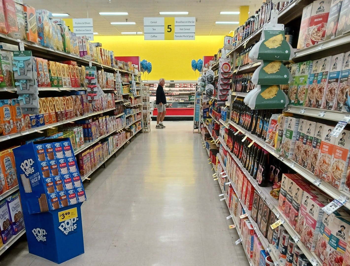
From produce, here's a look across the store's front end. Being this was an expanded 1970's store, it's pretty wide, coming in with a total of 19 aisles. Speaking of the aisles, we can see the aisle markers from this vantage point too. The aisle markers here are recycled Winn Win aisle markers, "updated" to the Centennial style by placing a sticker with the new WD emblem over the old Winn Win-era checkmark logo. An interesting truth about the new Centennial decor is that it's pretty much all built from recycled Winn Win elements. I'm not saying "recycled" in reference to the style either - I mean recycled literally. The wood panels the department signs are mounted to, the aisle markers, the shopping carts, and even the lane lights and new check stands are all brought into these remodeled stores from stores that Aldi closed. I actually saw all of a closing store's Winn Win decor elements packed up on pallets labeled for transfer to corporate, presumably to be rehabbed into Centennial for one of these upcoming remodels. I'm not saying this is a bad thing either - recycling is great - but it's interesting how Winn-Dixie has been able to turn what's old into something new with results that look like they were made specifically for this store.

One decor element that I'm pretty sure is brand new and not a piece of Winn Win with a sticker over it is the overhead beer and wine sign, which looks newly printed. Of the same square style as hanging signs from both Down Down and Winn Win, Centennial carries on that design tradition. In addition to the hanging sign, there was also a wall-mounted beer and wine sign over the beer coolers, which we'll see in a little bit. It's fitting the beer and wine department gets two signs here though - the beer and wine selection is quite large!

Flipping back to Harvey's for a moment, what a difference yet again. During the Harvey's days, the wine selection was only half what it is now, with wine relegated to only the back half of this triple-wide aisle. Beer had roughly the same amount of cooler space, although the vast emptiness from where the old wine shelves from the Post-Bankruptcy era were removed was in-filled with pallet drops of beer. I remember walking into this part of the store during my Harvey's visit and thinking "what a depressing store this is", as the place felt so empty (not just spatially either, but there were a lot of empty holes on the shelves during my visit too). When I got to the deli my impression of this store sunk even more, but we'll jump back to that thought in a minute...

Getting back on track with post-remodel coverage, here's a look from the wine aisles back toward produce. As you'll notice, produce is the only sign in the Centennial decor to use a color that isn't red, with a nice olive green to break things up. While the signage itself is nice, in a larger Winn-Dixie like this, Centennial does look a bit bare in places, an example of that being the large expanse in blank wall between the produce sign and the floral one just out of frame to the right. The blank areas didn't jump out at me too much in St. Cloud, but were more noticiable in this store with it being much wider than St. Cloud was.

While Winn-Dixie's remodel was the new buzz in Lakeland the weekend I was here, some of the new alcoholic beverage options this store had to sell were offering up a different kind of "new buzz". I didn't even realize these kind of beverages were legal to sell in Florida!

While after drinking one of those you may see lots of pretty colors, we'll will turn our attention to a different kind of color quirk in this store that's not a vision but reality. While the entirety of this store's wall paint scheme is beige with a black stripe, the one variation to this occurs in beer and wine, where that sign gets mounted onto an all-black background. The all-black accents for beer and wine is a design tradition that's been carried over from both Down Down and Winn Win yet again, one that Winn-Dixie seems to be keeping going forward.

The selection of wine in this store was quite impressive, especially after how much it was cut back during the Harvey's days. Other than lacking the $100 per bottle stuff, the selection of wine here wasn't too far off from what you'd find in a high-tier Winn-Dixie.

Entering the back right corner, here's a look at the new faux-wood accent flooring in front of the beer coolers, which wraps around the corner into the deli department.

Per the traditional 1990's Marketplace layout, we find the deli located in the back right corner of the store, with its modern companion the "kitchen" attached. Post-Harvey's, this store has a full-service deli with the traditional hot foods and wing bar, nothing too out of the ordinary for a Winn-Dixie these days.

Revisiting Harvey's, after wandering through the sparse beer and wine department next to the partially empty shelves of water, I was surprised to see the store's deli was mostly closed off. As you can see behind that BOGO display, the sliced meat and cheese case was covered over, that service totally out of commission. All the deli had to offer in these late Harvey's days was some fried chicken and limited hot foods, in addition to a few pre-made sandwiches and pre-sliced packs of sliced meat and cheese. Looking at the limited offerings, this was a really sad deli department, although I will give Winn-Dixie some credit for keeping limited fresh services (like hot foods) in this store instead of eliminating deli services completely. According to the Sing Oil Blogger, while Harvey's was never known for its elaborate deli departments (fried chicken was Harvey's primary claim to fame as far as deli offerings go), SEG seemed to slowly be phasing out many deli services in the Harvey's stores for one reason or another over the last few years, with most Harvey's stores losing the sliced meat case and scaling back to what we see here. To me, a limited deli wasn't the best look for a store trying to operate in a town ruled by a competitor that's famous for its deli!

Thankfully the conversion back to Winn-Dixie corrected the limited deli offerings from Harvey's, and while Winn-Dixie's sub sandwiches may never become famous enough to spawn its own variety of memes, at least you have a few different lunch options from the deli once again! Anyway, looking along the back of the store beyond the deli, we find the service seafood counter, followed by the meat coolers.
 |
| So...much...yellow... |
Much like the deli counter, Harvey's also never operated a service seafood counter. You can see the counter covered over in the above photo, buried away in the sea of yellow. And of course SEG had to paint all the support columns yellow to boot! I'm surprised the coolers in the center of the aisle were painted red and not yellow too!

Post-remodel, the seafood service counter has been reopened, with the attendant appearing to be tending to the case when I took this photo too.

Moving along to aisles 2 and 3, we find a double-wide aisle home to various types of soda. Double-wide soda aisles are a common sighting in larger Winn-Dixie stores like this one.
 |
| Oh no, one of the balloons ran away! |
The store's front end was looking very patriotic on this Memorial Day weekend, with every endcap decorated with red, white, and blue balloons. The America 250-themed fireworks display adds to the ambience too, and there were even patriotic themed baked goods for sale as well:

Inside the front door was a table with various red, white, and blue baked goods for sale, placed front and center for weekend impulse buys. While I probably should have gotten a picture of the entire table, I was too enamored by the "Red, White, and Blueberry Pie" - I thought the name was both fitting and clever! While my diet did talk me out of buying a red, white, and blueberry pie, as I was leaving, I did see a display of red, white, and blue yard spinners on a display in front of the next door Dollar Tree - a few of those did come home with me to add to my summertime lawn decorations.

Returning back to my comment on how most of the major decor pieces used in these Centennial remodels are recycled, one of the most blatant examples of recycled decor in this store are the check lane lights - if you zoom in, you'll notice they're the Down Down style lights instead of the newer Winn Win ones. It's not that big of a deal these older lights were used, as structurally the Down Down and Winn Win lights are identical outside of the font used for the number, but it's another small detail to show that Winn-Dixie is trying to keep many of their fairly new fixtures from the closing stores out of the dump.

Compared to the somewhat sad looking aisles with empty holes during the Harvey's days, we now find the grocery aisles fully stocked and perfectly faced.

Due to this store's size, as we return to the back aisle, we'll notice the back aisle is extra-wide on the right side of the building. Pallets of overstock and promotional beverages occupy the extra space in the center of the aisle, alongside the promo coolers.

As part of the remodel, all new grocery shelves were installed, similar to what we also saw back in St. Cloud. These fresh white shelves replace the grungy off-white ones here prior, and even though the shelves are mostly hidden by the product on them, the little bit of bright white that does appear makes for a nice bright pop throughout the aisle.

The meat department's wall sign lines up perfectly with the end of this aisle. Whether it was planned that way or just a coincidence, I don't know.

The lighting and the natural sunlight coming in through the windows provide just the right amount of brightness to this store, no need for bright yellow paint to add any additional brightness here!

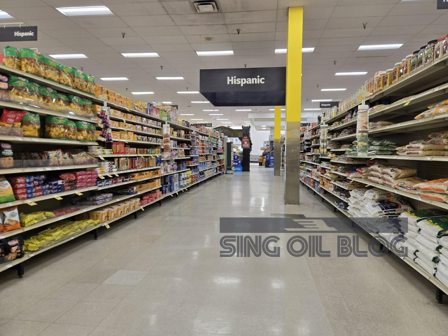
Under the Harvey's branding, this store had a dedicated Hispanic food section in aisle 4, complete with its own hanging sign. As part of the conversion back to Winn-Dixie, the Hispanic products were shifted over here to aisle 10. Even without its own department sign anymore, the Hispanic product offering is still just as extensive as it was before, and on par with the expanded Hispanic grocery assortment that was a big talking point during St. Cloud's recent remodel as well.

Roughly halfway through the salesfloor, we find the frozen foods department. While the coolers were repainted, not much else was done here. Thankfully this store had its flooring redone during the Post-Bankruptcy remodel, or else we could have seen something like this here during the Harvey's days (and I hope flooring like that didn't slip through any Centennial remodels!).

Turning the other way, Frozen Foods gets its own department sign on the store's back wall, lined up with the frozen foods aisles (unlike St. Cloud's, where the sign was pushed further to the left).

From frozen foods, here's a look back toward the seafood and deli counters.

While the former dedicated Hispanic department was relocated elsewhere in the remodel, one other major feature from Harvey's was cut - the old Dollar Shop aisle. While the addition of a Dollar Shop was hit or miss when it came to Down Down and Winn Win remodels at the main Winn-Dixie stores, all Harvey's had the Dollar Shop section as part of its "discount" retooling. While the Dollar Shop did survive in some of the Harvey's to Winn-Dixie conversions (complete with its own new Centennial-style hanging department sign and matching white category markers that are also new), it was eliminated here for some reason (low sales possibly?). I have noticed many of the remaining Dollar Shop sections at Winn-Dixie have a lot of out of stocks, and with the Dollar Shop (like the no-longer-Dollar Tree) also having been forced to push up its once "everything's $1" price point over the last few years, it seems that department has become less of a priority for Winn-Dixie.

Looking out the end of the baking supplies aisle, we get a look at where this store's service desk had been located from the original Marketplace remodel through the Harvey's days. Following the desk's relocation to the island in the most recent remodel, the old service desk space has since been relegated to the new home of various vending machines.

Around the corner from the former service desk location we find the store's former pharmacy box. The pharmacy in this store remained until 2023, when all the remaining Winn-Dixie (and Harvey's) pharmacies were shut down. Following the pharmacy's closure in 2023, some shelves were pushed in front of it to cheaply block off the area. The latest remodel formally sealed off the old pharmacy box with a real wall and a new door, making this part of the store look much nicer as a home for assorted promo items.

Even with the pharmacy gone, health and beauty products were still located in one of the aisles across from the former pharmacy space.

This store had a lot of large support columns all around, another product of this store's major reconfiguration from an old 1970's store into a larger, modern Marketplace.

Dairy begins on the back wall following meats, with the section of dairy seen above being the portion on the back wall.

Turning into the store's last aisle, aisle 19, we find the remainder of dairy along the store's left wall. A second dairy sign was installed on the left wall as well.

Entering the store's front left corner, we find the bakery. The photo above is a good example of why Winn-Dixie should have splurged for a new floor throughout, as the Post-Bankruptcy tiles were quite patchy over here. You can see behind the display tables a small patch of new wood-grain flooring was installed in front of the counter, something they should have brought out into the rest of the department.

Flipping back to Harvey's for a moment, not only do we find the new decor to be a major improvement over what was here before, we also see the current selection of baked goods is much deeper than before too. A few sparse tables of pre-packed baked goods, a few cakes, and some bread was all Harvey's had to offer in their bakery. Harvey's was traditionally never known for baked goods, and many Harvey's stores lacked a bakery in general. For the SEG retooling of Harvey's, many of the stores converted from Winn-Dixie to Harvey's lost their bakeries entirely, which is what I experienced at the other two Harvey's conversions I've been to (one of which is pictured at that link). The Sing Oil Blogger told me he was surprised this much of a service bakery was left here by Harvey's, and with how some departments like the deli and seafood were cut back, I'm surprised this much of a functional bakery was left here toward the end of Harvey's run too.

With Harvey's having had such a limited bakery, pretty much all of the display tables we see post-remodel are new (to this store, at least). A few more of those displays spill out toward the old pharmacy counter, with a few carts of clearance (mostly stuff left over from Harvey's that Winn-Dixie would no longer be selling) just beyond that next to the regular clearance rack.

Here's one final look at this store's front end as we wrap up our post-remodel coverage of this store. One thing to note about the remodeled front end that I found interesting was this store did not receive any self-checkouts as part of the conversion back to Winn-Dixie. The St. Cloud store received new (and this time I actually mean brand new - I saw them being unpacked from the original box) self-checkout lanes as part of its remodel. I don't know if the other former Harvey's stores received self-checkouts as part of their remodels or not, or if the addition of those will continue to be hit or miss as Winn-Dixie continues with remodels of some of the last few older stores lingering about. Anyway, even without the self-checkouts, this store had three regular lanes going on this busy weekend morning, with lines starting to pick up by the time I made my way out. I can't say my visit to Harvey's had that big of a crowd!
 |
| Note that when this store was a Harvey's, the computer system was set up to do BOGOs Georgia-style , where BOGO items rang up as 50% off each rather than taking one of the two off completely like normal. When this store converted back, that went away. |
Since we've compared and contrasted the new Winn-Dixie to Harvey's quite a bit, I figured I'd wrap things up here with a side-by-side of my receipts from both of my visits to this store. Other than the logos at the top they're not much different, and the Harvey's receipt is one of my few mementos from that chain outside of a few weekly flyers and a few bags. The Winn-Dixie receipt showcases the new logo and tagline for that brand as well, a recent addition.

Even though I didn't have as much of a connection to Harvey's as the Sing Oil Blogger, it is sad to see a 102-year-old brand go away completely. However, with how much SEG neglected Harvey's toward the end, I'm not surprised that was the brand's eventual fate, and with the chain's new trajectory, I think it was probably for the best that everything is now united under the singular "Winn-Dixie" name. Winn-Dixie doesn't need a sub-brand serving as a distraction right now, or having those brands dragging down the image of the rest of the chain. Winn-Dixie needs to focus on remodels and new stores, and some increased marketing showing that they're not going away completely (as you wouldn't believe how many people online seem to think that's the truth!). I have a feeling we'll be seeing some more remodels trickle out in the coming months, and hopefully a few more new stores getting announced too (and please, please, please, I beg - no more outright closures!!! Another one of those just slipped out earlier this month due to Winn-Dixie being outbid from a location by a gym!).
Anyway, these remodels are a good sign there's still life in Winn-Dixie, and the East Lakeland store cleaned up very nice for its new life as a Winn-Dixie again. The new Winn-Dixie will serve the area much better than the old Harvey's did, and hopefully this store will be around for many years more. With that, I hope to end the first half of this year of AFB on a high note, as I will be starting my usual summer break. I ended up not getting much of a summer break last year due to more Winn-Dixie news, so hopefully there won't be too much excitement out of Winn-Dixie these next few weeks. While AFB will be on hiatus until August 23, 2026, I will try to work on some MFR stuff during my break to get a few things I've been thinking about published (such as a new post coming June 28th - something to look forward to at least, as I haven't written anything for MFR since last year!). While I try to fix that MFR lull, have a nice summer everyone and see you again on AFB in August!
So until the next post,
The Albertsons Florida Blogger