

Albertsons #4349 / Publix #1344
4701 Park Boulevard North, Pinellas Park, FL
| Today's post is a presentation of Pinellas County retail |
Last time on AFB, we toured a Grocery Palace Albertsons in Arizona (thanks to contributor Monique Sammi). Unfortunately, I won't be able to top that this time, as we're right back to looking at yet another Publixsons store in Pinellas County today! Just in the last few months on AFB, we've toured stores in Washington State and Arizona - two states I never thought would see coverage on AFB. Thanks to our blog contributors we've been able to take a look at what Albertsons has been up to at some of the remaining stores out west, however, us Floridians will just have to settle for this if we want a little taste of the good old days of shopping at Albertsons. Maybe one of these days I'll end up at a Safeway in the Washington, DC area or an Acme to add a little bit of modern Albertsons to our rotation of Publixsons stores (or if the Kroger merger goes through, would the Fernandina Beach Harris Teeter count as a modern Albertsons store?), but for now though, let's turn our attention to our good old friend Publixsons and see what former Albertsons #4349 is all about:
 |
| Clipping courtesy of the Tampa Bay Times |
Construction on Albertsons #4349 began on March 25, 1981 at the northeastern corner of Park Boulevard and 49th Street in Pinellas Park, a suburb of St. Petersburg located just to its north, not far from the Pinellas County approach to the Gandy Bridge. The new Pinellas Park Albertsons would bring a new design prototype to the county, a 58,000 square foot store with an "updated and modernized" exterior, a larger produce department and liquor store, and Albertsons' usual features of a deli, bakery, and pharmacy. The new building design mentioned in the article is what I've been calling the "Trapezoid" model Albertsons, based off the shape of the store's vestibule when viewed from above. Only 11 Trapezoid model stores were built throughout Albertsons' Florida division from 1981-1984, a fairly short-lived design overall. A somewhat stylistic revamp to the previous Skaggs-designed building format, the Trapezoid design was replaced by the Superstore Albertsons buildings, a totally new design era for Albertsons come the mid-1980's.
 |
| Photo courtesy of Google Streetview |
Albertsons #4349 would opened on December 2, 1981, replacing a few city blocks that once contained a few small business along Park Boulevard and 49th Street, and some trailers on the inner portion of those streets. I'd imagine this store received some kind of remodel by Albertsons in the early 1990's, but it did receive one last remodel from Albertsons around 2003, where the design of the facade was updated to what you see in the Google Streetview image above, and in YonWoo's recreation below:
 |
| Photo courtesy of YonWooRetail2 |
A few other Trapezoid model Albertsons stores received similar remodels to the one we see here around 2003, and with this updated exterior treatment the stores would usually receive Albertsons' Broadway/Industrial Circus decor on the interior too. I haven't been able to track down any interior photos of this store from the early-to-mid 2000's to confirm what interior it had before it closed, but I feel pretty confident in saying this store closed with the Industrial Circus decor inside, based on the similar remodels elsewhere.
 |
| Photo courtesy of ferret111 on flickr |
Besides the paint color on the wall above the doors, YonWoo's recreation of this building from the mid-2000's was pretty spot on. The photo above shows the former Pinellas Park Albertsons in October 2009, as it was in the middle of its conversion into a Publix. This Albertsons store was one of the 49 locations sold to Publix in 2008, and one of the later stores to reopen as a Publix from that batch, with its grand opening not opening until January 21, 2010. Upon its opening that day, Publix #1344 replaced Publix #81 in the shopping center across the street, an old expanded Wing Store we'll discuss in much more detail later.

As one of the later stores to reopen from that batch of 49 Albertsons locations Publix bought in 2008, this store had a heavier remodel following its conversion. The interior of the store still has the bones of an early 1980's Albertsons, but Publix redesigned and rebuilt all the service departments from the start, not waiting until a secondary remodel in the early 2010's to do such (as was the case with many of the other Publixsons stores from the class of 2008).

In the years since Publix took over this building, they repainted the walls above the entrances from Albertsons' dark yellow to that shade of blue Publix likes to use on these former Albertsons buildings. Publix also replaced Albertsons' swinging doors with sliding ones, but that's been the extent of Publix's modifications to the exterior of this building since 2010.

That stucco panel where Publix's logo is now was added by Albertsons in the 2003 remodel. Outside of similar decorative stucco over the liquor store entrance, that was the extent of Albertsons' exterior modifications to this building through the years too. Outside of all those small changes the exterior of this building is still pretty close to original...

…including the exposed river rocks still visible on the outside walls! While the rocks have been painted over in the years since 1981, the texturing from the rocks is still visible, which still counts.

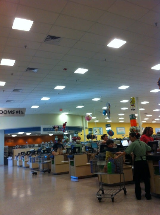
Heading inside, here's a look at the store's right side entryway, which brings shoppers into the store's grand aisle. A similar set of doors is located at the opposite side of the vestibule, bringing shoppers into the pharmacy department. The check lanes are located between the two sets of doors, with the customer service desk originally located along the wall between the two sets of doors when Albertsons was here, which Publix has since relocated to an island located on the grand aisle side of the check lanes.

The interior layout of one of these Trapezoid model Albertsons stores didn't differ much from its predecessor the Skaggs model. The main differences with these Trapezoid stores compared to their predecessors was the reconfiguration of the front vestibule and the location of the service desk, the removal of the side entrance, and pharmacy moving from the back of the building to the front where the side entrance used to be. As such, upon entering the store from the right side entryway, turning to the right we find the deli counter in the building's front right corner, the above photo being a close-up of the deli counter itself.

Zooming out just a bit, here's an overview of the deli department from out in the grand aisle, showcasing the department's signage, or better said, lack thereof. I happened to visit this store just as it began its remodel from Classy Market 3.0/Sienna to Evergreen in late 2021, so we'll be seeing a lot of blank but colorful walls during this tour. The remodel was in its very early stages, as the only progress made by the time of my visit was the removal of the wall signage. No direct signs of Evergreen were present during my visit, but rest assured, Evergreen is going strong in this store now.

With its 2010 opening date, this Publix opened with a late-era version of Classy Market 2.0. Publix remodeled this store to Classy Market 3.0/Sienna around 2015 and then remodeled it once again to Evergreen in 2021, keeping this store on pace with Publix's traditional remodel pattern of every 5-6 years that I've seen mentioned in the past (although as we've seen, some exceptions to that rule do exist from time to time, but certainly not to the extent other grocers let remodeling slip by!).

Panning just a bit more to the left, we see the sign-less bakery. However, the white blotches from where the old signs were pulled down make it pretty easy to recreate the scene in our minds.

Publix reconfigured the design of the bakery prior to the store's opening to make it conform with the then-current Publix design, with the curved ceiling and upgraded back room space.

Every time I walk by the Publix bakery, there's always one of the bakers standing back there, making it hard to get a nice close-up of the bakery counter like this. I must have gotten lucky with the baker having stepped away for a moment to get this shot! (Actually, upon zooming in, I think I found the baker - she's sitting at the computer behind that cake poster). That little area with the wall of drawers behind the counter must be the cake decorating area, but I don't recall seeing that so visibly open at other Publix stores.

Stepping further out into the grand aisle from the bakery, we find ourselves in the produce department. The produce department sign managed to survive the cut since it was hanging from the ceiling, but I'm sure it's days were numbered. Interestingly, that produce sign used to be located further back from that spot (if my depth perception isn't failing me), as the organic produce (which appears to have originally been located on that front display table) used to have a matching CM 3.0/Sienna hanging sign of its own.

Produce extends out behind the bakery department to complete the store's grand aisle, although the blank walls make the department feel just a bit less grand.

With a remodel in bloom, not only do we have a closer shot of the produce department above, but the floral department is poking out from the left side of the image as well.

Floral is located in a small island in what Publix considers this store's aisle 1, that half-aisle of groceries that marks the boundary of the grand aisle. The floral department sign was updated when the store last remodeled from CM 2.0 to CM 3.0/Sienna, but the tile backsplash on the island is actually a remnant from the store's original CM 2.0 decor. That tile matched CM 3.0/Sienna pretty well, so I don't blame Publix for keeping it through that remodel, but that tile pattern will really look strange with Evergreen if it wasn't swapped out during the latest remodel!

Friends, let us all take a moment of silence to remember our dear friend the CM 3.0/Sienna artichoke stock photo, who graced this wall with its presence for almost 6 years, just to be yanked off the wall with nothing more than a giant white rectangle to remember it by. May the collage of cucumbers, kiwis, and leafy greens carry on your honor.

I feel like I took a lot of photos of this store's produce department - if so, at least this is the last one before we turn the corner to take a look at the back wall:

The produce coolers wrap around the back right corner before ending with a shelf of pre-packaged bulk foods. Beyond that is the meat and seafood counter and the meat coolers.

While the back wall was totally sign-less, we can use the colors to tell what everything is - under the green patch is the seafood service counter, with meats under the red patch up ahead. For the most part, the brown paint was just filler color between the two service departments.

Between the transition from produce to seafood was a door to the stockroom, as well as a set of stairs that leads to the store's mezzanine level. Unlike Albertsons late 1980's stores with a catwalk above the front end that led to offices and the breakroom, these Trapezoid-era stores had all that over the backroom, with a much smaller window overlooking the store that we'll see in a little bit.

For now though, let's meander through the grocery aisles as we continue across the salesfloor...

Aargh you ready to take a look down the store's front aisle, maties? Only in Tampa Bay would you see a giant pirate ship as the focal point of a Frito Lay display, but it would make Jose Gaspar proud (and a reference to Jose Gaspar is fitting for this post, as the big Gasparilla festival in Tampa was last weekend).

Anyway, behind the pirate ship is the service desk (never would I have thought those words would ever make it into one of my posts!), with the check lanes stretching out beyond that. When Albertsons was here the service desk would have been located along the front wall between the two sets of doors, although Publix relocated the desk to an island when this store opened to conform the front end layout to what you'd find in a typical new Publix of the 2010's.

The service desk and the check lanes abut the front part of the store's dual front actionway, with the photo above showing us the inner portion of the front actionway, near the beginning of the main grocery aisles.

With this store having a more thorough remodel prior to opening as a Publix, Publix opted to install the much nicer faux terrazzo laminate in this building instead of the yellow and beige tile pattern most of the other stores from the batch of 49 received. Publix also redid the store's lighting before reopening as well, with the lights being Publix's preferred square style (and giving the store a more Publix-y ambience compared to the former Albertsons buildings that still retain their original fluorescent track lighting).

From one of the short front aisles, here's a look into aisle 4, home to all of your baking needs.

If the Seafood counter's signage wasn't removed, we'd have had a pretty good look at it from this spot near the end of aisle 4. The spotlights that once illuminated the seafood sign now shine on a blank wall, although the Sushi sign managed to squeak its way through the first round of signage removal.

The dark red paint makes it much easier to see where all the marks were left behind and covered when the Meat signage was removed. The window into the butcher's room was located under the meats sign, with the pre-packaged meats extending beyond that along the back wall.

Before leaving this area, here's a close-up of the seafood service counter, which also retained its original Classy Market 2.0 tile backsplash into the Classy Market 3.0/Sienna days.

Coffee and cereal are paired perfectly together in aisle 5.

From the end of aisle 5, we can see clear through the greeting cards toward the service desk, with the Jolly Roger flag poking out near the left side of the photo too.

Returning to the inner part of the front actionway, here's a look toward the left side of the store from our halfway point, with dairy lining the wall in the distance.

Baby supplies (complete with their Evergreen category markers and signs) are paired with juices and jellies in aisle 6.

Moving along to aisle 7, we find the first of the store's two aisles of frozen foods. Also, at the end of aisle 7, we can see the window from the mezzanine level that overlooks the salesfloor.

Following a break in the meat coolers by a stockroom door, the back wall transitions into dairy, which wraps around into the store's last aisle, aisle 14.

Aisle 8 is the other aisle of frozen foods in this store, pictured above.

Yuengling and Little Debbie cakes - that sounds like the diet of most college students there! Anyway, stepping out of aisle 8, here's another look toward the front end through some of the short general merchandise aisles, with some office supplies and health and beauty products visible down those aisles.

From over the halfway point in this tour, here's a look back toward the bakery from the front actionway.

Following frozen foods in the grocery aisles, we find wine and beer in aisle 9.

From the end of aisle 9, here's a look back at the meat coolers and the meat and seafood service counter.

With the chips and soda in aisle 10, this is the aisle to party in!

Jumping over to the internet's favorite grocery aisle, number 12, we find Ziploc bags and paper products.

Last but not least we find aisle 14, which runs along the building's left wall, where we find the remainder of the dairy department. On the other side of aisle 14 you'll find every kind of bottled water imaginable - sparkling, spring, distilled, purified, mineral, flavored, and even caffeinated (yes, that's a thing - what will we think of next to make water more interesting?).

Approaching the end of aisle 14, we find the side of the pharmacy counter.

The pharmacy signage managed to survive the signage purge for the same reason the produce sign did - while it looks like the pharmacy signs are mounted to the wall, they're actually hanging from the ceiling a few inches out from the wall. I guess since they weren't true wall signs, they made the cut to hang around this store a bit longer. The pharmacy was totally rebuilt after Publix took over this store, with everything you see being straight out of Publix's 2010's store design.

Walking away from the pharmacy, here's a really nice overview of the front of the store from the inner part of the front actionway. The low height of the short front aisles gives us a clear view of the bakery on the other side of the store, with the check lanes just on the other side of those shelves.

And speaking of the check lanes, here they are. Including the 3 express lanes in the middle, this store had 11 lanes total, which is on the higher side for a Publix (it's pretty uncommon to see a Publix with over 10 staffed lanes, so either this store is high volume or just had a lot of extra front end space).

Pictured above are lanes 10 and 11, with the service desk under the round ceiling behind that.

Here's a nice overview of the store's front end from the opposite side of the building, this time looking toward the pharmacy counter.

Publix's online order staging area is in the approximate area of where the service desk would have been when Albertsons was here. In addition to that, the front wall in front of the check lanes was home to more kiosk machines.

For a change, our final interior photo of this store will be of the pharmacy. When you walk into this store through the left side doors, the pharmacy is right on top of you like this, so there's not a lot of maneuvering through the store if you're coming in just to use the pharmacy counter.

Back outside, this building is still undeniably an old Albertsons.

While the exterior is still mostly vintage to 1981, Publix has done a good job of keeping this store up to date, especially inside.

Now that we're back outside, here's a look toward the attached liquor store, located on the front left corner of the building.

The trim and stucco detailing was added by Albertsons during the 2003 remodel, but otherwise the remainder of the liquor is just as original as the rest of the exterior.

Publix usually replaced Albertsons' old swinging doors on the old liquor stores, but opted to keep Albertsons' original ones here.

I really don't have much else to add about the liquor store, other than I took more photos of it that I thought!

Down the left side of the building, all that original river rock still lies exposed. After the last few Trapezoid stores were built in the mid-1980's, river rock was retired from Albertsons' buildings. The mid-1980's was when Family Mart also dropped river rock from their store designs, so that must have been around the time when river rock went out of style as a wall treatment, and went back to being used as a garden landscaping material.

That's about it for the old Albertsons building, but let's head out into the parking lot and back in time 16 years for a glimpse at this store's former Albertsons Express gas station:

Directly on the corner of Park Boulevard and 49th Street was the store's Albertsons Express gas station, added around the turn of the 2000's in an unused corner of the parking lot. This Albertsons Express wasn't as deluxe as others, and was only a gas canopy with a small booth between the pumps to pay for gas and buy cigarettes. After Albertsons sold off this station in 2008, the new owners tore down the old Albertsons Express and built a fancy new gas station on the site called Racin' Gas, which opened around 2010. Racin' Gas rebranded to Chevron in 2018, and has been a Chevron since.
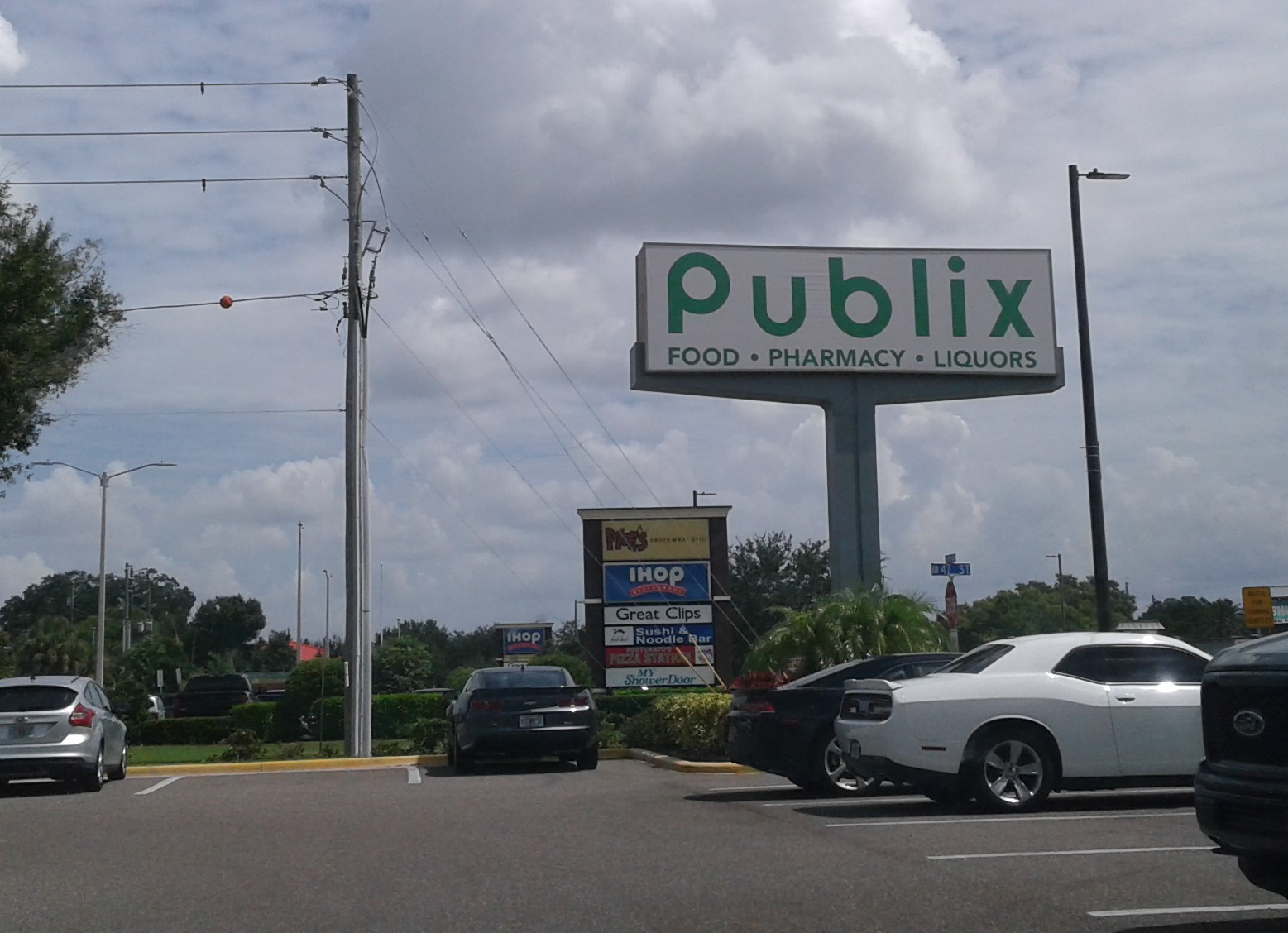
We'll finish out our ground coverage of this Publixsons store with a photo of its road sign facing Park Boulevard, which is very much a cheap reuse of the classic Albertsons pillar sign.
Now that we've seen that, it's up to the sky we go as we begin our aerial coverage, beginning with some Bird's Eye aerial images courtesy of Bing Maps:
Front

Right Side

Back

Left Side
And now for some historic aerial images, courtesy of Google Earth and historicaerials.com:

Former Albertsons #4349 - 2023 - The old Albertsons is the large building on the right side of the image, while the shopping center to my left contained the original Publix store the current Publixsons replaced.

Former Albertsons #4349 - 2010 - Redevelopment of the old Albertsons Express is in progress here.

Albertsons #4349 - 2008

Albertsons #4349 - 2002 - The building as it appeared before the exterior modifications were made during the 2003 remodel.

Albertsons #4349 - 1998 - Albertsons was doing something right in the 1990's.

Albertsons #4349 - 1984

Future Albertsons #4349 - 1969 - Here we can see all the buildings that were later removed for the new Albertsons store.

And with this parting shot, that will conclude our look at the Pinellas Park Publixsons. While that exhausts my coverage of this Publix in the present day, as you've probably noticed, I haven't talked much about the original Publix this store replaced. That was by intent - I didn't want to spend a lot of time talking about the original Publix today, as we'll be taking about it a lot in our next AFB post - the original Publix will be the store we're touring next time! Before you get too excited with dreams of Wavy Pastel and Classy Market 1.0 remnants to delight you, let me just say that while we'll be seeing some supermarket remnants next time, they won't be Publix's. However, there's a lot to see and explain about old #81 across the street and what happened to it in the years after Publix left. While it's no Nam Dae Mun, I think you'll still find the store interesting, so be sure to come back in two weeks for that!
So until the next post,
The Albertsons Florida Blogger
Shiver me timbers! A Publix without decor on the walls! I suspect this store looks better in nEvergreen than it does in a Krogering state with walls where decor used to be. Granted, in this case, the decor is missing because Publix took it down rather than the Krogering state where the decor has fallen off (actually, this seems to happen at Albertsons locations quite a bit as well, lol). Now, whether it looked better with Sienna or now with nEvergreen? Well, I think you know what my guess is going to be, lol.
ReplyDeleteGiven how dated the trapezoid model exterior looks here at this location, I'm surprised at how modern the interior looks at this Publixsons. I'm not going to say it looks like this store was built in 2010 on the inside, but it doesn't really look that far off. Yeah, the drop ceiling doesn't look like 2010. That said, Safeway was still building new stores with drop ceilings in that era, thankfully, and then there is this Market Basket in the Northeast which opened in late 2022/early 2023. Isn't she grand? Check out the staffing on the front end! Link: https://maps.app.goo.gl/rknopXxnVwBuiLKb6
It does amaze me at how tall the walls/ceilings look in these older Albertsons because I don't remember Blue & Grey Market-era Houston Albertsons having such tall ceilings. Grocery Palace is a different story, as we saw in last week's guest post from Arizona, but this really doesn't look much different from our Grocery Palaces here in Houston which have had drop ceilings installed by the new tenants! That probably helps the modern feel along with Publix installing the recessed lights.
Maybe the colors have something to do with it, but this Publixsons seems a bit nicer to my eyes than the Jewel Good Day Publixsons you shared with us recently. The flooring situation may help with that as well, but it should be said that both Publixsons have the ancient exterior look to them. With that in mind, I guess these stores must do well and the customers must like them if the wrecking ball has been kept away. Either that or the pirates have taken off with the wrecking ball and maybe the artichoke stock photo as well!
Ay, matey, that she is! Surprisingly, there aren't many decent photos of this store with Evergreen online, but I feel timing my visit to this store right after all the signage was removed made for some interesting scenes! Outside of a few aisle marker fails, I don't recall ever seeing any pieces of Publix's wall signs just falling off like you'd see in a Kroger or an old Winn-Dixie, however, I don't think Publix lets their decor stay on the walls long enough for that to ever be a problem!
DeleteOut of all the Publixsons stores out there (and not counting the rebuilds), Publix has only ever significantly altered the facade of one, the old Kenneth City Albertsons. For whatever reason Publix seems content with keeping the old facades as-is, even if the interiors received much more significant overhauls. With how 1980's some of these Albertsons exteriors look, I'm surprised Publix hasn't upgraded more of them. Interestingly, Publix did have a handful of newbuild stores in the 2003-2005 timeframe that got drop ceilings throughout inside - it was rare, but they did build a few before switching back to the completely open ceilings. I also would have never guessed that Market Basket you linked to was only a year old - it looks like something straight out of the 1990's! I have heard that Market Basket was a bit old fashioned when it came to how their stores were run, but I didn't realize that carried over to the new buildings too!
The mid-1990's built Albertsons stores in Houston had slightly lower ceilings than these older stores. These older stores have a ceiling height comparable to a modern open-ceiling store, and I like the effect of the higher drop ceiling myself. The ceiling height may also factor into why this store looks better than the Jewel-Publixsons from last time, as that store's perimeter had a lower ceiling than the center store, and had a more 1980's-style interior ambience than this store with the way the ceiling was designed. This store was pretty busy when I visited, so it seems to be doing well, and whatever the customers can do to make that wrecking ball walk the plank, I'm fine with!
I hate to break it to you, but this photo you linked to just shows plain 'ol Invigorate / CM 2.0. If you need more convincing, take a look at this picture GeorgiaPubDude added to the spreadsheet. Publix kept using Invigorate well into 2010, so I'm not surprised this store received it.
ReplyDeleteAs for the produce department, I've typically only seen those GreenWise department signs over the full organic department rather than just advertising organic produce. I'd have to guess that the produce department used to be smaller and there were previously a few shelves with organic dry goods here.
I know some of the 54M stores received 11 manned checkout lanes (before the SCO trend caught on), but I can't say I've ever seen a store with more than that. I also feel like the days of stores having 11 traditional checkouts are numbered . . .
Neat post, and like Anonymous mentioned, the store looks much newer on the inside than the outside would make you think. I'm also very intrigued by what you found in old #81, and have to admit that I'm even more confused after looking that store up on Google Maps!
Oh yeah, and thank you for all of the links as well!
DeleteI thought all those wall tile patterns (like the ones in Floral and Seafood) were exclusive to CM 2.5, but I guess they began in late-era 2.0 stores as well. Had I not seen those tiles I would have figured this store opened with plain 2.0 like the others from the 2008 batch.
DeleteI zoomed in on that photo of the Greenwise sign, and it looks like more produce underneath it. Maybe Publix left that sign behind for a while after the Greenwise aisles were removed?
One of the Publixsons I've been to had 13 checklanes (I can't find which one that was now), but that was the most lanes I've ever seen in a Publix. Even in the Publix stores with SCO, they'll still have a decent number of staffed lanes going too - certainly one of the more efficiently run front ends out there.
As for old #81, like I said at the end of this post, don't be looking for anything related to Publix in there, that post is all about who came after!
And you're welcome!
The artichoke is dead, long live the artichoke.
ReplyDelete"The internet's favorite aisle" -- ha, I'm going to have to steal that and add it as an attribution to the group page! Also, I'm kinda surprised you didn't say the sushi sign "rolled" past the first round of signage removals :P
While those Washington and Arizona tours may have been a bit more exotic, it's a post like this (and its author!) that makes this blog what it is! Always nice to check another Publixsons off the list, especially since there's only a finite number of them (even if they may seem infinite, lol...)
Aisle 12 has a new tagline now! (I guess all the other aisles will be even more jealous now!) That was a good sushi pun too - I guess I had too much seaweed in my mind at the time to come up with that one!
DeleteA Publixsons in Pinellas County may not be exotic findings for this blog, but I try to make them entertaining. Thanks for the compliment, and trust me, I have no shortage of Publixsons stores to post!
Hmm, it's going to be interesting to see this store in Evergreen. I actually liked this store as a Publix. It's a Publixified version of my long gone Panama City Albertsons, and had the company been doing better with that store, Panama City's would have looked probably just like this one. I could not find the newspaper clipping showing this store's grand opening, but if memory serves me correctly, the grand opening was on Wednesday, December 2, 1981. Hard to believe that was over 42 years ago!
ReplyDeleteThe trapezoid stores now do look dated, but they sure looked cool in the 80's and early 90's! I don't know if it's just me, but in these trapezoid stores the ceilings seem even higher than the old Skaggs model stores. It's probably just my imagination. I'm quite surprised that Publix has decided to keep this store as-is (not gonna complain though)! Actually going into this store (now nearly 3 years ago), I felt like I went back into time as a kid (from my times at identical 4355). The layout was exactly the same. I'm sure this store had the Video Rentals department just to the right of the interior photo you shot of the right side entrance. I remember in Panama City, they also had cigars and pipe tobacco lining the wall just under that set of windows by Video Rentals. I can smell that sweet smell of pipe tobacco right now. My mom and sisters used to go to the Brach's Candy display that was placed conveniently near the right front entrance in the front Actionway between the Bakery and Checkout. Ha, sorry to ramble on, but this store brought back a flood of memories for me when I went inside (even as a Publix!) I wish things had turned out different, but we live in an entirely different retail atmosphere now than even in the Mid 1990's!
There aren't many good photos of this store with Evergreen on Google, and even the few new ones from last month don't have any good angles of the decor. It's a shame this was only one of the 11 Trapezoid stores that became a Publix, although those Trapezoid stores didn't have the best fates overall - out of the 11, only 3 are still supermarkets (this one, #4347, and #4350, following the Lucky's debacle), and 4 have been demolished (#4348, #4352, #4353, and #4354). Had Albertsons managed to keep the Panama City store open two more years, maybe that one could have become a Publixsons too (the 23rd Street Publix is over a mile away, and for Publix, that's far enough between two stores). Thanks for the confirmation on the opening date of this store too!
DeleteI'm glad you got to visit this store yourself a few years back - this one is probably the closest left to what #4355 would have been like back in the day (although #4347 probably comes close too). The front end features at Albertsons seem much more exciting than the few kiosks Publix has up there now too! I thought this store would bring back some memories for you being a nearly exact copy of #4355, and maybe you'll be back in Pinellas again soon to see what this store looks like with Evergreen inside.
This Publix went through a remodel over 2 year ago and looks way different then what is shown in this post.
ReplyDeleteYes, I visited this store just as that remodel was beginning, which is why the store lacked signage on all the walls in my pictures. The new gray look is certainly much different than what used to be here.
Delete