

Jewel-Osco #4102 / Albertsons #4401 / Publix #1300
1921 N. Belcher Road, Clearwater, FL - Beckett Lake Plaza
| Today's post is a presentation of Pinellas County retail |
Hello all, and welcome to another year of AFB! How about we kick of 2024 in a big way with a really big Publixsons? If you want a big Publixsons, you don't have to look much further than one of the former Jewel-Osco stores Publix inherited from Albertsons. The 4 former Jewel-Osco buildings Publix still operates out of consist of the 4 largest stores in the chain, with all of these buildings hovering around the 75,000 square foot mark - a good 20,000 square feet outside of Publix's typical comfort zone. It's always fun to pop into a Jewel-Publixsons store, so let's find out a little bit more about this location in Clearwater before we head inside:
 |
| Photo courtesy of YonWooRetail2 |
The Clearwater Jewel-Osco opened on August 2, 1989 as the second of these Floridian superstores dreamed up by the Skaggs Company, opening 5 months after the brand's somewhat messy Floridian debut at Largo Mall. As far as I'm aware, grand opening day at the new Clearwater Jewel-Osco was much more uneventful compared to Largo Mall's total failure of the cash register system.

And speaking of the grand opening of the Clearwater Jewel-Osco, I managed to track down this photo of the store's ribbon being cut on the morning of August 2, 1989, one of many photos uploaded by Skaggs family member Mindy Skaggs Benkenstein to this fantastic album of photos showcasing many of the Jewel-Osco grand openings throughout Florida. While some of the interior photos in that album could have been from this store (all 7 Jewel-Osco stores opened in Florida looked exactly the same inside, so I can't narrow down where any of the interior photos were taken), the photo above I was able to confirm as being of the Clearwater location, as the building's address number of "1921" is visible above the doors in the background.

The Clearwater Jewel-Osco operated for just shy of 3 years before Albertsons purchased Skaggs' failing Floridian superstores in early 1992. Following a brief conversion, Albertsons opened in this location in April 1992, and remained here until this store was included as one of the 49 locations sold to Publix in 2008. Publix reopened this store after yet another brief conversion, with Publix's new "superstore" opening on November 6, 2008.

Outside of the paint color and the decorative trim Albertsons installed around their logo (which now surrounds Publix's), the exterior of the building is still exactly as it looked when Jewel-Osco was here. These massive stores had an equally as imposing facade, all adding to the effect of just how large these store are.

As usual with these Jewel-Osco superstores, the building has three sets of doors into the main store - a set of doors on the right side of the building that leads into produce and the service departments, a set of doors on the left side of the building to access the pharmacy, and a set of doors in the center of the building that leads to the check lanes and the center aisles. While Publix seems to use all the doors interchangeably as entrances and exits, the original Jewel-Osco configuration used the doors on the far ends of the buildings as the entrances, with the set of doors in the center of the building (behind the check lanes) being a central exit.

While Publix doesn't designate any of the doors specifically as an entrance or exit, the center set of doors seemed to be the most popular option at this store, with the photo above giving us a nice close-up of the central entrance.

Stepping onto the front walkway, here's a look down the long sidewalk that connects the three sets of entrances as well as the liquor store (located behind me, which we'll see later in the post). The center set of doors (behind the propane tank case) is the set we'll be entering through, so let's head inside and enjoy a little bit of the oddity that is the Jewel-Publixsons:

Say what you will about Publix's Evergreen decor, but every time I walk inside a Publixsons or any other ancient Publix and see this decor, I breathe a sigh of relief that it has evaded the replacement list for a few more years. The Evergreen decor you see in this store is the third Publix decor package this building has seen through the years, beginning its Publix tenure with Classy Market 2.0, followed by a remodel to Classy Market 2.5 in the early 2010's, and then receiving Evergreen in early-mid 2021.

The right side entrance is visible to my left, with the service desk in an island (most likely relocating to the island during the CM 2.5 remodel from one of the alcoves now present on the front wall).

As you would expect from a 75,000 square foot Publix, there's a lot of wide open space in here, especially along the front end. That tiny table of BOGOs doesn't do much to fill this wide expanse of salesfloor as we look from the service desk toward produce in the building's front right corner.

Even the produce department itself is pretty spaced out, as Publix had a lot of space to fill in this alcove.

Following produce are the bakery and deli departments, which we'll see more of in a little bit.

Floral found its home on the back wall of the produce alcove, a fairly spacious floral arrangement compared to some of the cramped little counters near the front entrance you typically find at newer Publix stores.

I always like these photos I take from the produce alcove looking toward the other side of these former Jewel-Osco stores. From this vantage point, you can really feel how large these stores are. Way out there in the distance is the pharmacy, with a large expanse of grocery aisles separating us from that.

As usual in these former Jewel-Osco stores, the deli counter is located in an island near the back right corner of the building. Originally, Jewel-Osco had a small cafe of some kind and a cheese counter at the front part of the deli island, with the main deli counter located toward the back of the island. A small seating area would have been located in front of the island to accommodate the cafe as well. Publix still uses the back part of the island for the main deli counter, with the front part mostly blocked off by grab-and-go coolers and the Pub Sub station. I'd have to imagine Albertsons had a similar deli set-up to what we see here today as well, as Albertsons didn't run any super-elaborate prepared food options like Jewel-Osco was trying to with these stores.
Also, it is just the photo, or does the "D" in the deli sign over the main counter look like it wants to fall off already?

Jewel-Osco's former seating area is now home to Publix's soup and salad bar, a few tables of baked goods, and more of that famous empty space. From this angle we also get a view down the inner aisle of this store's dual front actionway, another famous feature at Publixsons stores.

From the front of the deli island, here's a look back toward produce and the building's right side entrance. For a grand aisle, the one in this store sure is grand due to its size - Publix's smallest store is probably no bigger than this store's grand aisle!

As we approach the deli island, the grand aisle channelizes itself between the island to my left, and the bakery department to my right.

While Publix updated most of the decor during this store's Evergreen remodel, there were three major relics of past Publix decor packages that slipped by - the first and most obvious being the floor. While the tile floor isn't exactly decor specific, the tan and white color scheme meshed much better with the Classy Market iterations of the late 2000's and 2010's. I've yet to come across an Evergreen Publix that opened with a non-terrazzo floor, but if the remodel at the Oakland Park Publixsons was anything to go by, this shiny beige flooring is what appears to be the non-terrazzo floor covering that directly compliments Evergreen. Flooring aside, the other major relic of Publix decors past we'll find in this photo is the tile backsplash in the Bakery department, which is a remnant of this store's previous Classy Market 2.5 decor. All said, while you can tell floor and the bakery tile don't perfectly match Evergreen, there are worse clashes with Evergreen that exist in this world.
As for that third relic of Publix decors past, we'll see that a little later in our tour...

When someone says "It's too soon for pumpkin spice" and you realize you don't need that negativity in your life - oh no, Publix is bringing Instagram memes to life! #publix #pumpkinspice #afbisawesome #whyamimakingfakehashtags

Last fall pumpkin spice was everywhere, to the point where a tire shop by me put a similar message to this one on their roadside sign, which I thought was fun satirical spin on the modern pumpkin spice craze. Anyway, there's still a few more months before we have to think about pumpkin spice again (and what new products will be getting a pumpkin spice version this year), so lets move on to the Meat & Seafood department and think about some pumpkin spice steak & shrimp for a moment:

The Meat & Seafood counter is located behind the deli island along the store's back wall, with an alcove beyond the service counter for the prepackaged meats.

Aisle 1 begins along the back of the deli island, with water of all kinds to my right, and juices to my left. Looking toward the back of the building, aisle 1 lines up perfectly with the center of the meat and seafood counter.

Here in aisle 2, we get a better look at the raised ceiling over the center of the store, featuring a similar effect to what we'd find in an older Publix store.

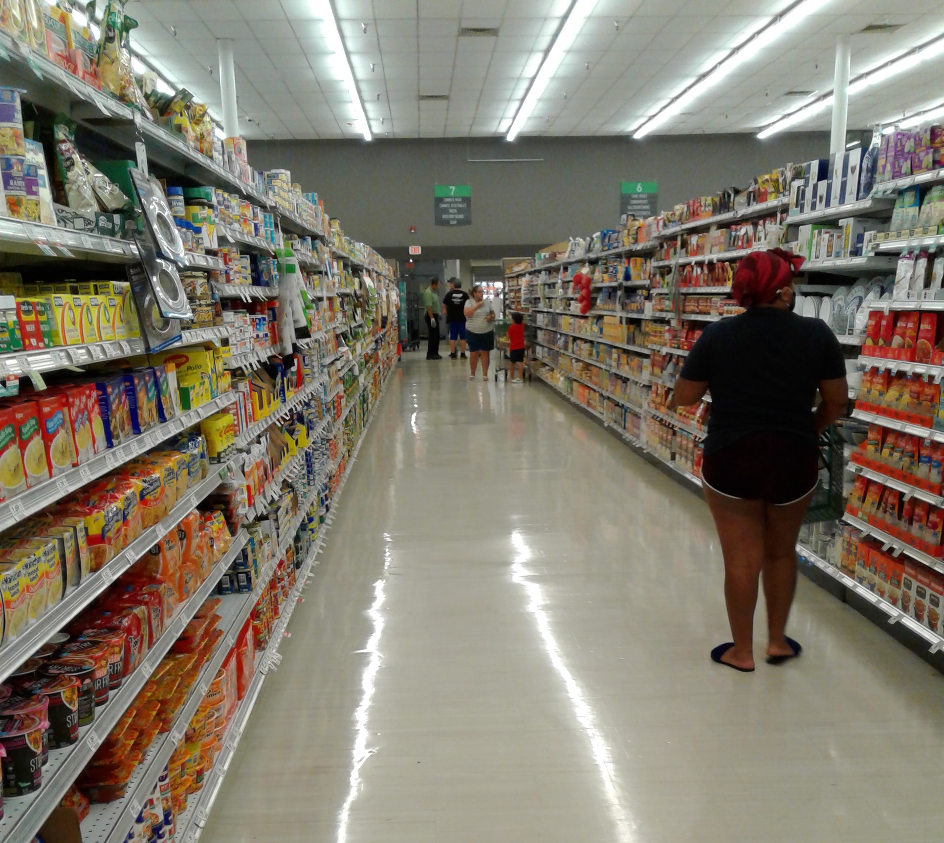
Wide aisle are certainly one bragging point about this store - all the grocery aisles and actionways in this store were plenty big for carts to pass by. Even though this store is obviously oversized for Publix's taste, I have to say, the spaciousness is really nice for shopping purposes. It's quite annoying having to maneuver around people blocking the aisles in tighter stores, and that's not a big problem here with how much passing room is available!

While the last photo showcased the inner aisle of the dual front actionway, the outer part of the actionway near the check lanes is even wider, and chock full of filler displays to try to hide all the extra space.

The cleaning supplies aisle is nice and tidy, as it certainly would have been ironic if it wasn't!

Returning to the back of the store, here's a look into the meat alcove. The only signage for the meat department was the sign over the service counter, with some of Evergreen's stock photo collages breaking up the blank wall space in the alcove.
And if it makes you feel any better, I did pick up that package of hamburger buns on the floor after taking this photo - it was bothering me too.

Pet supplies, hardware, and other assorted general merchandise items could be found here in aisle 6.

From aisle 7, here's a look toward the doors at the very center of the building. Yes, we are roughly at the halfway point of this tour!

There is something oddly satisfying about how neatly all those bottles of Sparking Ice were placed on that endcap. I applaud whoever took the time to do that, because that endcap looks very painstaking to stock so perfectly!
Anyway, reaching the end of aisle 7, the short segment of it between the two parts of the front actionway contain magazines and books.

Halfway through our tour, we still have plenty more to see, as we still have a bit of walking to do before we get over to this store's last aisle, aisle 15.

All the comfort foods you need are available here in aisle 9 - candy and soup.

Here's a closer look at the photo collage in the meat alcove. Pretty much every Evergreen store has this collage somewhere on the perimeter wall, this particular one most commonly found in the frozen foods aisle in newbuilds. This photo collage seems to be a nod to Publix's Floridian roots, with its artistic depictions of palm fronds, the art deco building, and the tropical cocktail ingredients. The middle panel says "I ♥ Green #Publix", stating the theme of the collage (everything featured is green in some way), and may even be a subtle nod to the decor package's name, "Evergreen". Unlike Publix's previous decor packages (which were all named after random paint, tile, or fixture elements within the packages themselves), I wonder if the name "Evergreen" was created as a nod to Publix's longtime corporate color (green) and mantra ("Bleed green"), and isn't just a random named picked out of the Sherwin Williams catalog like some of the others were. So far that's the only theory that makes sense, as the name Evergreen certainly wasn't derived from this decor's primary color scheme! (Hence the tongue-in-cheek "Evergray" name this decor has developed in the supermarket fan community).

While most of the departments in the store only got one wall sign, Dairy was the exception, getting its name on the wall twice. The sign in the corner is clearly the primary sign for the department, with its complementary textured back paneling (which from closer inspection at another store, is just wallpaper of some kind). The secondairy sign for this department (and I'm sorry if I used that one before, but it's too fitting here) looks like an afterthought, just slapped on the wall without any background directly on the colored stripes.

Returning to the grocery aisles, we find the health and beauty overflow in aisle 11. The front aisles closest to the pharmacy contain the rest of this store's health and beauty/pharmaceutical selection.

Near the pharmacy side entrance was this gigantic beer display, which featured signage congratulating the Tampa Bay Lightening for their second consecutive Stanley Cup win in 2021. While the signage is a nice tribute, this display isn't as creative as the faux hockey rink the Palm Harbor Jewel-Publixsons built to fill their extra front end space!
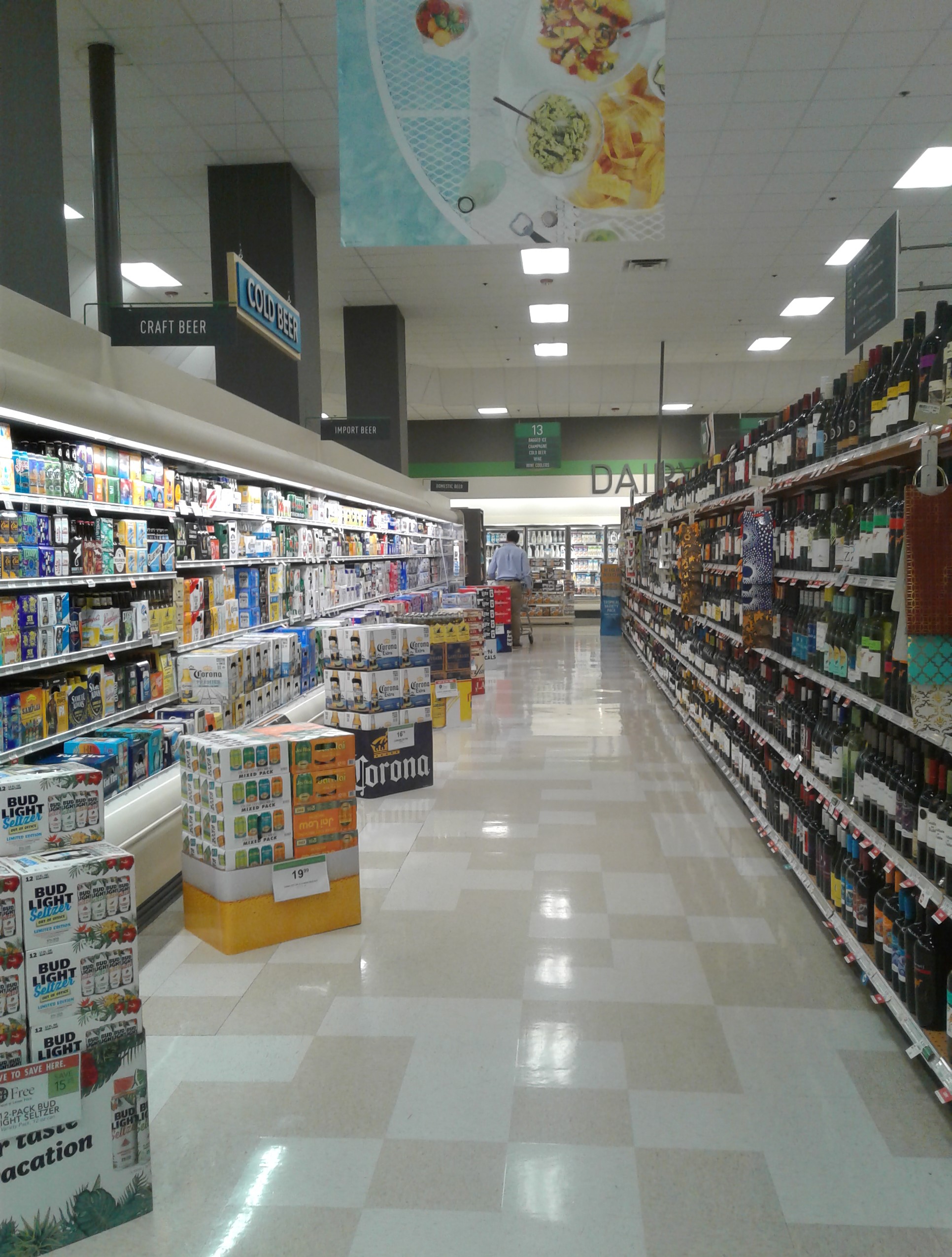
Earlier in this post I mentioned there were three major relics of Publix decor past floating around in this building - the first two being the flooring and the bakery tile backsplash. The third relic can be found in this aisle, and stands out quite a bit from its gray surroundings - the Classy Market 2.5/3.0 "Cold Beer" sign. No one bothered to yank that sign down during the remodel, and this isn't the first time I've seen that "Cold Beer" sign survive an Evergreen remodel either.

Following the beer coolers in aisle 13, aisles 14 and 15 contain frozen foods. The photo above shows aisle 14, which is entirely dedicated to frozen food coolers...

…while aisle 15, the store's last, is three quarters frozen foods, with a tiny bit of the dairy department wrapping around from the back wall into this aisle.

Speaking of the dairy department, we'll take a closer look at it now. The above photo shows us the secondairy department sign again, as well as an overview of the store's back wall as seen from the building's back left corner.

The main dairy department sign is located in the back left corner, with the sign taking up the perfect amount of space to fill the corner cut.

The dairy photo collage was placed on the left wall in aisle 15, although I feel it would have been better if Publix flipped the placement of the secondairy department sign and the collage. The secondairy department sign would have looked less awkward on this wall than the taller back wall.

Leaving aisle 15, the front left corner of the building is home to the pharmacy counter. The pharmacy counter itself is located just out of frame to the right, with the short aisles of pharmaceuticals in front (and what the above photo is focused on).

The pharmacy counter itself if pictured here, with the pharmacy side entrance located just beyond the counter.

Quite a bit has changed here since the pharmacy's days branded as an Osco (although it appears the Florida stores called the pharmacy "Jewel-Osco Prescriptions" instead of just plain "Osco" like the stores around Chicago would, probably because Osco on its own didn't have name recognition in Florida).

From the pharmacy, here's a look across the front of the store from the inner part of the front actionway...

…and our final interior photo shows a similar scene to the prior photo, just looking across the part of the actionway closer to the check lanes.

Exiting the store through the pharmacy doors, here's a look at that set of doors from the exterior, with the liquor store just to the left.

Here's a better look at the liquor store itself, tucked into the left side of the building.

While that concludes our tour of the main store, let's jump across the parking lot to see one last element of this store's past, this time with a relic from the Albertsons era:

At the back of the parking lot, in the tip of the triangle where Belcher Road intersects with Old Coachman, lies the former Albertsons Express gas station. This little corner of the Jewel-Osco property remained empty until the turn of the 21st century, when Albertsons decided to squeeze this gas station on the site. Albertsons Express operated here until 2008, the year when Albertsons began exiting the gas station business (although the company has since returned to operating gas stations). I don't know if the gas station ceased being an Albertsons Express following Publix's purchase of this store in 2008, or if Albertsons began purging gas stations prior to their deal with Publix that August. Regardless, all of the Floridian Albertsons Express locations were sold off piecemeal to independent operators around that time. This station briefly became a Citgo after Albertsons sold it in 2008, then operated independently for a few years before becoming a Valero station in the early 2010's. Today this gas station still operates under the Valero brand, with the convenience store using the name "Fuel Express".

The convenience store building hasn't seen much change since Albertsons operated it, to the point where the only difference to the building's exterior was Albertsons A-leaf logo being removed for that square sign that reads "Fuel". The "Express" portion of the sign is a remnant from Albertsons Express!

Even though this gas station has seen nothing more than an obvious cheap rebrand, on my original visit to the area in 2021, I only took those first two interior photos we just saw and drove off to my next destination. Later on I began to regret my decision that day, especially after seeing how other former Albertsons Express stations that were sold off to independents had virtually nothing done to their interiors. Thankfully I ended up in this area again in 2023, and I intentionally made this place my gas stop for the day so I had an excuse to check out the interior of the convenience store.

Stepping inside the convenience store, the cashier counter is immediately to your left, with a few aisles of snacks and such to your right. the self-serve coffee and drinks are straight ahead toward the back of the building. The above photo was taken from the hallway that leads to the restrooms, which were located behind the cashier counter, looking out toward the few aisles of snacks.

From the other side of the building, it becomes much clearer that nothing has been done inside this convenience store since Albertsons left! Besides the removal of the A-leaf logos, the wall decor is all original, with the signage for the check out and beverages visible here.
Now that we've explored the former Albertsons Express gas station, we can head on up to the sky for a quick look at some satellite imagery, starting off with some Bird's Eye aerial images courtesy of Bing Maps:

Front

Right Side

Back

Left Side
And now for some historic aerial imagery, courtesy of Google Earth and historicaerials.com:

Former Albertsons #4401 - 2023

Albertsons #4401 - 2007

Albertsons #4401 - 2002

Albertsons #4401 - 1998 - The Albertsons Express had not yet been built in this image

Future Jewel-Osco #4102 and Albertsons #4401 - 1985 - It looks like the Jewel-Osco was built on the site of a small farm.

And there you go, another tour of one jewel of a Publix complete! With this tour finished, we only have one more operational Jewel-Publixsons left to see - the Bradenton one, as we've already toured the Jewel-Publixsons in Palm Harbor and Largo. Sadly, I didn't get to visit the Hudson Jewel-Publixsons before that one was ripped down, but we will eventually get a tour of that site in the future. For the remaining Floridian Jewel-Osco stores, we've already seen what remains at the former N. Dale Mabry site, and the Temple Terrace store's remains will come in the future as well. That said, I've finally hit the halfway point in my coverage of the 7 former Floridian Jewel-Osco stores, a modest milestone I suppose. We'll come back to the topic of Jewel-Osco again in the future, but next time we'll take a look at a slightly tamer former Albertsons store, so be sure to come back in two weeks for that!
Here's to a great 2024, and until the next post,
The Albertsons Florida Blogger
It looks like you're starting 2024 with a Jewel of a Publixsons! Well, it would be more of a jewel without the nEvergreen, but I understand your point about it being a good sign, if not a good sight, to see these stores with Disagreeable Gray because that means the wrecking ball isn't too close nearby. It is really strange that Publix has kept this one around given, if nothing else, an exterior design which looks right out of the 1980s. I suppose this store was destined to become an Albertsons at some point. Those semi-circle designs on outside that Jewel-Osco used look like a Good Day logo!
ReplyDeleteSpeaking of the outside, I find it rather amusing that there is an 'Exit Here' sign on the outside of that Jewel-Osco when presumably nobody should be exiting there since they would have to enter the store first! That's a bit odd. It's also a bit odd that the entry and exit signs still exist at the Publix since Publix logically doesn't differentiate between entrance and exit doors. It is a strange relic from the 1980s.
The wide aisles of a regular Publixsons are quite strange looking as it is, but the extra wide aisles of a Jewel Publixsons is even more strange to see. As you say, it is very nice to shop at a store with aisles as wide as that, but it does look a bit strange in photo form!
Also a bit weird, but maybe not, is the overall look of the store in the photos. I don't know if it is the wide open spaces in the store, nEvergreen, the mismatch between the 'warm' colored floor and the 'cold' wall paint, the lighting color in the store, or just the white balance of the photos, but the store has a very clinical feel from the photos. I'm sure the nEvergreen has a lot to do with it, but there is something in the photos which gives off a hospital-like vibe. I suspect things feel quite different in the store itself, though I'm sure Disagreeable Gray will always have some degree of coldness to it. Hopefully this store will survive long enough to get a new decor package which will hopefully not be so depressing looking! Admittedly, I've seen worse implementations of nEvergreen than what I'm seeing here.
The Albertsons Express decor lives on at another C-store! It is amazing how many C-stores which have not been an Albertsons in a long time still have that decor!
That pumpkin spice sign is something else! I really don't have any great feelings for pumpkin spice. I went all of 2023 without having anything with pumpkin spice. Heck, I didn't eat pumpkin at all in 2023 that I know of, not even pumpkin pie! I'm sure the Publix manager here would accuse me of being negative though given my comments about nEvergreen and pumpkin spice! Oh well, lol, negativity and nEvergreen go together like Starbucks and pumpkin spice I suppose!
I'd rather see Disagreeable Gray over the wrecking ball any day! Besides the gray clashing with the late 2000's floor tile pattern, Evergreen doesn't look terrible in this store, but it certainly looked better with the prior CM 2.5. I really like visiting these old Jewel-Osco stores, as they actually do make for a nice Publix, and being extra large also makes them even more intriguing to walk around in. I like the exterior of these stores too, and now that you say it, I can't stop picturing the Good Day logo over the entrances now! A long time ago when Good Day was still around, I could never stop associating that logo with the one of Days Inn.
DeleteI guess Jewel-Osco hoped that by labeling the exit from the outside, no one would think to use it as the entrance! Publix seemed to realize a lot of people would be using that center set of doors as an entrance regardless of how they were labeled, as unlike Jewel-Osco, Publix made a gap in the check lanes in that spot so people could cut through the front end easier when walking in, and even put bins of BOGOs there too.
I seem to get stuck behind people who like to hog the entire aisle at the supermarket while walking slowly or blocking it with their carts for whatever reason, so having the extra wide aisles here to breeze around everyone was quite nice!
Jewel-Osco's original decor used a white backdrop with pops of pastel colors and neon, so this building was designed to have a whitewashed clinical feel. Evergreen brings the building back to that original feel with the light gray walls and the white ceiling tiles, as looking at the older photos of this store with CM 2.5 on Google, you really don't get that effect when you see all those other colors on the wall. In person though the store didn't feel that clinical, but the visuals have diminished a bit with the plainness of Evergreen.
It helps that a lot of these independent c-store operators don't seem to have big remodeling budgets!
I tried a few pumpkin things this past fall, but nothing from Publix's bakery though. I don't mind pumpkin in baked goods, but some of these pumpkin spice concoctions I've been seeing lately are just weird (like pumpkin spice tomato sauce!). I guess that's what Starbucks and the internet have done to us!
#bigstartto2024 #halfwaythruthejeweloscos #totallygoingtostealthetermchannelizing #coolremnants #hamburgerbuncleanupcrew #afbisawesome
ReplyDelete#thankyou #jewelpublixsons #onlyinflorida #anotheronefortheretailglossary #nosquashedbuns
DeleteTime and again I've heard how different the Florida Jewel-Oscos were from the Jewels in Chicago, but the layout of the doors and the size of the store are reminiscent of the Jewel we shopped at when I was a kid in the 70's (Harlem-Foster, a former TurnStyle-Jewel). The service departments were lifted from the Jewel Grand Bazaar stores that were introduced in the mid-1970's.
ReplyDeleteThat said, I love visiting the former Jewels when I visit Tampa-St Pete. I haven't been to this one yet, but Boot Ranch is my favorite Publix. Thanks for the photos and the link to the grand opening photo album.
I've heard Jewel-Osco was no stranger to large stores, especially in the 1970's and 1980's when the company was experimenting with a lot of different concepts. The original interior decor of the Florida stores was certainly tailored to be Florida-specific, and compared to the other supermarkets in Florida in the late 1980's, these Jewel-Oscos were much showier. I didn't know about Jewel Grand Bazaar though, so that's interesting to hear.
DeleteThese stores are very fun to visit - Boot Ranch is great! The old Jewel-Oscos are some of my favorite Publix conversions. I'm glad you liked the photos!
Wow, look at that handmade “Exit Here” sign! I’m glad you managed to track down those original Jewel-Osco photos because they are neat!
ReplyDeleteIt’s interesting that Publix doesn’t treat the center doors in these stores as exits considering how they do with the similarly-configured 61Ms. At least this store must be considered a higher volume or more upscale store since it has a salad bar. It’s surprising Publix didn’t put a seating area back by the deli considering how dining areas now seem to be in vogue with the chain.
Thanks for the link, too! Judging by your pictures, I wouldn’t be surprised if #720 could fit within the confines of this store’s deli island and produce area.
I have to wonder if it is coincidental, or if The Beef People took some inspiration from these Jewel-Osco stores for how to design the Marketplace & Food Pavilion prototypes. Your picture of aisle 1 gave me some serious flashbacks, and then I thought about how the rest of the grand aisle was situated too.
I was wondering if you would mention that pack of bread on the floor; I’m sure the Flower’s bread man would thank you! I can totally relate as I, too, have straightened out such a thing when passing by.
While you are correct that most Evergreen remodels now just apply wallpaper behind the department signs, some of the earlier remodels I’ve seen (and possibly the new-builds) receive actual 3D-textured panels. These are especially noticeable in the meat and seafood departments where a cross-section tends to be visible. I was just in a store that likely remodeled to Evergreen in 2020 and had the textured panels.
It’s amazing how much better the beer aisle looks by just having the tiniest pop of color in that beer sign!
YES! I finally inspired you to take some convenience store pictures! It looks like this old Albertsons Express was a neat find, and reminds me of the two other former stores I’ve photographed. Neat post all-in-all!
Those old Jewel-Osco photos are great! These stores were certainly something when they first opened, and the decor was spot on 1980's Florida!
DeletePublix seemed to realize the center doors would end up being an entrance, as they spaced the check lanes into two clusters with a gap where the center doors are, and even put BOGO bins in the gap. Like I said in the post, even I went in through those doors. I would not be surprised that this was a high volume store - I've been in this store twice and it was quite busy both times. Publix certainly has the space to add a few tables by the deli here, so I don't know why they didn't add some in the last remodel.
You're welcome! You just need to visit a Jewel-Publixsons sometime so you can say you've seen the two extremes of Publix store sizing!
The Marketplace Food Pavilion is really similar to the grand aisle in the old Jewel-Oscos. I know supermarkets are no strangers to ripping off the building designs of others (like Family Mart did - and admitted to - with Albertsons), so it wouldn't surprise me if that's what Winn-Dixie did. I guess we'll never be able to find an answer to that, but these stores were a big deal when they opened, so it's possible Winn-Dixie may have sent people to check one of these stores out and see what ideas they could bring back for themselves.
I happened to be in a remodeling Publix not too long ago where the wallpaper backing was installed but not the signs themselves, and it was really obvious it was just wallpaper. I'm sure the remodels are easier with the wallpaper, but hopefully Publix hasn't cheapened out with the newbuilds and begun using the wallpaper there too.
I have no idea why I didn't think to go into that Albertsons Express the first time around. The fact that c-store left half the original sign up on the front should have been my clue to go in there!
Cool! You made it to Florida's behemoth Publix! I may sound like a loony when I say this, but I really like Evergreen in this Jewel-Alblixsons! It makes the store look refreshed and updated. Isn't it amazing at how much space there is in the fresh departments area?! I was here in December 2017 (glad to see my photos under (Ian Woods) still in here showcasing the previous Sienna decor package. I thought that Sienna was my favorite Publix decor, but as time has moved on, I am totally bored with it now. I think Evergreen gives Publix a whole new vibe. It makes their stores seem brand new. Sing Oil Blog stated above how "this must be a high volume store". I absolutely can attest that it certainly is! It was tough getting photos in here with all the Christmas displays and even a Christmas tree placed in the Bakery area. My favorite decor packages by Publix are Wavy Pastel, Classic Market 1.5, and Evergreen. This store wears it well as far as I'm concerned.
ReplyDeleteIt's a behemoth alright! The Evergreen decor doesn't look bad in this store, but it does clash a bit with the yellow and beige tile installed when Publix first opened. On the walls though it looks pretty good. I visited this store not long after it first got Evergreen, but at least you had those photos of the previous decor for comparison. This store was busy both times I was here too, so I'm very much on board with this store being high volume as well.
DeleteWavy Pastel will always be my favorite of Publix's decor packages, with CM 2.0 and CM 3.0/Sienna being runners up. Sienna became pretty ubiquitous with its long run, as it has begun to disappear, I have to say, I kind of miss seeing it around more.
My very first job was at this location in 1989. It was a truly awful experience. It was also, however, the best grocery store in the area when it opened, and made the Albertson's across from Countryside Mall look like a leftover abomination from the 1970s.
ReplyDelete