

Albertsons #4380 / Publix #1170
5371 Ehrlich Road, Tampa, FL - Carrollwood Square
Way back when, only a month after I first launched AFB, I opened my blog inbox and was thrilled to see a new email staring back at me. Back then, the AFB mailbox was pretty quiet, so getting a new message was quite the ordeal for me (and acted as confirmation that someone else is actually reading this crazy little website of mine!). That email was my very first piece of Albertsons-related fan mail, and was a question about this very store - former Albertsons #4380 in the Carrollwood neighborhood of Tampa. To the person who sent me that email almost 9 years ago now, if you've stuck with me and still read the blog, thank you again for writing in, and I'm sorry it's taken me until now to write the post about this store! Please enjoy!

Picking up where we left off last time, we just finished taking a look at former Albertsons #4406, the short-lived former Jewel-Oscosons 2.5 miles to the east of here in the Carrollwood Commons Shopping Center. While Albertsons was down the road trying to absorb that old Jewel-Osco into their systems, over here a few miles to the west Albertsons was trying to deal with a permitting nightmare to get store #4380 off the ground. Originally announced in 1988 with a projected opening in 1989, Albertsons was looking to build a new store in a grassy field at the northwestern corner of Ehrlich and Turner Roads. Unfortunately for Albertsons, the parcel they wanted to build on was split into multiple pieces with different owners, leading to the nearly 8-year delay in construction. Not only did Albertsons have to get all the different owners to cooperate in selling their land, Albertsons also had to get some of the pieces rezoned to allow for the construction of a grocery store, another lengthy process on top of another. In the time it took to get store #4380 off the ground, #4406 down the road already crashed and burned. I can't help but wonder if Albertsons' pursuit to build this store also factored into #4406's quick demise, with Albertsons knowing this one would eventually be built, rendering #4406 redundant in the end anyway.

Finally, in March 1996, Albertsons was given the green light to begin construction on store #4380, bringing some truth to the long-standing coming soon sign that graced this property for 8 years. It's quite impressive Albertsons stuck with this site for as long as they did in face of all the challenges, and didn't try to look elsewhere for their new store (or use #4406 as an easy way around the hassle of trying to get #4380 off the ground). Albertsons must have believed in this site, although in the end, I wouldn't call #4380 the astounding success Albertsons was probably hoping for (it certainly lasted longer than #4406 down the road, but something about this part of town never worked in Albertsons' favor).

Given the 8 year delay in construction, Albertsons redrew the plans for store #4380 before construction began in spring 1996. Instead of the 1980's Superstore building originally intended for the site, #4380 opened as standard mid-1990's store. In the linked article, the Albertsons representative described #4380 as a "basic store" at 50,000 square feet, with a 3,000 square foot attached liquor store.

Albertsons eventually got this store open in early 1997 after all those years of hassle and delay, just for this store to close 9 years later in 2006 - meaning store #4380 was in the planning process for almost the same amount of time it was open to customers. 9 years in business is still much better than the approximately 15 months #4406 lasted down the street, but it still seems like a bit of a flop considering all the effort Albertsons put into getting this store open in the first place. Thankfully, all of Albertsons efforts weren't put to waste. Only a few months after closing, it was announced in February 2007 that Publix had signed a lease to open a new store in Albertsons' former spot, the new Publix store to open that fall. As Tampa Bay's first Publixsons, this store must have been a preview for what was to come. Less than a year after this store opened, Publix agreed to buy those 49 stores from Albertsons, a large chunk of which were in the Tampa Bay area.

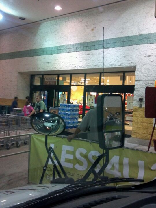
Making it to the store's front walkway, we can now immerse ourselves in plenty of 1990's Albertsons relics. The only major changes Publix made to the exterior were repainting the building and replacing Albertsons' old swinging doors with sliding ones (both typical practices for Publix, even in the laziest of conversions)

To the left of the entrance is the enclosed cart storage area, one of the defining characteristics for these mid-1990's Albertsons stores.

We've seen plenty of the exterior, so let's step through these doors and see what relics from supermarket past might be lurking inside...

Stepping inside, here's a look back toward the front doors. Upon entering the store, you're funneled into the bakery and floral departments. Considering how spread out this store is, Publix dedicated a lot of space in here to tables of baked goods! The bakery counter itself is located behind me, with floral along the front wall next to the entrance.

The conversion of Albertsons #4380 was a moderate-effort affair from Publix. Publix dressed up the service departments with new tile backsplashes and opted for the nicer faux terrazzo floors instead of the checkered vinyl tiles, but left the service departments in their original Albertsons configuration and design. A fancier conversion would have seen Publix rebuild the service departments to more of their liking, and some cheaper ones even left remains of Albertsons decor blatantly on the walls! (That link provided isn't even the best example of such - we'll see better examples of cheap Publix conversions on the blog before too long...)

The bakery is located in the front left corner of the building, still using the original Albertsons bakery design. Publix did dress up this department with new tile and signage to make it more Publix-like, but a more elaborate conversion would have made the bakery in one of these stores look more like this.

One last look at the bakery counter, before we move along to produce:

Between the bakery and deli (located behind me) is produce, the center of Albertsons' "grand aisle". To make the grand aisle feel a little more grand, the later mid-1990's build Albertsons stores used an open ceiling around the perimeter of the store, with only the center grocery aisles featuring a drop ceiling. That design (which Kash n' Karry used in the 1990's, and fancier modern Publix stores use today) creates an interesting effect that tries to create an emphasis on the fresh products, with the dry groceries in their own little world in the center of the store.

The mid-1990's Albertsons stores built with this hybrid ceiling design opened with the Blue and Green Awnings decor, which I'd imagine this store kept for its entire 9 year run. Publix opened this store in late 2007, which was right around the transition from Classy Market 1.0 to Classy Market 2.0. From this lone photo I found from 2011, it appears the colors on the wall in the background better match CM 2.0 than CM 1.0's more sedate pastel look, so this must have been an early CM 2.0 store. The CM 2.5 decor we see in here today was installed by 2013, and from what I understand, is still in place currently. Nearing 10 years since its last remodel, this store will probably be getting a remodel to Evergreen soon. At least I hope that's the plan, and not Publix's other option for odd stores they've intertied that retain older decor packages...

The CM 2.5 decor looks really nice in this store (and actually, it probably looks a lot better than Blue and Green Awnings would have). Due to those pipes in the way from the refrigeration units, the wall signs and props for the produce decor are floating out from the wall, which has a much nicer 3D effect than if all that stuff was mounted to the wall like it usually is.

Beyond produce is the deli counter, or first glimpse of which can be seen above.

What we see here is considered aisle 1. While produce branches off to the side of this aisle, those coolers to my right are home to dairy products. It seems like an odd placement for dairy products, but the remainder of the dairy department picks up to the right of the deli counter, so it that way it makes sense in relation to the flow of the store.

Much like the bakery, the deli still retains its original shape and configuration from the Albertsons days.

As you can tell, that pole wasn't doing me any favors!

A busy afternoon pictured here at the Publix deli. If you hit the Publix deli at the wrong time, you'll be waiting here a long time for your Pub Sub. Even worse is if you get stuck behind someone ordering sandwiches for their entire office, because at that point you can consider your entire lunch break shot.

From this angle we get a less-obstructed look at the deli counter. The deli is almost always the busiest part of any Publix store at any given time of day, so it's always the most frustrating part of the store to get good photos of!

Spinning around from the deli, we find the remainder of the dairy department picking up on the back wall, with the grocery aisles off to my right.

The dairy signage here is a different variant to the standard CM 2.5 dairy signage, which looks like this. This "stacked" variant of the CM 2.5 department signs seem to pop up randomly here and there, as we spotted the produce version of the stacked CM 2.5 signage back at old #4372 in Sarasota.

Turning into the grocery aisles, the drop ceiling appears above us. The drop ceiling really gives off a "store within a store" effect for the grocery aisles.

Here's a quick look across the front end, with the check lanes and pharmacy visible in the distance. We'll see more from up here later in the post, but for now, back into the grocery aisles we go:

On my recent post about former Albertsons #4332, The Sing Oil Blogger left an interesting statement in his comment about that post, saying "I’m much more accustomed to seeing an Albertsons with Publix décor than an Albertsons with Albertsons décor -- the latter just feels wrong to me now!" I feel where he's coming from too with that statement - I've been to and looked at so many pictures of Publixsons stores lately, it seems weird to think Blue and Green Awnings used to be in here! For a rough idea of what that decor would have looked like in here, here's some photos of a semi-preserved mid-1990's Albertsons in Houston with some remnants of that decor in a similar building to this one.

Returning to the store's back wall, here's a look from dairy toward meats and seafood. The pre-packaged meats begin where the wall color changes to red, with the seafood service counter in the back right corner in the distance.

Frozen foods are located in the center of this store, taking up half of aisles 6 and 8, and the entirety of aisle 7. Pictured above is aisle 6, the first of the two half-aisles of frozen foods.
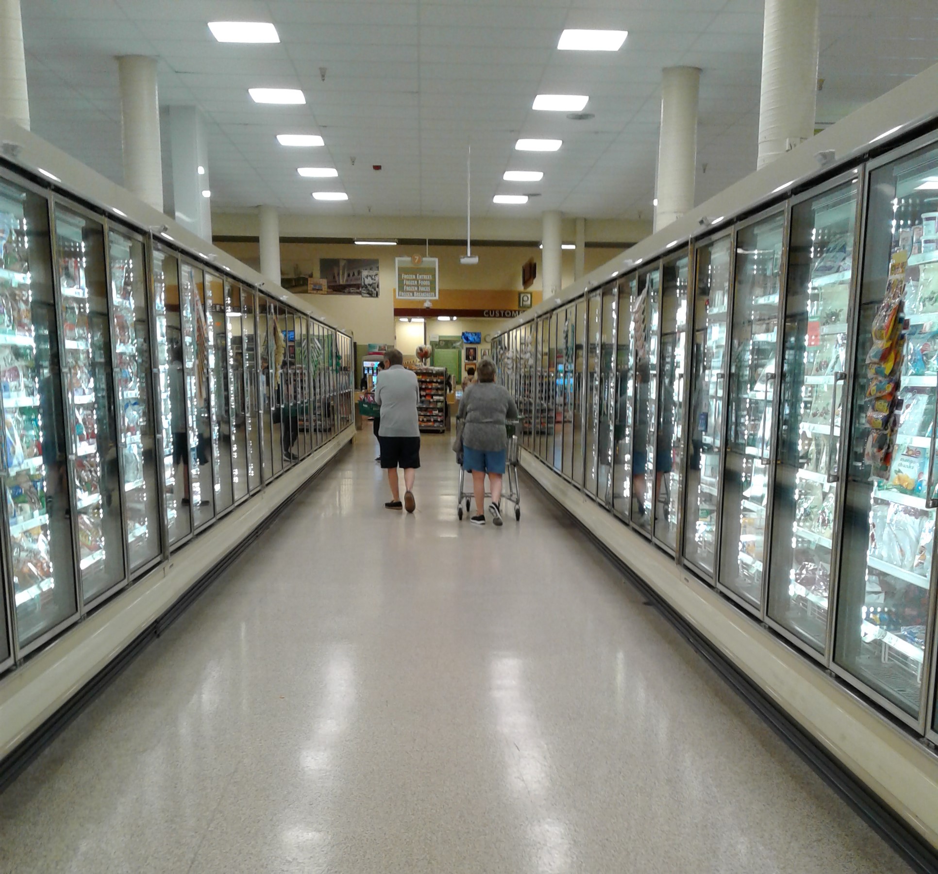
Aisle 7, the lone full aisle of frozen foods.

I feel like it would have made more sense to have two full aisles of frozen foods (rather than the arrangement in place here), but I'm not the one who laid out this store, so Gatorade and ice cream it is! (A refreshing summer combo, look for it at a Publix near you!)

Getting closer to the pharmacy counter, we find this aisle of health and beauty products. There are more short aisles of pharmaceuticals in front of the pharmacy counter itself, with this aisle acting as overflow for all the products that didn't make the cut for the aisles closest to the counter.

A lot of greeting cards here in aisle 11...

We're getting closer to the meat and seafood counter in the back right corner, and we'll take a closer look at those departments after snaking our way through the last few grocery aisles:

Pet supplies here in aisle 12...

…and skipping along to aisle 15, we find ourselves in the soda, tea, and juice aisle.

Like dairy, the meat department's sign is also of the "stacked" CM 2.5 variety, meat and dairy being the only two such style signs in this store. The spotlight washes out the sign pretty bad in this image, but a few photos back you can get a slightly clearer look at this sign (although the angle isn't the best).
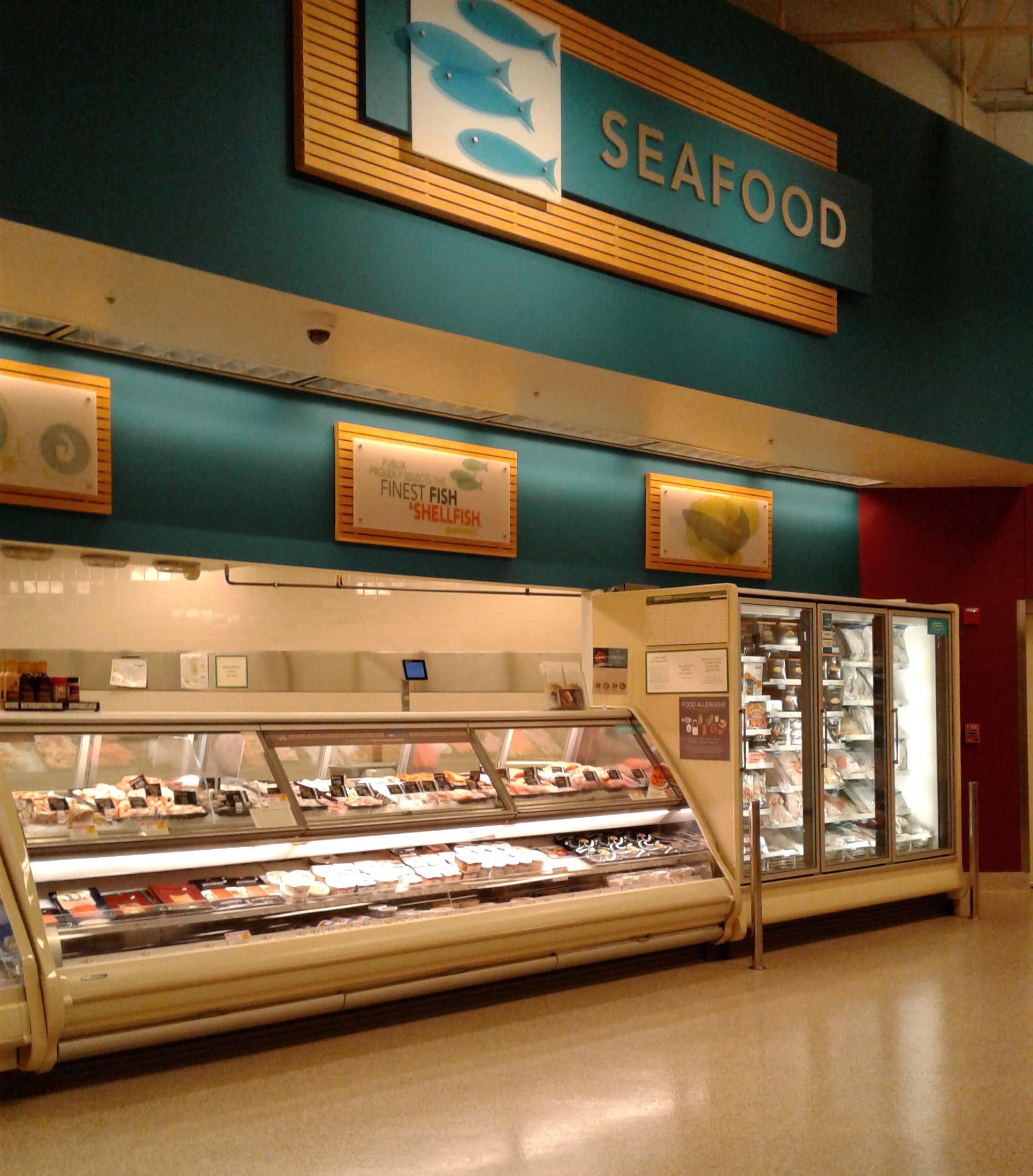
The seafood counter. I'm not sure what's going on with the seafood counter here, but it looks like Publix is covering over some old tile (probably from Albertsons) with a gray material.

After the seafood counter, we turn the corner into aisle 17, the store's last aisle, home to beer and wine. While Publix did install a "Wine" department sign, the sign should really be on the other side of the aisle, as the coolers are home to cases of beer instead. I guess this really isn't a true goof, as Wine is still in this aisle, but it's probably the closest we'll ever get to seeing Publix do something like this.

Leaving aisle 17, we return to the front of the store to finish out our tour. But before we leave, we still have the pharmacy and the front end to look at, so let's start with the pharmacy first:

The front right corner of the building is home to a few short aisles of pharmaceuticals, as I mentioned before, with the pharmacy counter itself along the front wall (just out of frame behind me). I'm not really sure who set the endcaps here, but Bang energy drinks seem like an odd choice to feature at the front of an HBA aisle.

The pharmacy counter can be seen poking out to my right in the above photo, under that curved awning.

The pharmacy counter is the one department Publix heavily modified to their liking, as the curved design of the awning is a Publix thing, not an Albertsons thing. Here we see the pharmacy counter itself straight ahead, with customer service and the front end straight ahead.

Leaving the pharmacy, we now find ourselves by the check lanes. This store had 8 regular check lanes in addition to a bank of self-checkouts at the opposite end, a relatively new addition to the store at the time of my visit.

From the other end of the check lanes, here we can see the self-checkouts. In a lot of cases Publix waits until a store's Evergreen remodel to install the self-checkout lanes, but I have seen a few stores (like this one) get the self-checkouts well before a remodel began.
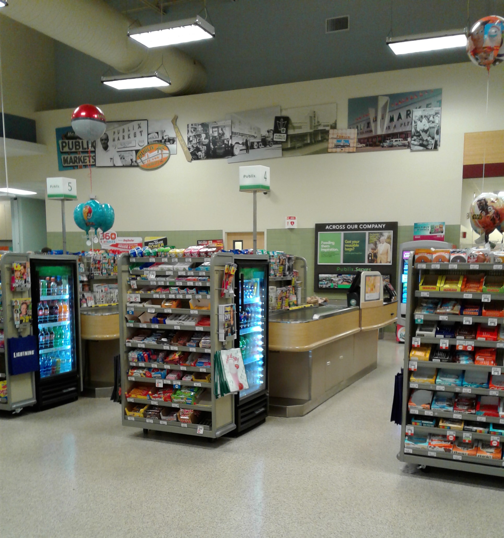
Over the front end, we find the famous CM 2.0/CM 2.5 vintage photo collage. With only around 100 Publix stores left with CM 2.5 (and none with CM 2.0), these collages have gotten harder to find, with most being unceremoniously removed and discarded in remodels. I always thought these collages were a fun touch, even if the same pictures were used in every store.
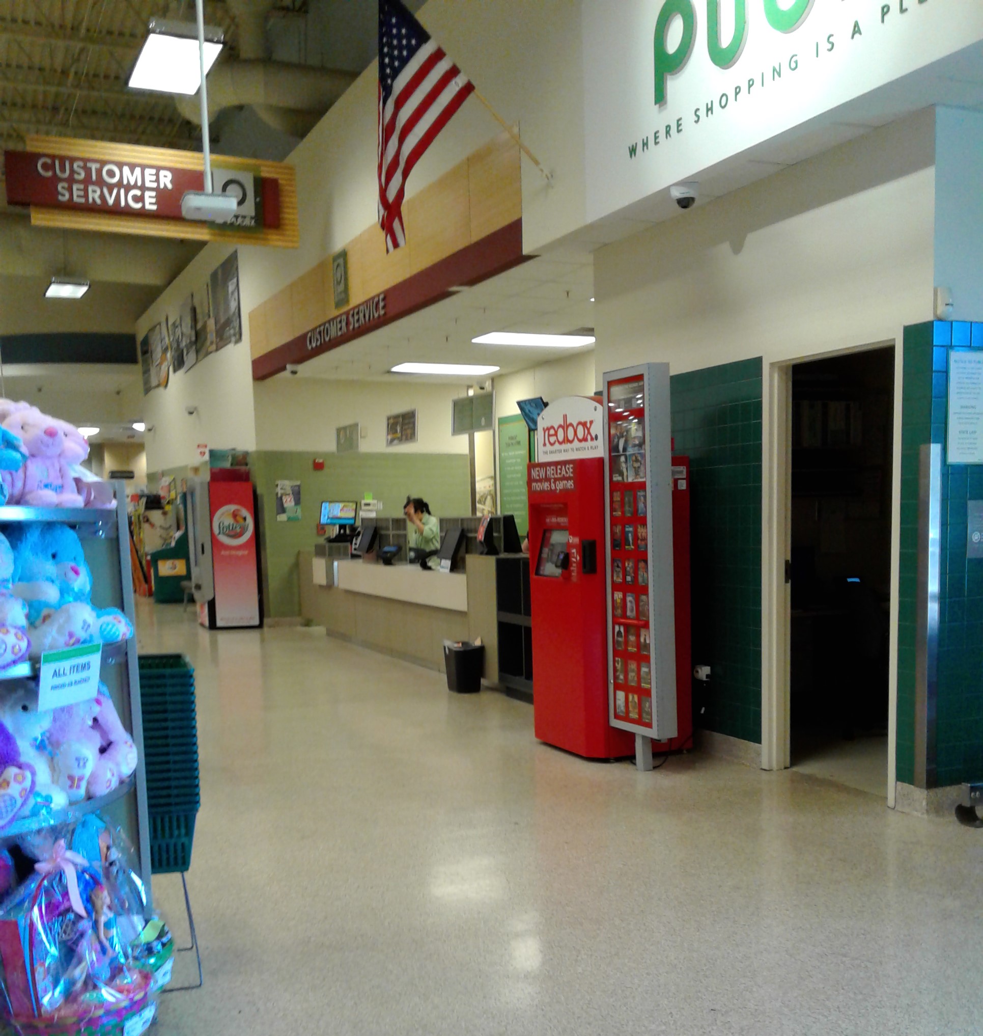
Customer service was still located in Albertsons' original spot along the front wall, and not moved into an island next to the check lanes by Publix.

So following that quick peek at the service desk, we've looked at everything we needed to in here. Out these doors we go for some final photos of the exterior before we wrap things up here:
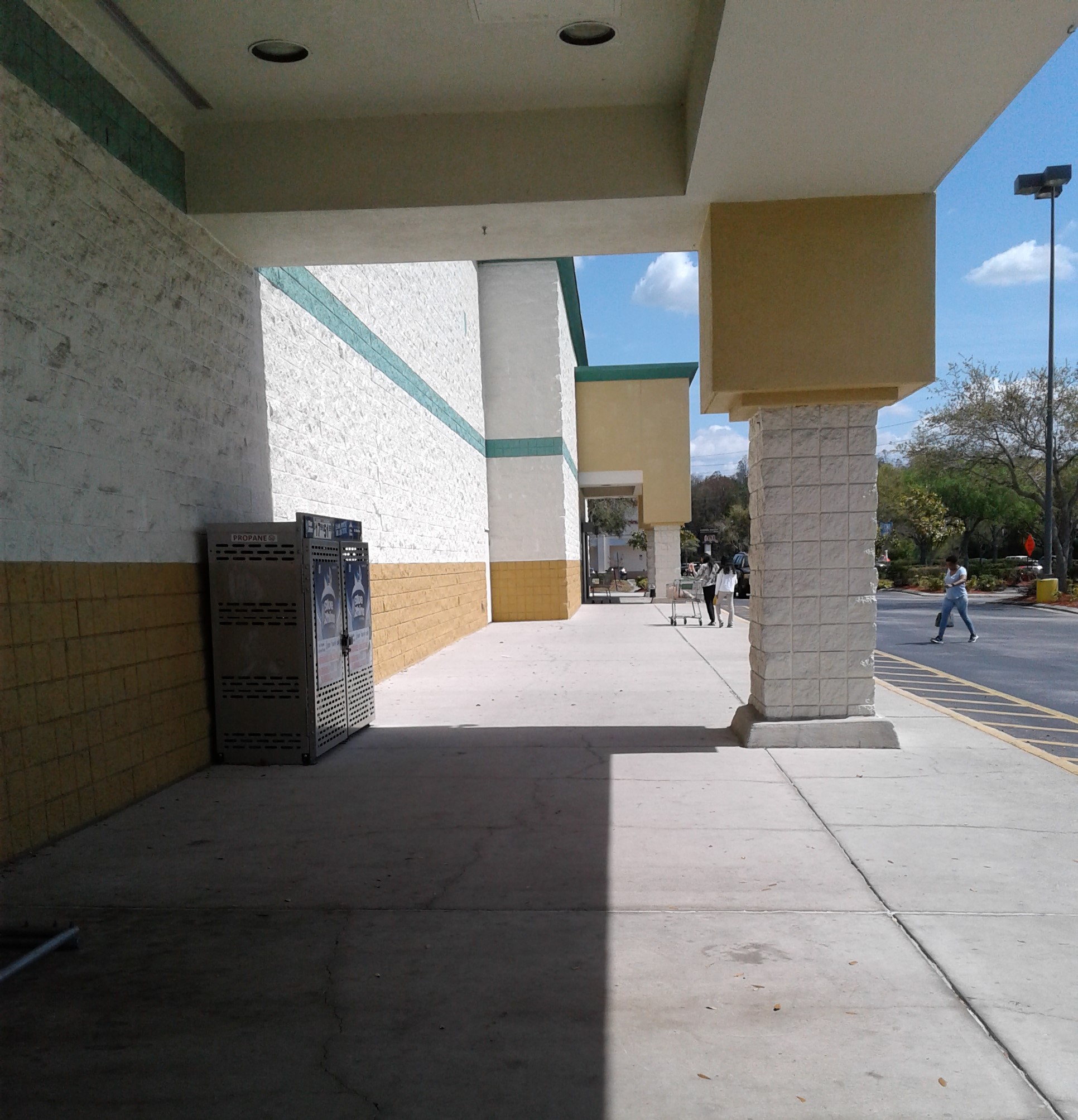
Back outside, here's a look down the front walkway toward the right side of the building. That awning in the distance belongs to the liquor store, which is where we'll be heading.


The liquor store found its home on the right side of the building, the typical mid-1990's attached liquor store.

As with a lot of these late 1990's and early 2000's built Publixsons stores, most of these have now been Publix stores for longer than they ever were an Albertsons. As of when this post was written, Publix has been in this building for 15 years now compared to Albertsons' 9 years, yet again proving that one chain's failures can be another's success.

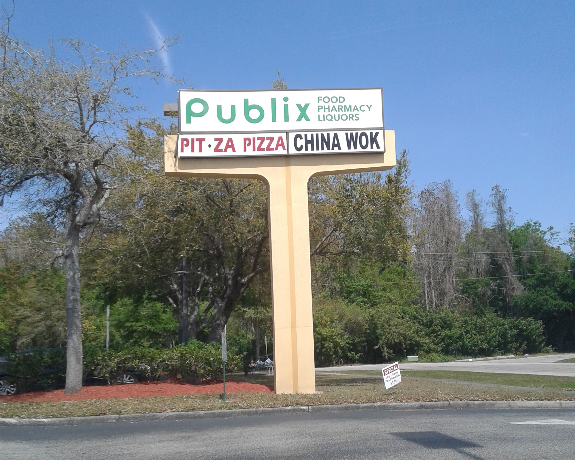
Extending to the left of the supermarket building are the 8 or so storefronts that make up Carrollwood Square, featuring a lot of your usual suburban strip mall tenants (Chinese takeout place, pizza shop, cell phone store, etc.).
And lastly, here's a look at one of the plaza's distinctively Albertsons road signs.
With our tour complete, let's wrap up this post with aerial imagery, beginning with some Bird's Eye aerial views courtesy of Bing Maps:

Front

Right Side

Back

Left Side
And now for some historic aerial images, courtesy of Google Earth:

Former Albertsons #4380 - 2019

Former Albertsons #4380 - 2008

Former Albertsons #4380 - 2007 - Still an empty building here

Albertsons #4380 - 2006

Albertsons #4380 - 2002

Albertsons #4380 - 1998 - A nice new store here, the product of many years of zoning hassles.

Future Albertsons #4380 - 1995 - The land is empty here, although Albertsons' plans are in the works for this property.

One final look at former Albertsons #4380 will conclude today's post, one of two short-lived Albertsons stores that tried to establish a presence for the company in the Carrollwood neighborhood of Tampa.
While there are plenty more relics of Albertsons lurking around Tampa that we can explore, we'll come back to those another time, as next time on AFB we're off to a different part of Florida to tour a really fun former Albertsons store. That post will go live on Tuesday, December 6th, AFB's 9th anniversary on the web. You know I usually try to save something really good for the anniversary post, so be sure to come back then for a fun post!
So until next time,
The Albertsons Florida Blogger
Reminds me about this store. As I was composing the Publix list I thought this one was a 61M- though that may have just been as the Google Maps entry was a jumble of different locations.
ReplyDeleteThere's a 61M down the road from here - the next closest Publix to the west. I saw those photos in the Google Maps listing and those are from #754 down the street, so someone mis-posted them to this location. #1170 is a Publixsons in every way!
DeleteYeah, that's the downside to many of these review sites, people may get one location confused for another without proper knowledge of what they were labeling. I also found a former Kash 'n Karry (Publix #1103) to be rather confounding in whether it was a 61M or KnK POB.
DeleteNine years feels like an eternity compared to how long Albertsons' locations lasted here in Houston! Heck, 15 months seems like a smashing success compared to some Albertsons here as well! Safeway had a new location near me that lasted a whopping 3-4 months before closing as Safeway was preparing to leave Texas in 1987 (the majority of Houston's Safeway stores were turned into AppleTree stores, but that one didn't last long enough to be converted). Heck, that makes Safeway's stay in Florida seem long and successful, lol.
ReplyDeleteI'm glad to see Mike's post about the Houston Meyerland Albertsons Town (former kosher Albertsons!) linked here, but if you really want to see a good representation of a Blue & Green Awnings Albertsons Town, check out the one in Pearland, TX! Here, the awnings are still up, but they are now maroon and white instead of blue and green. And, yes, you will see a little bit of Kroger Bountiful decor in these photos. If you really look hard, you'll also see a Walmart Spark logo. That is not a mistake, those objects really exist in this store! Well, the Bountiful does, I assume the Walmart Spark was put in by mistake by a vendor and it is probably long gone by now. Still, this is another gem from Food Town! Link: https://goo.gl/maps/7LAUYCZ5RaWHZmky5
I must admit that while I didn't shop at Blue & Green Awnings Albertsons all that often (I think I only shopped at one location with that decor), it did seem like a rather odd design to me that I never fully became accustomed to. Randall's at the time had a pretty similar decor package with the hybrid drop ceiling, albeit without awnings, but I never shopped in one of those Randall's locations either. Oddly enough, our man Mike from HHR was a recent guest on a Houston radio station, KPFT-FM. The show is a Houston history one and Mike was on for 30 minutes. Mike briefly discussed how his experience working in one of these hybrid drop ceiling Randall's got him interested in the retail hobby. I doubt most of the retail stuff discussed in the interview would be of much interest to anyone outside of Houston (well, there was brief discussion of Herfy's so perhaps NW Retail will be interested), but it's still neat that a retail enthusiast was asked to be a guest on a radio show for a 30 minute segment! I know that the co-host of the show is an avid reader of Mike's blog so that is neat. If anyone wants to give it a listen, I'll post the link. Mike's part is at about 30:15 in the show: https://archive.kpft.org/mp3/kpft_221118_180000houstohour.mp3
As for the Publixsons, I think Publix did a pretty decent job erasing some of the oddities of the Awnings decor package. It's certainly not like a regular Publix, but at least it approaches a regular Publix somewhat so. If nothing else, at least this store isn't quite the disaster that the Winn-Dixie is that Sing Oil posted on MFR today! After seeing that disgraceful Kroger-like floor, it's nice to see some Publix consistency here! The colors also give the store a bright look, more so than Awnings would have had, so I'd hate to see this store get nEvergreen treatment! Then again, it's not like I'll probably ever shop here so my opinion does not carry much weight, lol.
Oh, here's a quick Florida retail update in the Houston area. Bealls Outlet opened a new store with the Bealls name in Galveston, TX this past week. The store is joined by Houston's first Home Centric. Bealls has said that all Burke's Outlets will get the Bealls Outlet name soon enough, but this might be the first one with the Bealls name. It's interesting to see the Bealls name return to Houston, but in a somewhat different form!
I've found a number of Albertsons stores in Florida that lasted for 2 years or less (which seems crazy to me), but it's even crazier to think some entire divisions (like Houston) didn't even make it a decade in their entirety. Even in Florida, Albertsons lasted over 40 years total, which is really good considering chains like Kroger crashed and burned in Florida in the same amount of time Albertsons lasted in Houston!
DeleteI always enjoy those posts Mike does on the Food Town stores, as those seems to hold lost of surprises from supermarkets past inside in various forms. I had known about the Meyerland Food Town from Mike's post, but Pearland is much more original (and basically what this store looked like back in the day - well, minus the Kroger and Walmart elements, of course!).
Kash n' Karry's 1990's stores were the closest in design to these hybrid Albertsons stores from the mid-late 1990's, although Publix had a short-lived store design in the mid-1990's that had an open ceiling over the perimeter and a drop ceiling in the center. Winn-Dixie never tried any store designs with an open ceiling until the 2010's. That's neat Mike was brought onto that radio show too, bringing some exposure to this hobby!
Publix's conversion of this store wasn't super cheap but it wasn't super elaborate, so it still had a stronger Albertsons feel to it than some stores where Publix begins to rebuild the service departments to their own liking. It will be interesting to see how elaborate this store's Evergreen remodel will be (which it hopefully gets, instead of option B). Those Transformational Winn-Dixies like the one the Sing Oil Blogger posted about on MFR were notorious for having rough looking concrete floors, as most of them were heavily rebuilt Marketplace stores where the concrete subfloor was never intended to see the light of day. Winn-Dixie's newer stores go back and forth between using concrete floors and a wood-esque laminate, so it depends, but I've yet to see a modern concrete floor from Winn-Dixie look like any of those Kroger monstrosities!
Oh, that's interesting to hear a true Bealls Outlet opened recently in Texas! New Burke's Outlet stores were still opening recently, so I wasn't sure what the plan was for naming new stores now that Bealls owns the national rights to their name. It's nice to see Bealls finally trying to unite their company under one name now, although I wonder if people in Texas will get confused about Bealls Outlet being some kind of rebirth of the old Stage Bealls store that's now gone.
What an amazing post, can't wait to see what's in store for next month. It is pretty ironic this store opened right before Publix bought the 49 Albertsons stores and the store looks really nice honestly.
ReplyDeleteUnrelated but I have commented here as Anonymous a few times but now I decided to change up my name so yeah here it is.
Thanks! I've seen this store get mixed up as being part of the block of 49 Publix bought shortly after, but it's weird Publix bought this one Albertsons store just to buy all those a year later.
DeleteI know how it is to get your first email with new insight into a specific location, especially since that was only a few months ago for me! Anyway, this store seemed to turn out nicely, which is likely partially due to the fact that Publix was able to get a head start on it before it had 49 other stores coming down the pipeline. I can only imagine what cheap Publix conversion your are talking about too . . . Regardless, it's amazing how much replacing the tile does to make the store look more loved in addition to not having a dropped ceiling with strip florescent lights.
ReplyDeleteI feel pretty confident in saying that this store indeed opened with CM 2.0. The fact that Publix had extra time with this location makes me think they would have gone ahead and spent the money to redo everything at once, rather than waiting for a more thorough CM 2.5 install. The flooring, the aisle signs, and the tile all point toward a CM 2.0 install, but I think I can see the leaf outlines in the produce department in the one older picture you found of the store – which would only be present with CM 2.0! Regardless, the "floating" Invigorate decor reminds me of what I saw in #1427, which really gives a nice effect!
I really wish you had gotten a head-on shot of the "stacked" dairy sign in this store because that is still one I haven't seen in person! I've seen the "stacked" meat sign (mostly in CM 2.0 remodels or new-builds) and the alternate produce sign you mentioned, but I hope one of us is able to get one of the dairy sign before those are all gone. I also like the effect of the lower ceiling over the grocery aisles in this store. It really reminds me of a Publix-built 56N since there is a wall above the lower ceiling, but I feel like the placement of the aisle signs really adds more dimension to the space.
Thanks for the callout, and my statement from #4332 applies just as much to this store as it did to that one! Those pictures of Mike's from the Houston Food Town reminds me a lot of Kroger's Flagship Script package (with a few differences, like font) and I think it looks just as dated.
It is odd to see the wine sign hanging over beer, too. I'm not entirely what I would expect to see here though since Publix doesn't have a large "beer" sign. It sounds like its time for some historic photo collages! (the store designers' answer to blank wall space in CM 2.x) Anyway, I'd imagine that Publix installed the self-checkouts whenever they swapped the pharmacy sign to the 2018 logo. Publix also can take this opportunity to install a new customer service desk, but that relocation would probably be too expensive here.
Cool post, and a nice example of a Publixsons that looks to remain in good shape. I can't wait to see what you have in store for December 6th!
Yes, that email was a significant milestone for me, but like I said - you sometimes never know what kind of insight might end up in your inbox unexpectedly! The conversion of this store is a nice balance of Publix's updates while keeping a lot of the original Albertsons feel of the building - not as fancy as what we saw at old #4332, but not as cheap as that other store you might be thinking about...
DeleteThanks for the second opinion on CM 2.0 being this store's original decor too. This store would have been a good way to test how to install CM 2.0 in one of these buildings, although I wonder if this store was a way for Publix to test the waters for a pending deal to buy a whole bunch more of these stores from Albertsons a short time later too.
I really wasn't too keen on the nuisances of CM 2.5 when I took these photos almost 3 years ago now, so I probably didn't think too much of the signs when I was here (most of that analysis of the Publix decor came as I was putting the photos together for this post!). As far as I'm aware, CM 2.5 is still going strong here, so if any of us end up near this store again in the near future, the dairy sign should still be there. These late 1990's Albertsons stores fit Publix's aesthetic much better than some of the older Albertsons stores out there, so hopefully this store sticks around for a long time!
You're welcome! Even for the early 2000's, Blue and Green Awnings seemed a bit dated, so I'm surprised that decor was the one Albertsons picked for a brief revival during that era.
It's pretty unusual for beer and wine to be in the same aisle in most Publix stores, but it worked out at this store to at least give the placement of the Wine sign some sense (even if wine is on the other side of the aisle than the sign). A photo collage would have looked good along that wall, but Publix must have really wanted a Wine sign instead.
Thanks for the link in this post! This store reminds me quite a bit of the Ridgeland Krogbertsons -- I'm happy I've gotten enough experience to start notice these similarities now :) This blog has definitely been a ton of fun to read over the years, and I'm excited for the upcoming anniversary post! From those humble beginnings and that first email, the blog has come a very long way!
ReplyDeleteYou're welcome! The Ridgeland Krogbertsons would have had the same layout as this store back in the day, just minus the open ceiling around the perimeter. After shopping at that store more frequently, the Albertsons nuances will begin to jump out at you more! The anniversary post is going to be a fun one (and may also give you vibes from the Ridgeland Krogbertsons too), and I'm glad you've continued to read the blog for all these years too! :)
DeleteHow did I not even pick up on the fact that this store does have the same layout as the Ridgeland store?!?! That warehouse ceiling around the perimeter makes a huge difference!
Delete