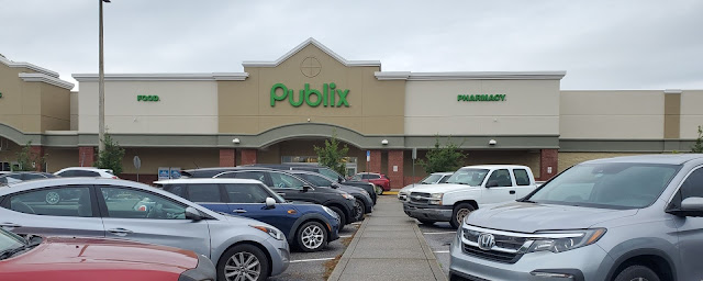
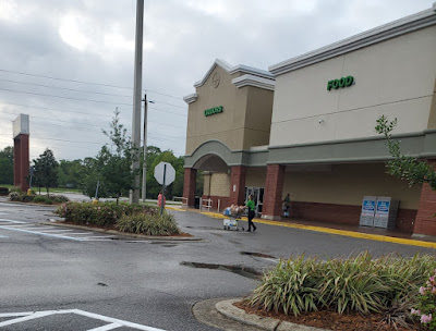
Former Albertsons #4441 | Publix #1343
Publix at Nine Mile
2180 W Nine Mile Road
Pensacola, FL 32534
A New Territory
Well, he did it again: the Sing Oil Blogger is back for another Albertsons Florida Blog takeover! Not only do I love referring to myself in the third person, but I also appreciate that Mr. AFB himself would give me control over his blog again – the very blog that inspired me to explore this hobby! I will say that my life, and my own blog, have changed a lot since I first found this blog nearly two years ago. That being said, my unconscious love for Publix is what brought me here and that same passion continues on in the post you'll be reading today.
Today also marks a special milestone as it will be my first tour of a former Albertsons on The Albertsons Florida Blog. The timing of this post occurred as a coincidence since I originally planned to share a different store. I ended up not having the time to write up a full-featured post, so I decided to pull this half-written post out of my archives and share it today. That being said, this store happens to be nearly identical to the former Albertsons #4413 that AFB and I shared back on the 6th; therefore, it would be advised for you to check out all three of the posts on that store to get an idea as to what hides behind the walls (and in the past) of Publix #1343 / former Albertsons #4441.
AFB has taken you on plenty of tours through Peninsular Publixsons, but he may or may not have ever left the Eastern Time Zone. Thankfully, I was able to offer my assistance when I found out I would be heading to The City of Five Flags. That trip happened to be an interesting one for me, as it allowed me to compare four different Publixsons within a close proximity. These stores also served as a testing ground for Publix itself since they were the company's first foray into its "last frontier" of Florida (who knew it would take until 2008 for Publix to conquer the last major metropolitan area in the state). Don't worry, I'll dive into that history in another post, but today, we will dive into the history of #4441.
This particular store happened to warrant two visits by yours truly, namely because I was ridiculed by AFB for not stopping by the old Albertsons Express station out front on my first trip (don't send him furious emails, he didn't actually ridicule me). Both visits will be encapsulated in this post and gave me a chance to capture even more pictures than I typically do.
Albertsons #4441's construction was announced in April 1995, but the store made its grand debut in Fall 1996. The store was planned as part of the larger Milestone development at the intersection of West Nine Mile Road and Pine Forest Road on the Northwest edge of Pensacola. At the time, Milestone was described as having "a Mayberry Feel" and was a recently developed "neotraditional town" attempting to hearken "back to earlier times when people sat on their front porch and everything didn't revolve around the TV – or computer." This seems to be a larger trend among developments at the time as similar communities, including the nearby Seaside and Celebration, were also mentioned in the article as having the same goal in mind; however, the latter two seem to have gained much more popularity over the last two and a half decades.
 |
| Courtesy Newspapers.com - The Pensacola News Journal - September 23, 1996 |
Unfortunately, it doesn't look like The Pensacola News Journal digitized their sales ads around the time this store opened; therefore, I haven't been able to find a specific grand opening date for this store. I was, however, able to find a series of ads (like the one above) mentioning career opportunities at a new Albertsons, leading me to believe store #4441 was the intended target and opened soon thereafter. If you didn't want to work as a cashier at your local Albertsons, you could pursue the adjacent ad in the September 23rd classifieds to make $500+ per week as a topless dancer at Sammy's: the choice is yours! I also saw mention of "the new Albertsons off Pine Forest Rd" in a November 1, 1996, classified ad which tells me the store likely opened in October of that year.
I was able to find several later articles mentioning how Albertsons was courting a potential bank tenant to set up shop in the front of the store. It appears that they found their match when Destin Bank filed to open a branch in three of the four area stores (#4309, #4329, and #4441), in addition to five other Albertsons stores in Panama City and Tallahassee.
I did find a picture taken in the produce department (and one of a lady sniffing a pineapple) in an article discussing weight loss, and a letter to the editor which mentions how friendly the employees were, but there wasn't much else of interest concerning the old Albertsons in the articles I found. Otherwise, this store almost certainly sported the same Blue and Gray Market interior throughout its entire tenure as an Albertsons.
 |
| Courtesy Newspapers.com - The Pensacola News Journal - December 3, 2008 |
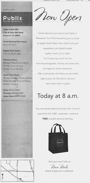
I may sound like a broken record, but Publix acquired this location, along with 48 other Albertsons stores, in June 2008. The following months involved a rapid succession of remodels and reopenings, with this store taking roughly 5 months to reopen following the acquisition. As the second Pensacola conversion, and the third Pensacola-area Publix, store #1343 reopened its doors to shoppers on December 3, 2008, at 8 AM. I'd like to note how this store opened two months before Publix #1331 in Fort Myers, meaning it had an even more rushed remodel than what we saw two weeks ago.
I decided to approach this post a bit differently than I typically do since I was presented the rare opportunity of seeing two previous chapters in this store's life. Thanks to Flickr user dirtyblueshirt, we can see how this store looked in the days leading up to its closure as an Albertsons and the days following its opening as a Publix. We'll get to see his photos, indicated by the caption, integrated with my photos from earlier this year. This store will be a treat!
 |
| Courtesy dirtyblueshirt (Flickr) - Albertsons #4441 - August 9, 2008 |
To start off, we'll take a look at an exterior shot of the store, complete with a distinct yellow "Total Inventory Blowout" banner hanging above the logo.
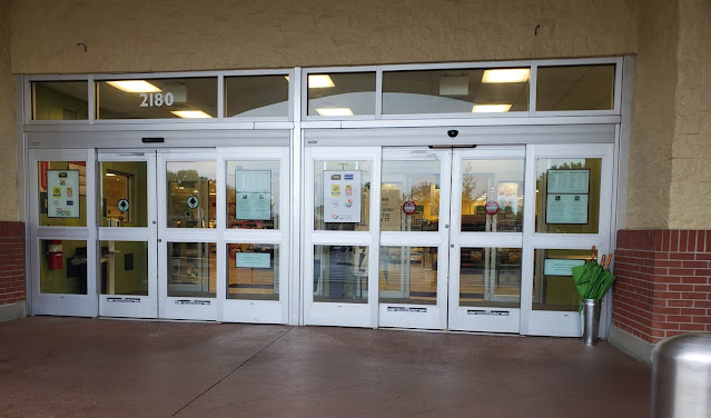
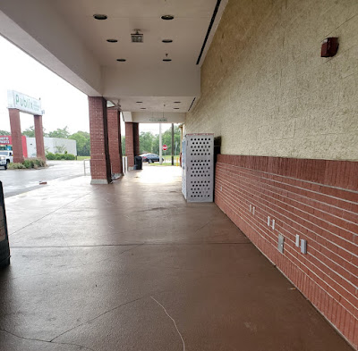
Stepping forward in time up to the front doors, we see that the store's entry has mostly remained the same since Albertsons left town. As usual, Publix did exchange the swinging doors for their preferred sliding ones. Something that really throws me off is how the entrance and exit doors are swapped from what you would expect. Why would they bother to put the entrance on the left, when most people have to grab a buggy from the right anyway? Regardless, this is the same alignment Albertsons used when they occupied the space.
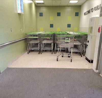
Speaking of buggies, here is where they live in this store, next to some Classy Market 2.0 2.5 tile. When I zoomed in to this shot, I noticed how there was a row of carts behind the ATM where nobody could really access them. I guess the store wanted to be prepared for the Christmas Eve rush? (FYI, I wrote that line back in June – how fitting!) Also, there are no green beans here, so we must be in for a "vintage" Publix treat! (As if a décor from 2010 was actually vintage.)
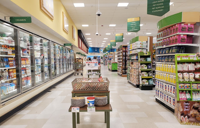
Immediately as you walk in the store, you are greeted with a few islands of seasonal or sale merchandise and a lot of empty space. Now I am starting to see what AFB means by Publix not knowing what to do with some of these stores they acquire.
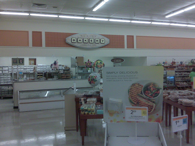 |
| Courtesy dirtyblueshirt (Flickr) - Publix #1343 Bakery - June 21, 2009 |
Thanks to our trusty ole Blackberry pictures, we can see where Publix extensively modified the bakery to its current configuration during the store's Invigorate remodel around 2014; however, 2009's bakery looked nearly identical to how it would have when Albertsons occupied the space.
We can see where Publix added their signature curved soffit above the bakery during the more extensive remodel, along with adding some Classy Market 2.x tile. We also see the edge of the floral department which occupies a nook between the bakery and the door.
Looking back toward the doors, we can get a better look at the floral department and the entry area. I'm guessing that Publix reconfigured the front end a good bit during the Invigorate remodel since #1331 had an entirely different setup. I'd imagine that the floral department used to be walled off as a manager's office, the vestibule just didn't exist, and the cart area was the Destin Bank branch. You can check out my behind-the-scenes post covering former Albertsons #4413 or this drawing for a better idea of what I'm talking about.
We can also see how sparse this section of the store was. That little green table of "Assorted Easter Products" looks so lonely and awkward!
Anyway, I guess shoppers can still find their pineapples at Publix #1343!
Zooming out a bit more, we can see a wider angle of the bakery corner and the fringes of the produce department.
Here's a slightly different angle, before we move on.
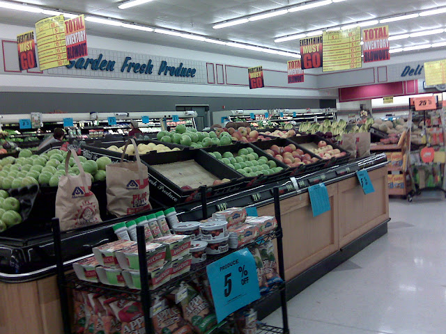 |
| Courtesy dirtyblueshirt (Flickr) - Albertsons #4441 Produce - August 9, 2008 |
Next up, we'll sneak a peek at how the produce department looked 14-years ago . . .
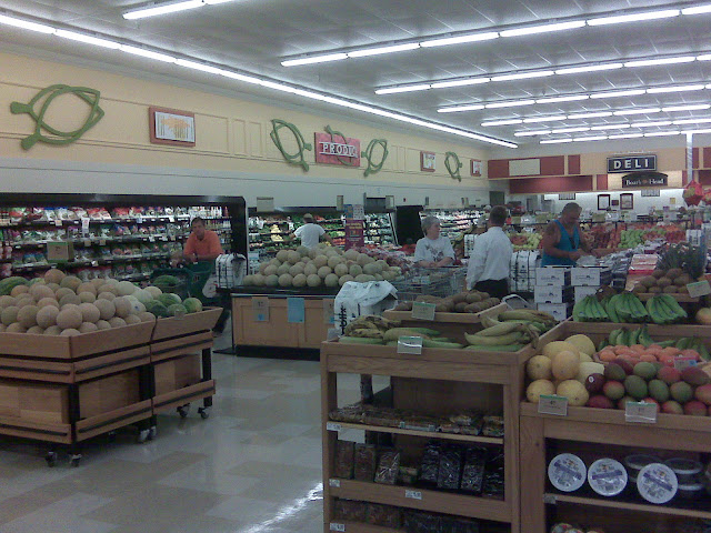 |
| Courtesy dirtyblueshirt (Flickr) - Publix #1343 Produce - June 21, 2009 |
before we see how it looked 13-years ago. As you can tell, Publix didn't do much with this store after first taking it over besides paining the walls, changing out the floors, and putting up new signage. Interestingly, Publix #1343 received a slightly different flavor of Classy Market 2.0 than its sister store #1331. Namely, this store received smaller department signs and more secondary accents in the produce department. It looks like the produce sign in the photo above is the same size as my meat and seafood signs from #1331, which measure 8' x 2' 2", compared to the produce sign in that store which measured 12' wide.
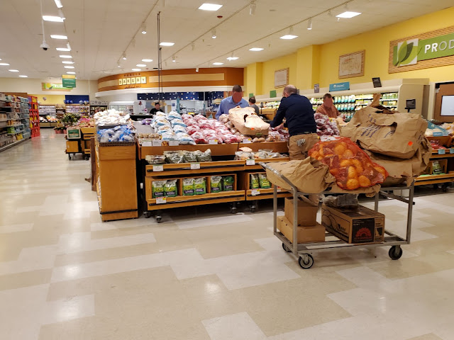
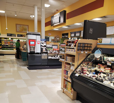
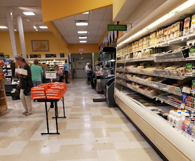
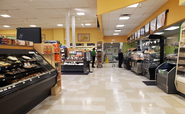
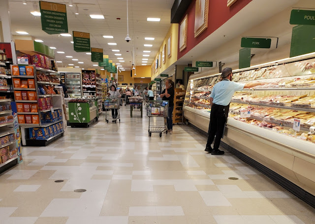
Let's now get an overview of the produce department with the deli peeking out in the distance. As with most other acquired stores, Publix retained most of Albertsons departmental layout when they took over the space.
I didn't notice much of anything that was special about this produce department, other than the Classy Market 2.5 signs and the typical post-Albertsons beige and cream Tetris vinyl tiles.
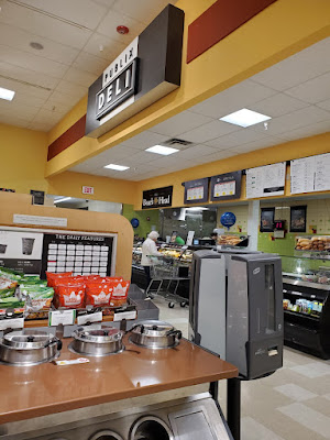
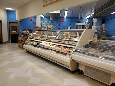
We'll take a quick look at the deli as I camouflage myself behind some basil and thyme plants. As usual with Publix, the deli was pretty crowded during my visit, so I had to make sure to be discrete with my pictures (and time them very carefully).
Interestingly, this Albertsons lacked the tea and lemonade cooler we saw next to the deli in Fort Myers. I guess the prototype had slightly evolved in the two years separating these stores' completion dates.
I did eventually manage to get a few shots of the deli, and also found it curious that this Publix had a small Coke Freestyle machine. I don't recall having seen those in any other Publix as I mostly see a standard fountain machine.
The lower ceiling in this department would be another architectural trait left over from Albertsons.
 |
| Courtesy dirtyblueshirt (Flickr) - Publix #1343 Deli - June 21, 2009 |
Publix has made a number of cosmetic changes to this department since they opened the store in 2008, but the overall feel has remained largely the same.
I do wonder if they could've found a more substantial table for the Hawaiian bread display, though! It looks like that thing would tip right over the minute this guy finds it!
The fact that I visited this store twice probably helped the odds of me getting an uncrowded shot of the deli; we'll take one last look at it before moving on to the rest of the store. I'd also like to point out how this store has already received Evergreen-era menu boards over the deli department.
 |
| Courtesy dirtyblueshirt (Flickr) - Albertsons #4441 Produce - August 9, 2008 |
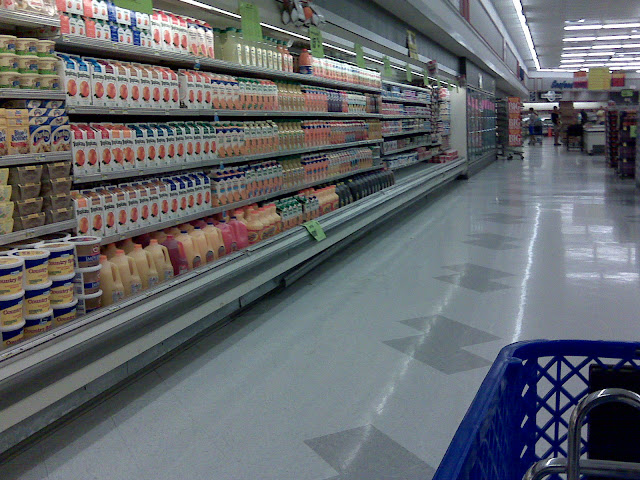
Turning down the back aisle, we would have seen orange juice with a few dairy products intermingled along the back wall (along with Anonymous in Houston's favorite "S" shaped Tetris piece floor design) . . .
 |
| Courtesy dirtyblueshirt (Flickr) - Publix #1343 Dairy - June 21, 2009 |
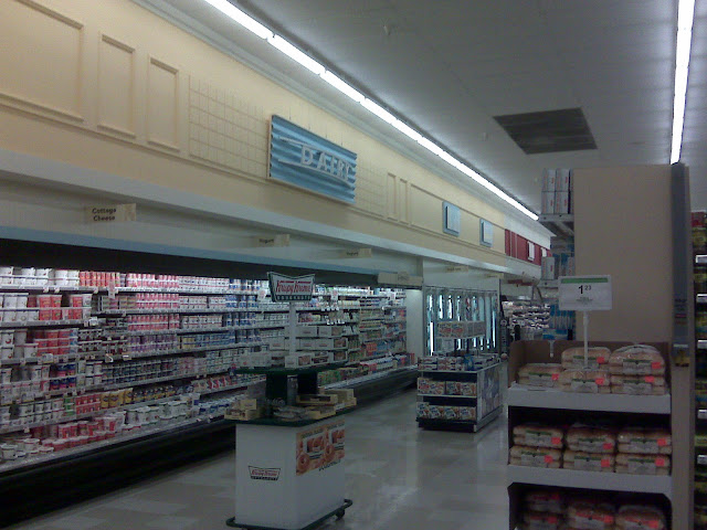
Until Publix decided it was best to move juices to the produce department and save this half of the back wall for traditional dairy products.
After seeing the Classy Market 2.0 photos from this store, I realized that #1331 didn't get as cheap of a remodel as originally thought; at least the dairy department received two paint colors! It's also worth noting that this store retained Albertsons' old checkered department sign backing while they went through the effort to remove this in #1331. The dairy sign we see above is also smaller than the one I tried to wrangle at #1331, and likely measures 8' across rather than 12' (and is suspended from the ceiling rather than hung from French cleats). Who knew that buying a décor package would answer so many questions! I just wish they had used these smaller signs in Fort Myers!
Continuing into the present, the store looks much brighter today due to vastly improved smartphone cameras and new recessed lighting in the dropped ceiling.
 |
| Courtesy dirtyblueshirt (Flickr) - Albertsons #4441 cheese and sliced meat cooler - August 9, 2008 |
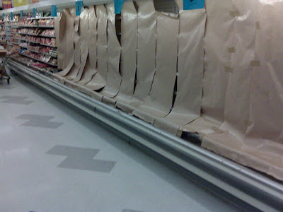
By the time dirtyblueshirt made it Albertsons #4441, they had already begun to sell out of some product. Rather than leaving the shelves barren, they deemed it important obscure the horror with premium brown butcher paper. How classy.
 |
| Courtesy dirtyblueshirt (Flickr) - Publix #1343 rear actionway - June 21, 2009 |
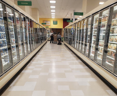
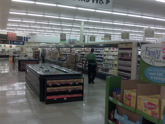
Publix #1343 kept the old Albertsons refrigeration units (the same ones we saw in #1331) until the extensive Invigorate remodel and therefore kept Albertsons' awkward aisle configuration on the right side of the store. We can see how this cooler forced Publix to have an additional aisle on the other side of it which ran parallel to the rear actionway, before the shortened grocery aisles 10-14 could begin.
Furthermore, I'd argue that #1331's meat and seafood departments look nicer since they got proper department signs rather than a "custom cuts" fixture and lettering for each department stuck to the wall.
We can also see where Publix opted to remove the old coffin coolers when they reconfigured the rear actionway.
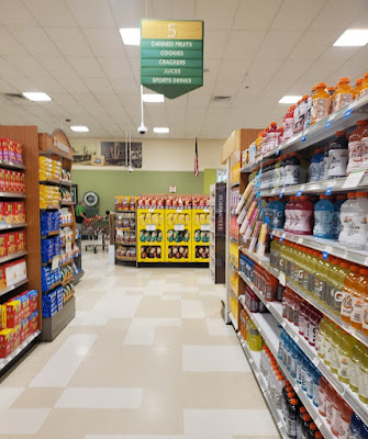
But before we take a closer look at the meat and seafood departments, we'll zig-zag through some grocery aisles, beginning with aisle 5. If you were looking for canned fruits, juices, or crackers, then this is your place!
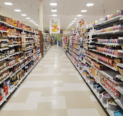
Here we find an assortment of baking supplies and condiments on aisle 6.
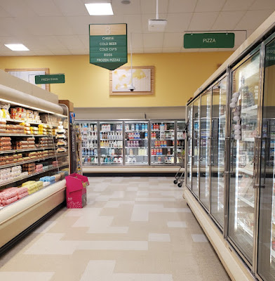
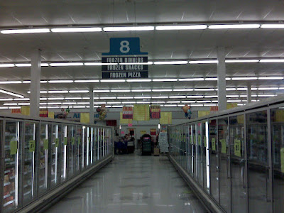
As I have probably done before, I'm going to complain about stores which decide a middle grocery aisle is a good place for sandwich meat and cheese. It is not a good place. Just like center cut-through aisles. There's my two cents! Anyhow, aisle 8 is where you can find the above-mentioned products, in addition to eggs, frozen pizza, and beer. I guess this store could cater to college students who want beer and pizza on Friday night, then eggs and cheese for breakfast the next morning to recover from all of the good times, and a ham sandwich for good measure!
I do find it ironic that Publix decided to put the CM 2.5 cheese graphic over milk alternatives, and not over the actual cheese! At least they managed to line it up with the cheese aisle!
 |
| Courtesy dirtyblueshirt (Flickr) - Albertsons #4441 aisle 8 - August 9, 2008 |
Aisle 8 was also home to frozen pizza in the Albertsons days, but the aisle used to feature two sides of freezers since the sandwich meat coolers were along the rear actionway. Here we are looking toward the front of the store.
Other frozen foods are located over on aisle 9, which previously only had one row of freezers lining the aisle.
Next, we'll take a look at aisle 12, where Publix prevented me from adding another photo to Retail Retell's collection due to this banner of random junk food they decided to hang in the way. I feel like eating one piece of broccolini and one strawberry does not counteract the full corndog, cupcake, chicken leg, pretzel, or wrap (okay, the wrap isn't really unhealthy, but you catch my drift).
You want to know what the best zero-Calorie snack is? Water. That, along with bread, can be found on aisle 12.
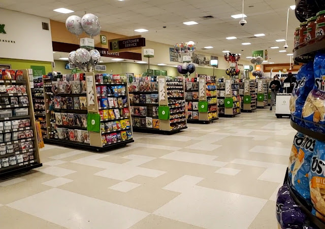
Popping out of that aisle, we'll take a quick look at the front end of the store. I still find it interesting how Invigorate (CM 2.5) stores feature Publix's pre-2012 logo at the customer service desk, while its sibling, Sienna, doesn't use the logo at all. This store also still features Publix's older style of checkout cube, which features a green stripe around the bottom and the Publix wordmark on the side.
I personally think these 2014-era Invigorate installs look really nice in a variety of spaces and are a far cry from the cheap installs from several years prior.
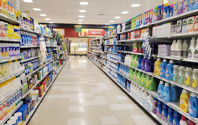
Venturing back up aisle 14, we see some cleaning supplies and laundry detergent, along with the meat department off in the distance.
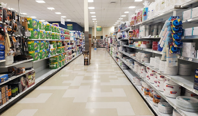
Aisle 15 was the first aisle I noticed to not quite line up correctly with the structural columns (I'm sure there were others that I missed). Luckily, the aisle seemed wide enough for two carts to be able to pass. The reasoning for this will make much more sense in a bit.
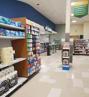
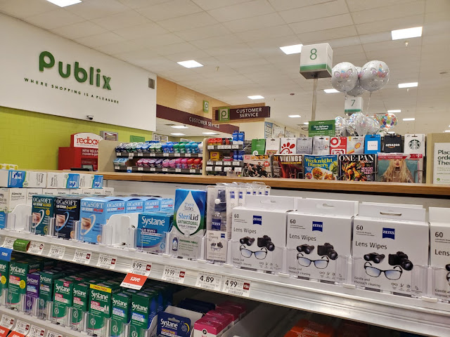
At the end of aisle 15, we can see the pharmacy in the front right corner of the store and a few pharmaceutical aisles. I do find it odd that a number of the Invigorate stores have received the new pharmacy signage over the last few years; meanwhile, Publix didn't bother to remodel the rest of the store or remove the old "P" logo. This is also the third version of redesigned pharmacy sign I have seen which makes me wonder why different stores receive different ones. I've seen a number of stores with Sienna or Invigorate get the wood grain version seen here, while retrofitted Evergreen stores often get one with this style; however, I don't remember seeing this particular hybrid style before.
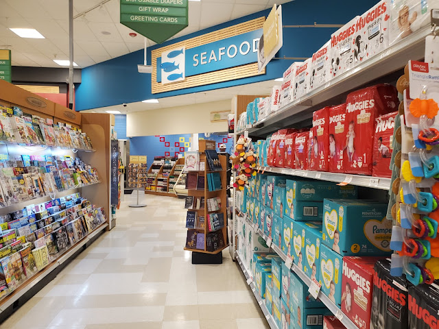
On aisle 16, we'll get to see baby products, magazines, and the seafood counter.
 |
| Courtesy dirtyblueshirt (Flickr) - Albertsons #4441 seafood and meat counter - August 9, 2008 |
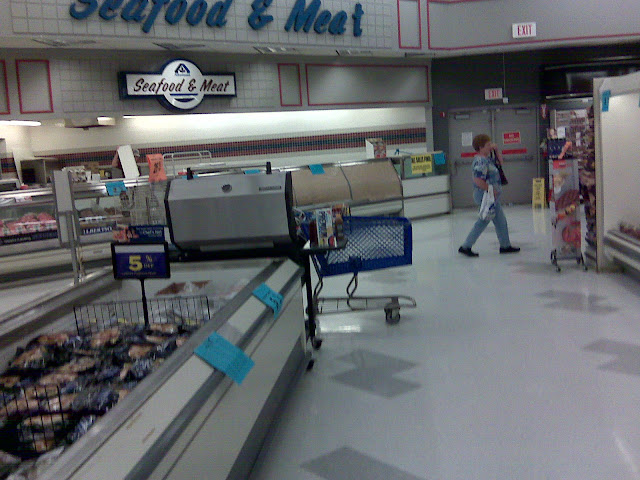
The seafood and meat counters may have been split into two separate spaces under Publix's reign, but the angled configuration Publix uses for their seafood department is also a direct remnant from Albertsons. Something I just noticed is how all of the refrigerated cases in these Albertsons photos are trimmed in white, while the early Publix pictures from this store show them in black (like the ones we saw in Fort Myers). The cases in this picture look to be the same model as the ones Publix used; the ones from Fort Myers had manufacture dates from the year prior to the store's opening, so I wonder if Albertsons had applied stickers to the faces or if Publix went through the effort to re-face them (I'm doubtful). Maybe one of you can shed some light on this.
It was surprisingly hard to get a good picture of the seafood counter, especially since there was a man who would not get out of the way!
Eventually, I was able to get an unobstructed view . . .
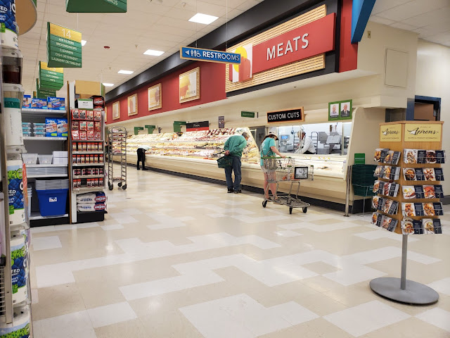
…in addition to the adjacent meat counter. Like I mentioned before, this "custom cuts" window was added during the store's Invigorate remodel and there previously would have upright coolers lining the entire wall.
I'm surprised that Publix went through the effort to add the black accent bar at the top of the meat wall, but it adds a subtle 3D element to the space.
I'd also like to address the aisle signs this store uses. You may remember that we saw them back in Publix #1427, but they are one of the roughly seven variations of aisle signs I have seen used with Invigorate. This style utilizes the same frame as Sienna but swaps the darker wood panel at the top for a lighter wood texture. This style of sign is only found in stores which received Invigorate from roughly 2013-2015, just as the package was about to be retired in favor of the exclusive use of its sibling, Sienna.
 |
| Courtesy dirtyblueshirt (Flickr) - Publix #1343 - June 21, 2009 |
I didn't think a remodel could be any cheaper than what we saw in Fort Myers, but it appears that it can; just stick a picture of a Wing Store up over an old department sign and call it a day!
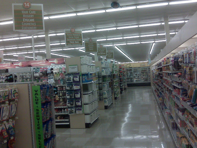
This photo was taken looking down the right wall of the store toward Albertsons' old pharmacy box and alcohol corner. It's interesting to see Publix's old aisle configuration where aisles 15 and 16 were sacrificed in favor of some HBA aisles which run parallel to the front of the store. I wonder if the Albertsons aisles had this same configuration, or if the aisles would have run all the way to aisle 9 rather than stopping at aisle 14. This is also why aisle 15 now has those awkward columns in the middle, as they previously lined up with the old horizontal aisles.
Publix eventually moved this store's pharmacy to the old alcohol corner in order to create an aisle 17 along the right wall of the store, while moving beer and wine to the middle of the store.
 |
| Courtesy dirtyblueshirt (Flickr) - Publix #1343 - June 21, 2009 |
Something I thought was odd is how a commenter on one of dirtyblueshirt's photos described this section of the store. He said, "The groceries were on aisles that were vertical [perpendicular to the front of the store] while the drug items were on horizontal aisles [parallel to the front of the store] that ran the length of the meat case, if that makes sense."
Although #1331 didn't see many changes from its Albertsons days, it did receive aisles 15 and 16 as opposed to these odd short HBA aisles.
We'll now take a look at the new-to-Invigorate aisle #17 and the pharmacy box which was moved during that remodel. Had this photo been taken 10-years ago, we'd be standing in the old alcove adjacent to the pharmacy, looking at the side wall of the box. You typically only see aisle numbers above 15 or 16 in first-gen 54M stores or in acquisitions.
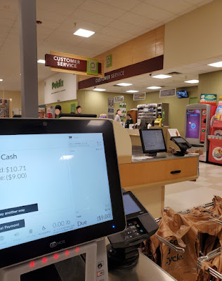
Here we have another view of the Customer Service counter from the current HBA aisles in front of the pharmacy.
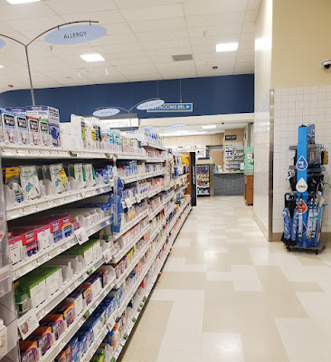
Spinning around, we'll take look at one of those aisles and the pharmacy off in the distance. I do find it interesting how the restrooms in this store were hidden in the front right corner (as indicated by the sign hanging from the ceiling), but it is likely that Publix didn't want to spend the money to relocate them. Next to the umbrellas was another hallway leading to the water fountains and a few offices.
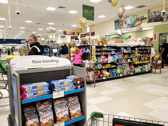
As I was getting ready to check out, I managed to take this shot as a front-end overview. Our Fun Featured Product for this trip happens to be . . . Cinnamon Toast Crunch popcorn. Get yours today for only $4.99 a bag!
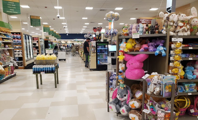
We'll take one last look at the front end (toward the pharmacy) before we head out. Anybody need a large stuffed Peep?
It's interesting to note the fact that this store recently received some new NCR self-checkout units. Although I am beginning to question whether CM 2.5 stores are becoming targets for remodel, at least this location did receive the new pharmacy branding, deli menus, and self-checkouts. This leads me to believe it will be several years before it receives Evergreen (or the worse alternative).
During my three trips to this store (I forgot that I had to run back in on my first trip to pick up a SunPass), I overheard a few interesting conversations. The first one involved an angry customer yelling at checkout employee, calling him a "jackass". I forgot how the situation arose, but the manager had to come over and talk to him; meanwhile, other managers were buzzing around front end of store talking about the situation and how to deescalate it.
My other checkout eavesdropping experience happened on my return trip, when a lady inquiring about a job was talking to a customer service employee. The lady was saying she heard she couldn't get a job because she didn't have a high school diploma. The CS lady had to reassure her multiple times that a high school diploma was not required because Publix hires minors. This primarily caught my attention because I had to wait what seemed like forever for this conversation to end in order to get my SunPass!
One last thing I'd like to note is how Publix switched to a different color of green plexiglass on the customer service signs with their later installs of Invigorate. The earlier iterations used a darker, smokey shade of green, while the newer versions have a more neon / fluorescent tint. I'd say this change likely occurred around the same time as the Sienna-esque aisle signs began to roll out, since stores using the 2012-era aisle signs still have a smoky-green customer service sign.
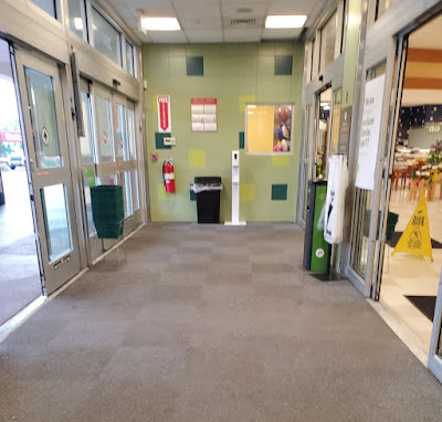
Since we were looking toward the carts as we came in, I figured I'd take a shot pointing the other direction as I left the store. Here we can see the window leading to the floral department, which is possibly a relic from the old Albertsons manager's office.
Since we didn't look at it on the way in, let's glance over toward the liquor store. As we can see, it still features the triangular sign frame Albertsons would have used. We can also see one of the original road signs from this angle, facing Pine Forest Road.
This liquor store was deemed important enough by Albertsons to receive its own arch!
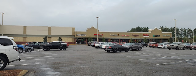
The rest of the shopping center seems to also match the look of the Albertsons.
Here's another angle before we move onto the old Albertsons Express out front.
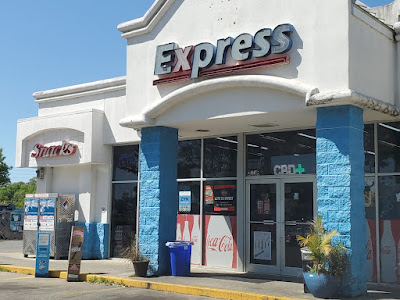
While I never went to one of these stores before Albertsons closed their Florida locations, it was very easy to tell what the store had been in its previous life. Luckily, I wasn't scared of photographing convenience stores, either!
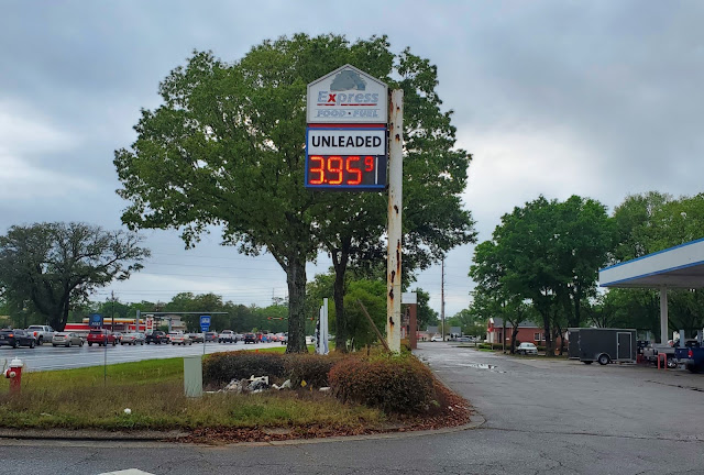
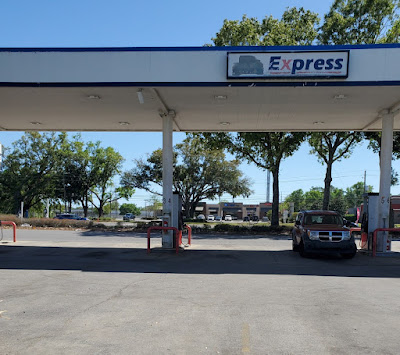
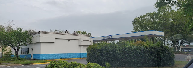
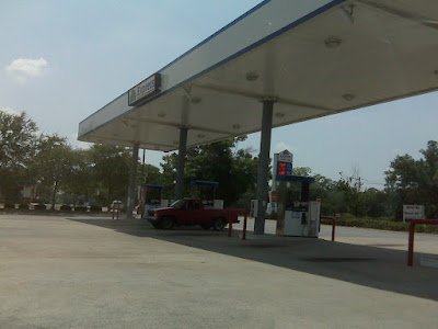
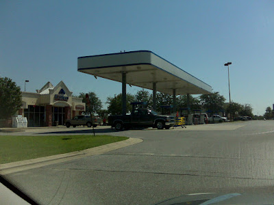
The sign facing Nine Mile Road has certainly seen better days; I'm guessing the only thing that has been touched since 2008 was the addition of the digital gas price sign. We also see where the current owner hastily painted over the old Albertsons "A" logo, giving us a strong indication of this store's past.
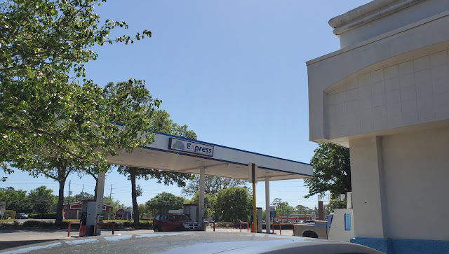
Additionally, the "Express" portion of the sign is still visible on the canopy and the building, but the "A" had been painted over or removed altogether. Unfortunately, the Gilbarco Veeder-Root Encore pumps we see here look like a much more recent installation compared to whatever Albertsons would have used.
 |
| Courtesy dirtyblueshirt (Flickr) - Former Albertsons Express - June 21, 2009 |
Their pumps appear to have been old Wayne Vista dispensers which likely dated back to the store's construction in the mid-1990's. While researching the specific pump model, I learned that these gas pumps apparently have an IR remote used for service functions – who would've known!
As we can see, the north face of the canopy has retained its "Express" sign as well, which looks a little bit tired due to its age.
I didn't manage to capture the exterior of this store very well (since there were a couple of people wandering around who probably didn't want their picture taken), but I did get a better shot of the store's original "Express" and "Snacks" signs. You can also zoom in and see the lablescar from the "A" logo above "Express."
Here's a different angle of the pump canopy, with its hastily covered Albertsons logo.
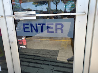
As I walked up to the front door, I noticed this "Enter" sign which looks compellingly original as well.
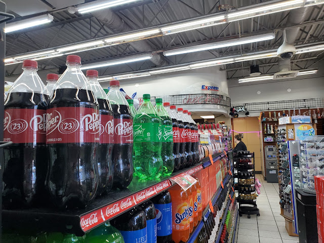
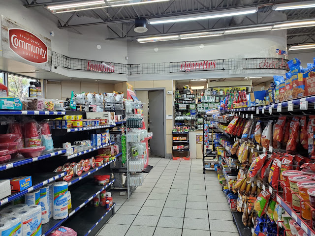
This is far from my best convenience store photo shoot, but I managed to capture most of what I thought was original to Albertsons. In this shot, we can see the store's original Albertsons Express checkout signage and the accompanying metal elements; it's unfortunate that the neon checkout sign no longer works! Off in the distance, we can see this store's wine, knife, sunglasses, and hookah selection: just the products I intend to buy from my local Albertsons Express.
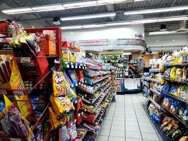
The next aisle was home to the typical convenience store fare. This angle also gives us a better view of the cashier counter and Albertsons "cigarettes" sign.
The following aisle had some more snacks, essentials, and a view of the "fountain" sign in the back of the store. I wish I had gotten a closer picture of it (you can zoom into the one above), but this store's fun featured product of the week was the display of "Beer Salt." While not something I would necessarily be interested in, it seems to be a popular product here!
Unfortunately, the back wall of this store only had a Community Coffee banner, and the wall behind me only had pegboards with random product above the wall of drink coolers. I didn't really want to hang out much longer in this store, especially since I wasn't planning to buy anything, but I didn't notice anything else that screamed "Albertsons!" to me. At least there were a few vintage finds left in here!
I took a few pictures of the back of the store as I was leaving Publix, and I really didn't see anything spectacular.
Here you can see how the store looked from where I parked my car, with its faded Albertsons branding on full display. Even though Albertsons moved out of this location close to 14 years ago, Pensacolans are still reminded of the impact the chain had on the region to this day.
 |
| Courtesy dirtyblueshirt (Flickr) - Albertsons Express - August 9, 2008 |
I'll conclude my coverage of the old Albertsons Express with this photo dirtyblueshirt took in 2008; I think the store looked much nicer under the care of the Idaho-based chain!
 |
| Courtesy dirtyblueshirt (Flickr) - Publix #1343 - June 21, 2009 |
Interestingly, Albertsons #4441 was mentioned one final time in The Pensacola Journal back in June for money that was owed to the store from a 1997 court case. The classified ad stated that the store would forfeit the $32.46 it was owed if it did file a claim by September 1, but I'd imagine the defendant in this case got off scot-free. Crazy how incidents like this are still in the legal system 25-years after they occurred!
That will wrap up our tour of Publix #1343 / former Albertsons #4441, so I hope you enjoyed our little adventure in the Florida Panhandle. I plan for this to be my last post for the year, but I've got a special surprise in store for next Saturday on The Sing Oil Blog. That being said, I hope y'all have a Merry Christmas!
Until next year,
- The Sing Oil Blogger

