
On this tab you will find just about everything you'd want to know about Albertsons Florida store models and their interiors. As a bonus, I'm also including information on Publix and Winn-Dixie store models and interiors here. I talk about both of those stores enough here on the blog and on my flickr page often enough, so why not include some information on both of them too! Anyway, here we go:
During their time in Florida, Albertsons had a few different store models. In this section I'll explain the most common ones and give some information on each of them, including time periods when they were built and a quick description of distinctive features. All of the names I'm giving these store models are ones I made up and did not come from Albertsons. Just to note: These models are for Albertsons Florida specifically. While in other parts of the country most Albertsons stores looked fairly similar or almost exactly like the ones described here, sometimes there were variations used in other regions that aren't mentioned here.
The Skaggs Model:
 |
| Albertsons #4301 Clearwater, a typical Skaggs Model store. All of the following bird's eye satellite images are from Bing Maps. |
This was the first store model that Albertsons built across Florida, back when they were still partnered with the Skaggs Company - therefore the name "Skaggs Model". These stores were based off of Skaggs and Albertsons original superstore concept. After the two companies split up in 1978, Albertsons continued to build stores that looked like this into the early 1980's. For the most part, stores #4301 through #4346 were of this style, but Albertsons gave some of these stores extensive remodels in the 90's, somewhat disguising them at first sight. Some distinctive features of the Skaggs Model are the 2 walls in the front corners of the store that stick out a little (however in some later versions of the Skaggs Model, these were removed), and a rectangular entryway that sticks out of the middle. The liquor store is usually tucked into one of the front corners of the building with a secondary entrance along the side wall.
|
The Trapezoid Model:
 |
| Former Albertsons #4354 Bradenton, a typical Trapezoid Model store. |
After the Skaggs Model died out, next came the Trapezoid Model, named after the trapezoid shaped area of the building over the entryway. That area is this model's most distinctive feature. The liquor store is still a part of the main building in one of the front corners, but the entrance has been moved from the side of the building to the front. These were built during a few years in the mid-80's, and were stores #4347-#4358. I've seen a few people online say that these Trapezoid Model stores are former Family Mart stores, but they weren't. The only Albertsons in a former Family Mart that I have confirmed is store #4381 in Tamarac. Albertsons tried to buy 18 Family Mart stores when A&P pulled out of Florida in the late 1980s, but that deal fell through. Below is a confirmed former Family Mart store in North Fort Myers:
|

The Family Mart above was one of the ones that Kash 'n' Karry purchased when Family Mart pulled out of Florida, and has been closed for years. While these two stores have many similarities, there are a few differences between them. The trapezoid area over the entryway on the Family Mart has a wall that extends back into the roof. The Albertsons doesn't. You can't tell from these pictures, but the entrance of the Albertsons is on an angle, following the roofline of the trapezoid on both sides. The Family Mart's entrance is not on a diagonal. Also, the Albertsons originally had an entirely stone front. The Family Mart had 2 stone bands that wrapped around the whole store (the two brown stripes in the picture above). Just some handy information to know to help identify the two and know what makes each different.
The Superstore Model:
 |
Former Albertsons #4376 Winter Springs
|
| As we get to the late 80's and early 90's, Albertsons began to build much bigger and more intimidating looking stores in Florida. These are the Superstore Model stores, named after what many newspaper articles referred to Albertsons stores of this time as. The exteriors of these stores varied in shape, size, and materials. For example, you can see a grand, rectangular brick exterior style on the store above, but a more graceful look of stucco and arches on the store below. |
 |
Former Albertsons #4410 Kissimmee
For this model, there were two entrances, one usually labeled ‘Food’ and the other ‘Pharmacy’. These stores were big, but lacked much of the merchandise variety found in Albertsons stores of past eras. By this time period, Albertsons was transitioning away from many general merchandise categories to become more like a traditional grocery store. Also for this model, the liquor store was no longer a part of the main building. The liquor store was now moved into its own smaller building attached to either the right or left of the store. If there was not enough room next to the building, the liquor store was moved out into the parking lot somewhere. The superstores were stores #4359-4389 (with a few exceptions of takeover stores and numbering violations) and #4410 and #4412. |
The Jewel-Osco Model:
 |
Former Albertsons #4401 Clearwater
|
In 1992, Albertsons bought 7 Jewel-Osco stores and 2 planned sites from their parent company American Stores. These Jewel-Osco/Albertsons stores had a distinctive trapezoid shaped area on the roof of each store. There were also 2 very distinct arches over the entryways, like the ones above. The liquor store was tucked into one of the front corners of the building. The first Jewel-Osco in Florida, which is now Albertsons #4402, has slightly modified arches over the entrances and only half the trapezoid on the roof. These Jewel-Osco takeover stores were stores #4401-#4409.
The Circle Model:
 |
Former Albertsons #4411 Kissimmee.
|
In 1993, the one and only Albertsons Circle Model store opened in Kissimmee, store #4411. This store looks different from any other Albertsons built in the state, and I have confirmed this store was built from scratch as an Albertsons. This store has always intrigued me due to its unique design, which is the large circular-shaped entryway. This may have just been a modified Mid-Late 90's Model design (see below for more on that model), but they were always square looking, except some of the later stores from that era. This store had a single entrance and exit under the circular area. If you know of any other Albertsons stores built like this outside of Florida, please tell me.
The Mid-Late 90's Model:
 |
Former Albertsons #4429 Melbourne
|
These stores were built in the mid-late 90's (hence the name) and consolidated the two entrances and exits from the Superstore era into one. Their exteriors were usually rectangular shaped, like the one above, but some of the later stores of this style used arches. Some of the later Mid-Late 90's stores had a windowed-in cart storage area before the main entrance doors as you would walk in, like the store above (it's to the left of the main arch). These stores were #4413-late 4430s (there was a transition period around 1996-1997 where the Mid-Late 90's stores and the Early 2000's Model stores looked like hybrids of each other).
The Early 2000's Model:
 |
A typical Early 2000's Model store, Former Albertsons #4471 Sanford
|
Now that we're in the late 90's and early 2000's, we come to the Early 2000's Model stores. Even though this design is most closely associated with stores built after 2000, the first stores of this style actually began opening in the very late 1990's. These stores typically had a large arched entryway, but sometimes it was rectangular. The entrance was located under the main arch, and the exit was located off to one of the sides under the smaller awning. There is a variation of this model, which you can see below:
 |
| Early 2000's Model Variation, Former Albertsons #4465 Sarasota. The entryway arch was slightly smaller and 'Albertsons' was off to the side. |
These stores were built during Albertsons last big push to make something out of the Florida division. They were stores from the late 4430's-#4486.
The Modified Early 2000's Model:
 |
Former Albertsons #4495, Orlando
|
The Modified Early 2000's Model marks the end of Albertsons time in Florida. 5 of the last 6 Albertsons stores in Florida were of this style, and were built from 2003-2004. What makes these stores different from the standard Early 2000's Model? The only difference is that the Pharmacy department now has its own entrance off to the side (the arch all the way to the left in the picture above). Otherwise, these stores look just like a typical Early 2000's Model store from the exterior. The interiors also included a slightly different layout, and were much larger than a standard Early 2000's store. These were stores #4495-#4498 (except #4496, which took over an existing building), #4316(2) and #4384.
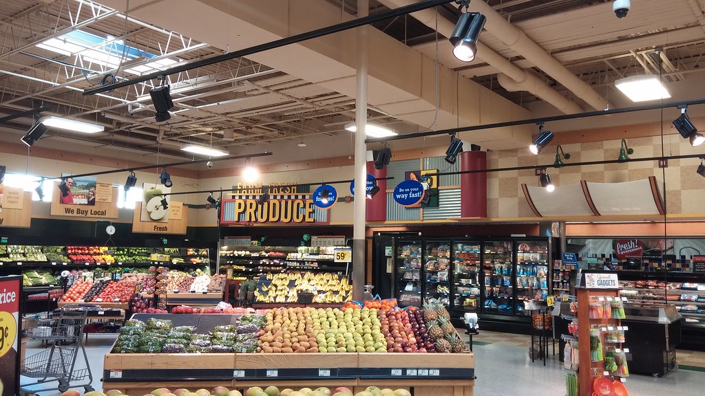
Albertsons Florida Interior Decor:
Now that we've taken a look at the different building designs that Albertsons used in Florida during their 42 years in the Sunshine State, let's take a quick look at what these stores looked like on the inside:
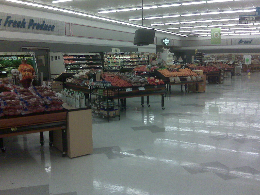
70's Stripes:
70's Stripes was the original Skaggs-Albertsons interior used from when Albertsons first entered Florida in 1974 through the early 1980's. This interior was very colorful, with many red and orange stripes and color schemes throughout the store. It's hard to find photos of this interior, especially consider that it was removed from just about all operational Albertsons stores by the early 1990s. All I've ever seen of this interior was small bits and pieces of it in the background of photos, much like the photo above. All of the Skaggs and Trapezoid Model Albertsons stores would have originally had this interior.
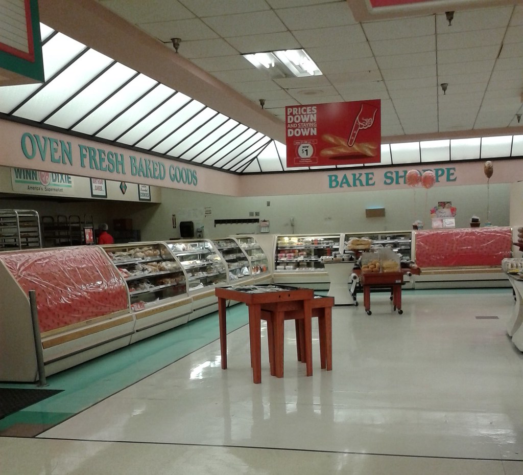
Colorful Transition Market:

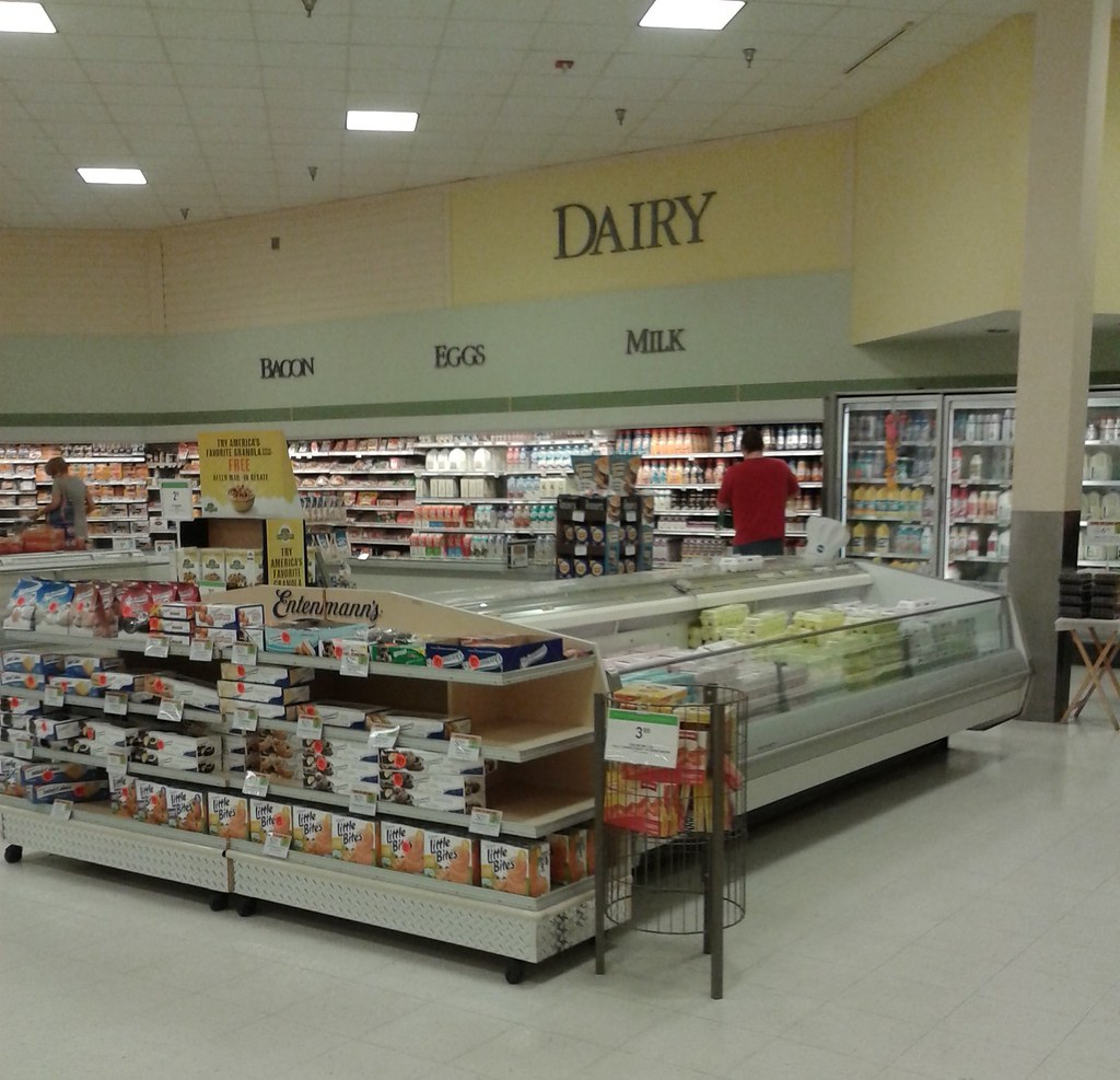
Blue & Gray Market:


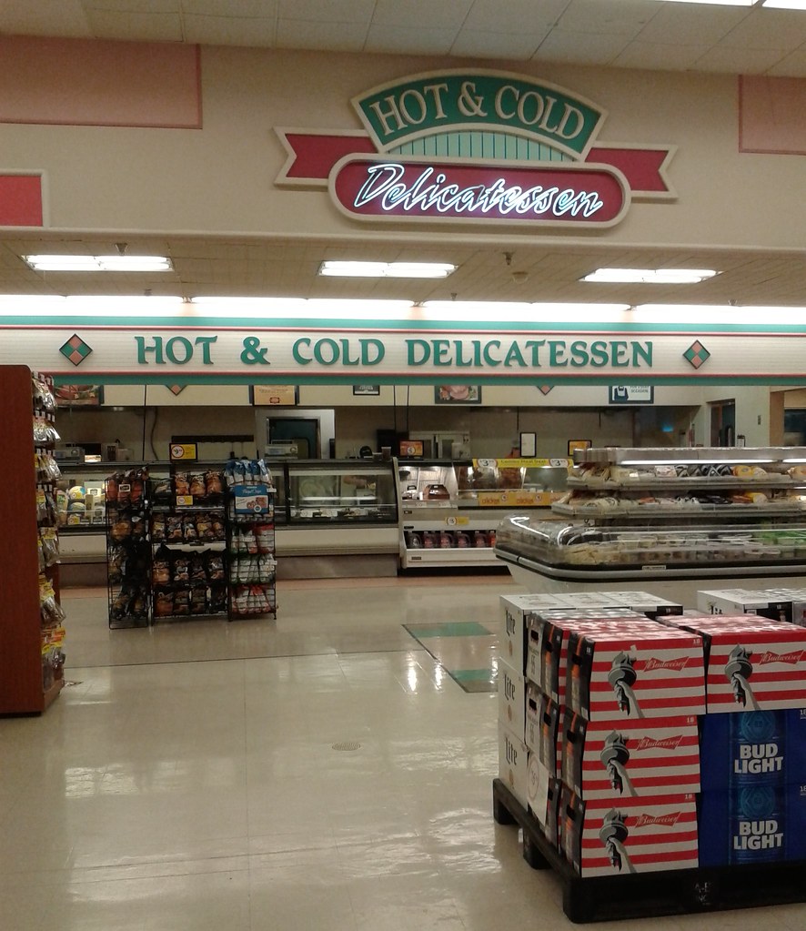
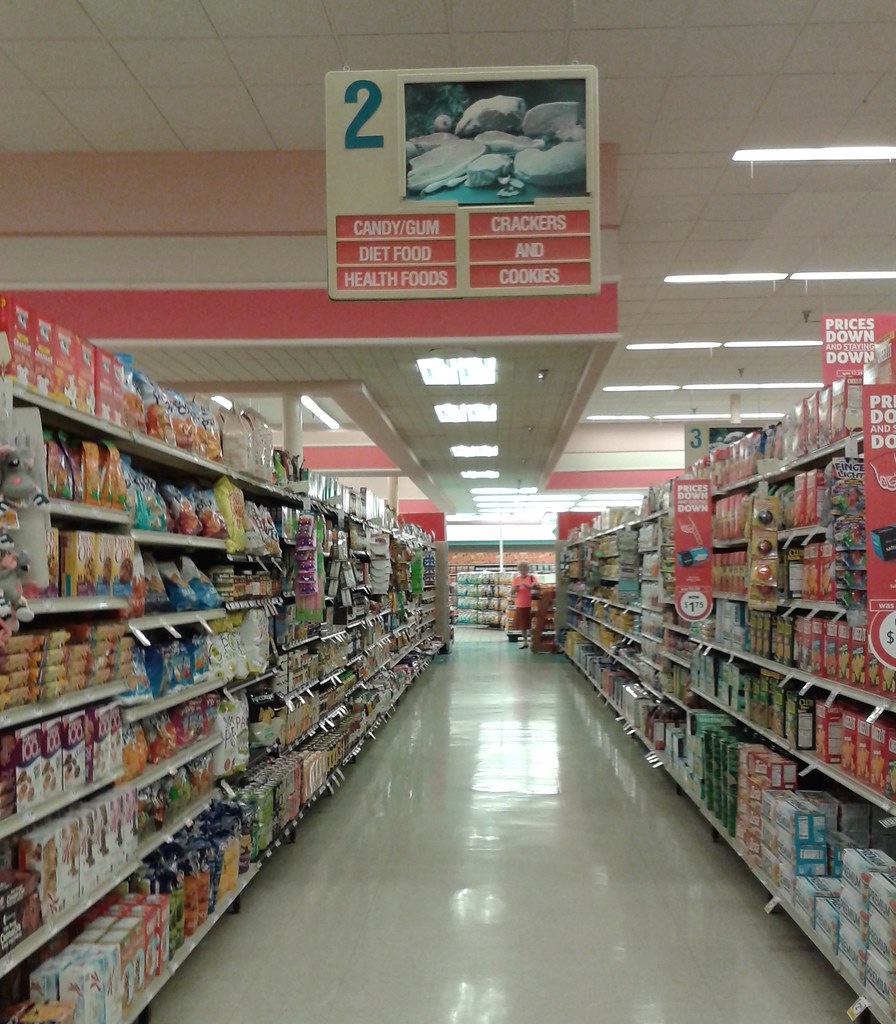
The Blue & Gray Market interior was the oldest surviving interior when Albertsons started to pull out of Florida in the late 2000's. This interior came out in the late 80's and was used all the way into the late 90's. It featured white walls with a gray textured stripe running around the perimeter of the store, much like what can be seen in the last photo showcasing this interior above. On the stripe were the department names spelled out in blue letters. As time progressed and Albertsons wanted to freshen up their stores, many times this decor was repainted in a new color scheme to "refresh" the look. The second to last photo in the block above shows a 2000's refresh to this interior at Albertsons #4301 in Clearwater, repainting it to a green and yellow color scheme. I've also seen brown and white repaints to this interior. Blue and Gray Market was an extremely common interior for Albertsons stores in Florida, and was the oldest surviving interior in Albertsons stores as their time in Florida came to an end.
***NOTE BEFORE WE CONTINUE: The Acme Style Blog has an entire decor directory for each of the following Albertsons interiors, which have also been used in Acme stores since they were acquired by Albertsons in 1999 and are exactly the same as the ones used in Albertsons Florida stores. Acme Style's posts are more extensive photographically, and describe these decor packages better than I probably could. For that reason, I'll include a link to each of Acme Style's decor directories at the end of each of my examples.***
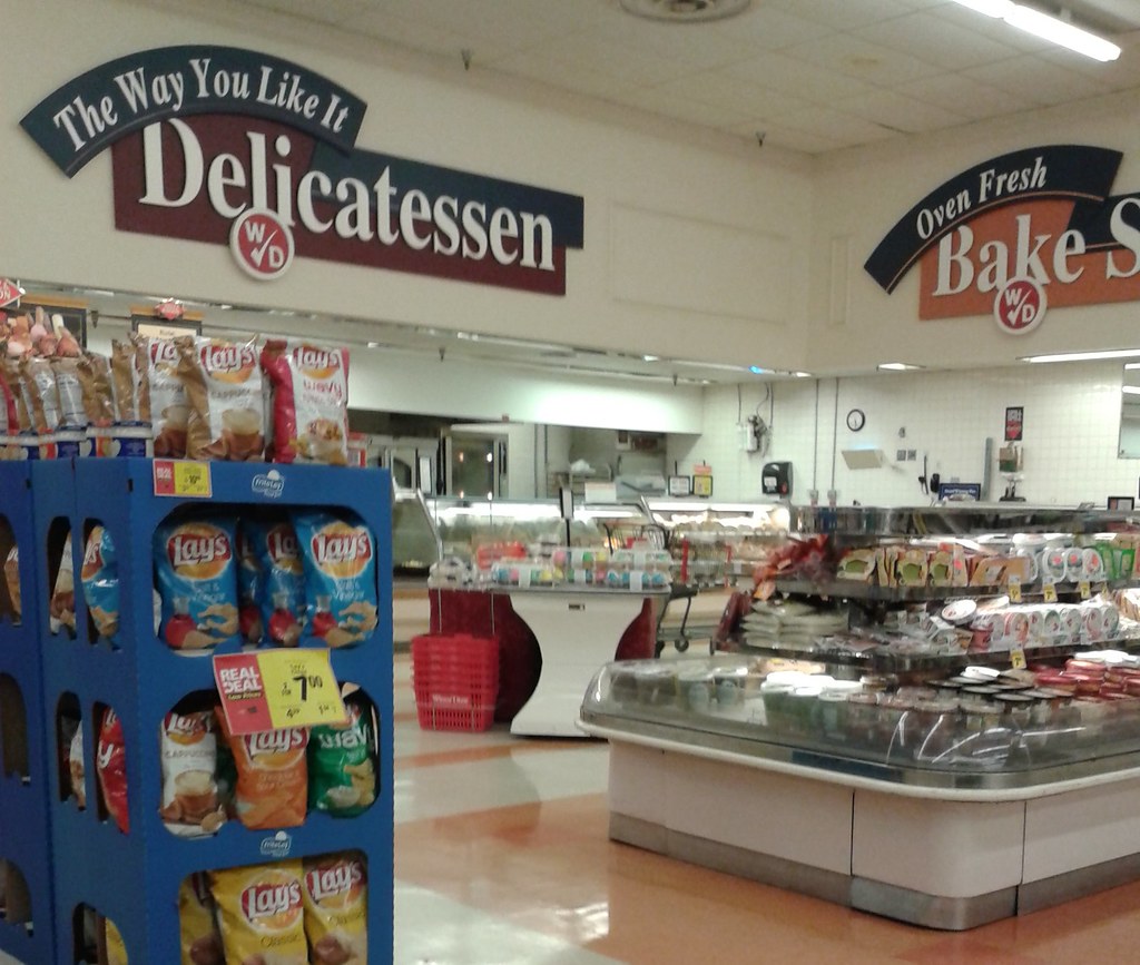
Blue & Green Awnings:


After over a decade of the Blue & Gray Market interior, Albertsons decided it was finally time for a change. That change brought along with it the Blue & Green Awnings interior (most of the interior decor names from here to Brown Lifestyle are the creation of the Acme Style Blog). Albertsons stuck with the Blue & Gray Market interior for almost a decade, but from here on they kept switching decor packages every 2-3 years. Blue and Green Awnings made its debut around 1997. Before Acme Style came out with the Blue & Green Awnings name (the name came from some of the wall decorations used throughout this interior), I used to call this look the 'Pillow' interior because the design used on the walls looked like pillows to me. However, I think Blue & Green Awnings is a much better name than "The Pillow Interior"! Anyway, the first photo in this section came from the Largo Albertsons prior to its conversion into a Safeway store, and was taken by AFB contributor Ross T. That photo covers most of the highlights from this interior as to what the walls, props, and department signage looked like. There were lots of little details on the walls in this decor, and lots of Pastels! The second photo shows the typical aisle signage seen in this decor, as we saw at the Altamonte Springs Albertsons during its remodel into Safeway in late 2015.
To see Acme Style's Decor post on the Blue & Green Awnings interior, click here. Acme Style calls this a "rare decor". For Acme stores it was fairly uncommon, but for Albertsons Florida, this decor was fairly widespread and used in many stores across the state, especially in remodels of older stores.
Grocery Palace (aka Acme Theme Park):


Grocery Palace is one of those decor packages that really needs to be described in photos rather than words. This decor, introduced by Albertsons in 1999, is a great example of excess and overboard. However, that excess and overboard, as well as the crazy props used in the different departments, is really what gave this decor its charm. Grocery Palace is my favorite supermarket decor package, mostly because of all of that excess I just mentioned!
In 1999, Albertsons debuted an all new interior decor they considered revolutionary, entirely replacing the Blue and Green Awnings interior by 2000.This new decor gave each department its own unique feel with huge, specially designed props and signs to make each department feel unique, like a barn used to store milk (seen above), a giant bowl of chips and pretzels over "Snack Central", and a giant spinning mobile of cats, dogs, and birds over the Pet Care department (among others crazy things - the stores built from the ground up with this look were much more over the top than the stores that were remodeled to this look). This was the Grocery Palace interior. Grocery Palace was Albertsons' official name for this decor package, although Acme Style gave this interior the name "Acme Theme Park" because of it's over the top feel and carnival like styling.
To see Acme Style's Decor post on the Grocery Palace interior, click here. For a fun look at a perfectly preserved example of an Albertsons Florida store with the Grocery Palace interior, check out my tour of Albertsons #4462 in South Orlando here. I highly recommend scrolling through those two links to understand the craziness that was the Grocery Palace decor!
Industrial Circus:


Albertsons used the Grocery Palace interior throughout Florida for new and remodeled stores from 1999 until 2002-ish, when the next interior decor came out. That new interior was Industrial Circus. Industrial Circus did away with all of the fun, unique, and quite excessive decor elements we saw in the Grocery Palace interior for a more "traditional" looking supermarket decor. The main element of the Industrial Circus interior was the metallic or metallic-styled department signs. Also, each department was painted bright, fun colors. I guess corrugated metal was the big trend in supermarket decor in the early 2000's, because the introduction of Albertsons's Industrial Circus interior coincided with the introduction of Publix's Metallic Marketplace interior.
I have a few photos above of some Industrial Circus decor remnants that I found in my travels to two different Albertsons stores in Florida. Most Industrial Circus decor stores in Florida had the "cheap" version of this interior with the flat signs. However, there was also a more deluxe variant to this decor which can be seen in the last photo of the block above, and in Acme Style's decor directory, saved for more extensive remodels and new stores. To see Acme Style's Decor post on the Industrial Circus interior, click here.
Santa Fe (aka Albertsons Marketplace):


Santa Fe was the last of Albertsons' interiors to make it to Florida. Very few stores in Florida got this look, which came out around 2003. The only stores I know to have gotten this interior were the new Modified Plaza Model stores built from 2003 and 2004, right before Albertsons began their great Florida exodus. This decor, which originated from the Jewel-Osco division, featured the popular 2000's earth tones color scheme that the more upscale stores like Whole Foods and Publix pioneered. While Albertsons used this decor until 2006, this decor was only used in Florida at the very beginning of this decor's life cycle.
To see Acme Style's Decor post on the Albertsons Marketplace interior, click here. There are much better photos there than the through-the-window ones I took of this decor at the old Apopka Albertsons (#4498).
Brown Lifestyle:


As Albertsons Florida began its transition into Safeway in Early 2016, the company debuted its latest interior design at these Florida locations. While a rather simplistic interior design, Brown Lifestyle incorporates the latest trend in supermarket design: minimalism and large, skinny letters to spell out the department names. In the photos above from the Altamonte Springs Safeway. In the photos above, you can see the brown/gray/white color scheme used throughout the store. While relatively simple, this interior does look nice at the three Florida Safeway stores. Another aspect of this new interior is local flare, with references to the city the store is located in throughout the building (such as street names on the aisle signs, and a local reference in the name of the cafe seating area). For some additional pictures of this interior, please click here.
Publix Store Models:
Art Deco:
The art deco style Publix stores were Publix's first widespread store model as they began to expand across the state, with this store model introduced in the 1940's. These stores are extremely tiny compared to today's monster 50,000+ square foot supermarkets, however they were a bold architectural statement when they first came out. These stores had that distinct, movie theater style front with rounded edges. The Publix sign ran down that vertical piece over the main entrance to the store, with glass block accents to either side of the sign. Despite being so old, many of these art deco style Publix stores remain throughout Florida in almost perfect condition, although all of them have been re-purposed for other businesses. This is what one of these stores would have looked like when open as Publix.
Wing Store:
70's Model:
80's Model:

The 80's Model stores are when Publix stores got pretty average architecturally, although every once and a while from here on Publix has been known to build a store with a fancy, custom designed facade. These stores were rather similar to their 70's counterparts, although the glass vestibule you see in the photo of the Lake Placid store would later become a standard design for these stores. This was a single vestibule, unlike at the early 90's built Publix stores where there were two separate ones.
Early 90's Model:

The early 90's model Publix was essentially just a larger version of the 80's Model store, with practically the same interior layout. The only real difference between the 80's Model and the Early 90's model stores was the entryway setup. There were still entrances on each side of the store, but they were now separated by the Customer Service counter and offices which were located on a second floor (similar to the entryways of an Albertsons Superstore Model store) instead of both entrances leading to one opening.
Late 90's Model:
The Late 90's model stores saw the double entryways condensed into one located in the center of the store. This store model was also the first to use incorporate a warehouse ceiling, although some older locations built during this era had full or partial drop ceilings inside. Once of the most interesting features of these early 90's built stores is the large skylight/clerestory over the front end. Not all of these stores got that feature, but it sure looks neat in the ones that did!
Early 2000's Model:
The early 2000's stores look quite similar to the late 90's stores, except the entryway was designed just a little bit different. You can see the new set-up in the photo of the West Melbourne store above. These stores have the frozen food department located on the far left side of the building, the pharmacy counter next to the main entrance, and meat and seafood in the back left corner.
The Current Publix Store Model:
The design of stores you see above is basically the default model that Publix uses when they build a new store these days. You do see Publix change up this design to match a shopping center or better fit a community, but it's still pretty obvious when you see one of those stores that it's a modern Publix. This store model was first introduced in 2004 along with the first iteration of the Classy Market interior, and unlike the interior decor, you can still find stores that look like this being built today.
Small Format:
The small format model Publix is a separate model Publix uses along with whatever regular current model they're using. I believe the first of these small format Publix stores were introduced in the late 90's as a way for Publix to enter markets where a larger sized store of 45,000-55,000 sqft. wouldn't be practical or where there wouldn't be enough room (such as in highly urbanized places like downtowns or in small neighborhoods). These stores still have all of the regular departments as a full sized store, but they just offer a smaller selection in approx. 28,000-30,000 sqft. The entryway is located at the left or right corner of the building, which takes you into a small vestibule that leads you into the rest of the store. The bakery and deli counters are made a part of aisle 1, with meat, seafood, and produce located in the back of the building.
Publix Interior Decor:
Publix is one of those chains that likes to keep their stores up to date. Because of that, the only surviving Publix interiors at this time are Classy Market 2.0 and later, although Classy Market 2.0 is pretty close to extinction itself (and that decor only came out around 2009!).
Wavy Pastel:


Wavy Pastel was Publix's interior through much of the 1990's. All of the department signs were plastic rectangles in Pastel colors, except the bottom of the signs were wavy and highlighted by another color (as can be seen in the photos above). The original aisle markers were rectangles with an inverted triangle in the middle for the number (an example of which can be seen in the bottom photo if you zoom in and look really close). The font you see on the department signs was the Publix font during this era, used on everything from the signs in the stores, to Publix's store brand packaging, to their advertisements. I personally miss this era of Publix, as this was the era where they weren't trying so hard to be the upscale, classy place to shop.
Photos of the Wavy Pastel interior are a bit hard to come by on the internet, but you can see some more glimpses of this interior in the posts here and here, as well as these six photos from Brand New Eye's flickr photostream.
Metallic Marketplace:
By the early 2000's, Wavy Pastel was starting to look a bit dated, so Publix upgraded their look to match the popular early 2000's supermarket interior trend of using corrugated metal practically anywhere and everywhere it could be placed. Thus, Metallic Marketplace was born. Metallic Marketplace, like its cousin Wavy Pastel, is also dead. Metallic Marketplace was basically just a modernized version of Wavy Pastel, except all of the department signage was placed on giant sheets of corrugated metal, using the same fonts and logos from Wavy Pastel. However, the aisle markers were changed for Metallic Marketplace to the same style as the ones Publix used in the first few iterations of the Classy Market look (however the Metallic Marketplace aisle markers were blue with green accents, as seen in the photo above, instead of pale green with yellow accents from Classy Market 1.0, 2.0, and 2.5). The store also would have a piece (I don't know what to call it, but it almost looked like a small floating wall with little rooflines here and there - it's what the 'Meats' sign is hanging from in the above photo) that ran the perimeter of the grocery aisles, and it was trimmed with corrugated metal. When stores were upgraded from Metallic Marketplace to Classy Market, this piece was sometimes left in place and just repainted to match the Classy Market interior, leaving it as the only remnant of the store's past interior. However, most later remodels would see this piece removed entirely. Metallic Marketplace was only used in newly built stores during the early 2000's.
Classy Market 1.0:

Around 2004, Publix decided to completely upgrade their image from fun fonts and colors to a more sophisticated, classy, earth tones feel. Here came the first iteration of what I call the Classy Market interior, which shared absolutely no similarities with any previous interiors (except a different colored version of Metallic Marketplace's aisle markers). Above you can see a few photos of what the Classy Market 1.0 interior looked like. This interior did a lot to shape and solidify Publix's image as an upscale, classy place to shop (hence the name, Classy Market). One of the main differences between Classy Market 1.0 and its later successors is the font used on the department signage. Classy Market 1.0 used a distinctive, thin, formal looking serif font. This font would later be killed off in Classy Market 2.0 for the font we see today. I'm 99.9% certain this interior is dead, with some of the last traces of it wiped away in Publix rampant remodel sweep around 2014 and 2015.
Classy Market 2.0:


In the late 2000's Publix, who's always on top of keeping their stores looking good and up to date, decided it was time to refresh Classy Market. Welcome second iteration of Classy Market, which made its debut around 2009 or so. The main difference between Classy Market 1.0 to Classy Market 2.0 was the change in font from the formal serif style to a more modern and bold sans-serif style (which you can see in the photos above). Classy Market 2.0 also a bit more color to the walls, as well as and some hanging props and custom designed signage for each department (such as the sign for the Deli was made to look like the Publix paper drink cups and the sign for produce having a leaf in it). Really, the Classy Market 2.0 brought back a little more fun to the Classy Market interior, as Classy Market 1.0 was quite bland. The best part of the Classy Market 2.0 interior was the historic photo collage of old Publix stores and memorabilia, which, unfortunately, didn't make the cut for the Classy Market 3.0.
Classy Market 2.5:


Classy Market 3.0:


Classy Market 3.0 is Publix's current interior decor package. Classy Market 3.0 made its official debut at a few prototype Publix stores in 2012, although this decor wasn't rolled out as a remodel package until 2013. Since the debut of Classy Market 3.0 and the rampant wave of remodeling that came with it, this is the most common decor package you will find at Publix these days. There are still a good number of stores with the Classy Market 2.5 decor out there, although I have seen some of those stores begin remodels recently. Classy Market 2.0 is still out there in a few stores, but it has become quite rare over the last year or so. Anyway, Classy Market 3.0 features lots of splashes of color among what is usually a brown or beige store. Circular shaped hanging signage can be found in a few departments as well. For Classy Market 3.0, the aisle markers were changed for the first time since the days of Metallic Marketplace. Above you can see some examples of the distinctive features of the Classy Market interior.
Evergreen:
Albertsons Florida Interior Decor:
Now that we've taken a look at the different building designs that Albertsons used in Florida during their 42 years in the Sunshine State, let's take a quick look at what these stores looked like on the inside:
70's Stripes:
 |
| A somewhat grainy view of the 70's Stripes interior in the South Orange Ave. Albertsons in Orlando (#4323). Photo Courtesy of Youtube.com. Watch the full video featuring this store here. |
70's Stripes was the original Skaggs-Albertsons interior used from when Albertsons first entered Florida in 1974 through the early 1980's. This interior was very colorful, with many red and orange stripes and color schemes throughout the store. It's hard to find photos of this interior, especially consider that it was removed from just about all operational Albertsons stores by the early 1990s. All I've ever seen of this interior was small bits and pieces of it in the background of photos, much like the photo above. All of the Skaggs and Trapezoid Model Albertsons stores would have originally had this interior.
Colorful Transition Market:
As Albertsons was transitioning away from the 70's Stripes interior, it seems like they were experimenting with a new interior in the early-mid 1980's. The Colorful Transition interior, which was dug up and named by AFB contributor Ian W., appears to be a colorful variant of the more widely seen Blue and Gray Market decor of the late 1980's and early 1990s. Since this interior had been wiped away from most stores by the 1990's, photos of this interior are hard to come by as well. I'm not sure how widely used this Colorful Transition interior was, but I've seen a old few photos with bits and pieces of colorful walls, hinting at an interior similar to this being used.

***NOTE BEFORE WE CONTINUE: The Acme Style Blog has an entire decor directory for each of the following Albertsons interiors, which have also been used in Acme stores since they were acquired by Albertsons in 1999 and are exactly the same as the ones used in Albertsons Florida stores. Acme Style's posts are more extensive photographically, and describe these decor packages better than I probably could. For that reason, I'll include a link to each of Acme Style's decor directories at the end of each of my examples.***
Blue & Green Awnings:


To see Acme Style's Decor post on the Blue & Green Awnings interior, click here. Acme Style calls this a "rare decor". For Acme stores it was fairly uncommon, but for Albertsons Florida, this decor was fairly widespread and used in many stores across the state, especially in remodels of older stores.
Grocery Palace (aka Acme Theme Park):


In 1999, Albertsons debuted an all new interior decor they considered revolutionary, entirely replacing the Blue and Green Awnings interior by 2000.This new decor gave each department its own unique feel with huge, specially designed props and signs to make each department feel unique, like a barn used to store milk (seen above), a giant bowl of chips and pretzels over "Snack Central", and a giant spinning mobile of cats, dogs, and birds over the Pet Care department (among others crazy things - the stores built from the ground up with this look were much more over the top than the stores that were remodeled to this look). This was the Grocery Palace interior. Grocery Palace was Albertsons' official name for this decor package, although Acme Style gave this interior the name "Acme Theme Park" because of it's over the top feel and carnival like styling.
To see Acme Style's Decor post on the Grocery Palace interior, click here. For a fun look at a perfectly preserved example of an Albertsons Florida store with the Grocery Palace interior, check out my tour of Albertsons #4462 in South Orlando here. I highly recommend scrolling through those two links to understand the craziness that was the Grocery Palace decor!
Industrial Circus:


Albertsons used the Grocery Palace interior throughout Florida for new and remodeled stores from 1999 until 2002-ish, when the next interior decor came out. That new interior was Industrial Circus. Industrial Circus did away with all of the fun, unique, and quite excessive decor elements we saw in the Grocery Palace interior for a more "traditional" looking supermarket decor. The main element of the Industrial Circus interior was the metallic or metallic-styled department signs. Also, each department was painted bright, fun colors. I guess corrugated metal was the big trend in supermarket decor in the early 2000's, because the introduction of Albertsons's Industrial Circus interior coincided with the introduction of Publix's Metallic Marketplace interior.
I have a few photos above of some Industrial Circus decor remnants that I found in my travels to two different Albertsons stores in Florida. Most Industrial Circus decor stores in Florida had the "cheap" version of this interior with the flat signs. However, there was also a more deluxe variant to this decor which can be seen in the last photo of the block above, and in Acme Style's decor directory, saved for more extensive remodels and new stores. To see Acme Style's Decor post on the Industrial Circus interior, click here.
Santa Fe (aka Albertsons Marketplace):


Santa Fe was the last of Albertsons' interiors to make it to Florida. Very few stores in Florida got this look, which came out around 2003. The only stores I know to have gotten this interior were the new Modified Plaza Model stores built from 2003 and 2004, right before Albertsons began their great Florida exodus. This decor, which originated from the Jewel-Osco division, featured the popular 2000's earth tones color scheme that the more upscale stores like Whole Foods and Publix pioneered. While Albertsons used this decor until 2006, this decor was only used in Florida at the very beginning of this decor's life cycle.
To see Acme Style's Decor post on the Albertsons Marketplace interior, click here. There are much better photos there than the through-the-window ones I took of this decor at the old Apopka Albertsons (#4498).
Brown Lifestyle:


As Albertsons Florida began its transition into Safeway in Early 2016, the company debuted its latest interior design at these Florida locations. While a rather simplistic interior design, Brown Lifestyle incorporates the latest trend in supermarket design: minimalism and large, skinny letters to spell out the department names. In the photos above from the Altamonte Springs Safeway. In the photos above, you can see the brown/gray/white color scheme used throughout the store. While relatively simple, this interior does look nice at the three Florida Safeway stores. Another aspect of this new interior is local flare, with references to the city the store is located in throughout the building (such as street names on the aisle signs, and a local reference in the name of the cafe seating area). For some additional pictures of this interior, please click here.
Publix Store Models:
Art Deco:
 |
| A former Art Deco Publix in Lakeland, FL |
Wing Store:
 |
| An amazingly well preserved original Publix Wing Store in Miami Beach, FL. |
By the time the mid-50's were rolling in, Publix was in need of a new, more modern, store design. With that came the Publix Wing Store, named after the distinct wing-like piece in the middle of each store's exterior. The Wing Model and the Art Deco Model are Publix's most famous store models, and are what many people think of when the here the name Publix. The store pictured above is the last surviving original Wing Store in the entire chain, although in recent years Publix has built some similar replicas of what many consider to be their most unique and timeless design, which lasted into the 1970's. Also, it was during the time of the Wing Store when Publix introduced their famous Tile Murals to the front of each store (more on those soon).
70's Model:
 |
| A now demolished former Publix store in Temple Terrace, FL. |
 |
| A repurposed but very well preserved (exterior-wise) 1970's style Publix store in Kissimmee, FL |
As the Wing Store began to fade away, Publix started to get a little more bland with their store design (although the 70's stores still look neat in their original form). The above photos show examples of a typical 70's Model Publix, with it's most distinct feature being that ribbed panels along the exterior. These stores did not have a glass entry vestibule like their later counterparts, with the entrance angled in along the front walkway.
 |
| A fairly standard 80's model Publix Store in Cocoa Beach, FL (now demolished). |

 |
| Two more examples of 80's stores with varying architectural elements. The first store (with the blue awning) was in Melbourne, FL (now demolished) and the second store is in Sebastian, FL. |
 |
| An exterior close-up of a very well preserved (but sadly now closed) 80's built Publix in Lake Placid, FL, with the commonly added on glass vestibule that so many of these stores later received by the end of the decade. |
Early 90's Model:

 |
| Two examples of early 90's stores, just with slightly different architecture. The top store is in Sarasota, FL and the bottom store is in New Port Richey, FL. |
 |
| A close-up of an early 90's built Publix in Melbourne, FL |
Late 90's Model:
 |
| A typical Late 90's model Publix that was located in Kissimmee, FL. |
 |
| A close-up of the same Publix that can be seen above, but after that store relocated across the street to a new building. |
Early 2000's Model:
 |
| A somewhat average Early 2000's Publix in North Lauderdale, FL. |
 |
| A close-up of another early 2000's built Publix in West Melbourne, FL |
The Current Publix Store Model:
 |
| A standard style Modern Publix in Cape Canaveral, FL. |
 |
| Another example of a typical Modern Publix store, this one located in Titusville, FL. |
Small Format:
 |
| A fairly average Small Format Publix, located in Boynton Beach, FL. |
Publix Interior Decor:
Publix is one of those chains that likes to keep their stores up to date. Because of that, the only surviving Publix interiors at this time are Classy Market 2.0 and later, although Classy Market 2.0 is pretty close to extinction itself (and that decor only came out around 2009!).
Wavy Pastel:

Photos of the Wavy Pastel interior are a bit hard to come by on the internet, but you can see some more glimpses of this interior in the posts here and here, as well as these six photos from Brand New Eye's flickr photostream.
Metallic Marketplace:
 |
| A glimpse of the Metallic Marketplace interior from a Publix Commercial from the early 2000s. Photo courtesy of Youtube.com. You can watch the full commercial here. Link to video sent in by Osi Florida. |
 |
| The Metallic Marketplace aisle signs, as seen in a store with the Wavy Pastel interior (a common update for these Wavy Pastel stores in their later years). |
Classy Market 1.0:

Classy Market 2.0:


In the late 2000's Publix, who's always on top of keeping their stores looking good and up to date, decided it was time to refresh Classy Market. Welcome second iteration of Classy Market, which made its debut around 2009 or so. The main difference between Classy Market 1.0 to Classy Market 2.0 was the change in font from the formal serif style to a more modern and bold sans-serif style (which you can see in the photos above). Classy Market 2.0 also a bit more color to the walls, as well as and some hanging props and custom designed signage for each department (such as the sign for the Deli was made to look like the Publix paper drink cups and the sign for produce having a leaf in it). Really, the Classy Market 2.0 brought back a little more fun to the Classy Market interior, as Classy Market 1.0 was quite bland. The best part of the Classy Market 2.0 interior was the historic photo collage of old Publix stores and memorabilia, which, unfortunately, didn't make the cut for the Classy Market 3.0.
Classy Market 2.5 was an interior decor rolled out by Publix around 2011, and used until 2013. The reason this decor is called "Classy Market 2.5" is that this decor is sort of a hybrid of Classy Market 2.0 and 3.0. Classy Market 2.5 used the same aisle markers as Classy Market 2.0, as well as featured the same colors on the wall and the historic photo collage. However, much of the department signage looked like what would be seen in Classy Market 3.0 (as well as some departments getting the curved ceilings from Classy Market 3.0), but with some departments (like seafood) retaining Classy Market 2.0 style signage. The distinctive factor from Classy Market 2.5 is that the department signs are mounted to what looks like a wooden crate like piece, like can be seen in the first photo above.
Classy Market 3.0:


Evergreen:
More coming soon!
Winn-Dixie Store Models:
70's/80's Model:
The oldest of Winn-Dixie's remaining stores (that haven't been completely altered in some way) are these 70's and 80's Model stores. These stores are rather distinctive with their awning like design on the exterior, and you can spot numerous former Winn-Dixie stores that look exactly like this throughout the Southeast. In addition to former stores, it's still pretty amazing the number of these stores that are left out there in practically original 70's condition exterior-wise, and still open as Winn-Dixie. This was one of Winn-Dixie's most prevalent store designs, as it was used during the peak of their expansion and strength as a company. In the 1990's, many of these older Winn-Dixie locations were abandoned for new Marketplace stores nearby. The entryway of these stores were typically located on one of the sides of a glass vestibule (although some stores had entrances on both sides, although one side was the most common). This vestibule usually contained a set of emergency exit doors along the front of the vestibule as well near the main entry doors. There are some variations to Winn-Dixie stores from this era, but for the most part the general look you see above can still be found.
1st Generation Marketplace:
The late 80's was when Winn-Dixie introduced their famous Marketplace store format and interior. With the introduction of the new concept Marketplace stores, a new store design was also introduced to different these new, larger stores from their predecessors. The end result of that redesign is what you see in the image above. This design would end up being the first of three designs used for Winn-Dixie's Marketplace era stores, which stretched from the late 80's to the early 2000's. These 1st Generation Marketplace stores are easily identified by that slanted part to the left side of the building.
2nd Generation Marketplace:
By the early 1990's, the original Marketplace design was retired in favor of the design you see above. The 2nd Generation Marketplace store design was probably the most prevalent of Winn-Dixie's three Marketplace store designs, used during the peak of the Marketplace era expansions in the mid-1990's. This store model was used from the early 90's and into the late 90's. The most distinct feature of the 2nd Generation Marketplace stores are that triangle shaped piece over the entryway. And instead of having a side facing entrance, the entrances to the last two Marketplace era stores were centrally located in a small indentation on the front of the building.
3rd Generation Marketplace:
In the late 90's, the Marketplace model got one last refresh before finally getting retired. The exteriors of these 3rd Generation Marketplace stores had a trapezoidal awning over the entryway (if viewed from above). Other than the redesigned facade, much of the interiors of these store were like their predecessor. However, by the time the 3rd Generation Marketplace model was rolled out, some of these stores received expanded fresh departments. The stores with the expanded fresh offerings have an island on the right side of the building where the deli and bakery are located. While much of the expanded features have since been taken away at these stores, the island is an indication that a Winn-Dixie was originally a "deluxe Marketplace" store at one time. The entryway of these stores was practically identical to that of the 2nd Generation Marketplace stores, an example of which can be seen below. This store model lasted from the end of the 1990's (about 1997-ish) until 2000.
Just as an addition to all of this Publix decor information, there's a really cool set of photos on shawnson's flickr photostream of a closing Publix in Tallahassee from 2004, which still had a very old interior when it closed (I think it's a mix of original 70's interior with some areas remodeled to an 80's interior). It's a very fascinating photoset, which you can view by clicking here! |
70's/80's Model:
 |
| A practically untouched (exteriorwise) 70's Winn-Dixie store in Mobile, AL, which was closed in 2011. |
1st Generation Marketplace:
 |
| A typical 1st Generation Marketplace store located in Jupiter, FL (which closed in April 2018) |
2nd Generation Marketplace:
 |
| A typical early 90's 2nd Generation Marketplace Store that was located in Albany, GA, which closed in 2013. |
3rd Generation Marketplace:
 |
| A typical 3rd Generation Marketplace store in West Palm Beach, FL. |
 |
 |
| A typical Early 2000's store located in Riviera Beach, FL. This store opened in July 2004 as one of the last new Winn-Dixies to open before the bankruptcy, and closed in 2014. |
The Transformational Winn-Dixie:
 |
 |
Winn-Dixie Interior Decor:
Marketplace:


To the best of my knowledge, Marketplace is the oldest Winn-Dixie decor package still remaining in their stores (however plenty of remnants from prior packages can be found in some of the older Winn-Dixies still floating around out there). The most famous version of the Marketplace interior, pictured above, was introduced in the early-mid 1990's (replacing the original 80's chrome and neon Marketplace interior). With the 1990's version of the Marketplace interior, pastels were a huge part of the color scheme (as can be seen in the first three photos above). This interior primarily used pink, green, and white in its earlier iterations, although Winn-Dixie toned down the pastels by the late 1990's. By that time, the Marketplace interior evolved into more of a cream, white, and teal color palate, which made newer Marketplace stores feel less dated than their overly pink pastel brethren. For a decor package that's around 25 years old now, this interior is still quite common throughout Winn-Dixie's remaining stores.

The Marketplace era was also when the America's Supermarket slogan came out, which can still be found on the walls in stores with the Marketplace interior. At the rate Winn-Dixie is shrinking, they'll be lucky to claim that they are Florida's Supermarket in the coming years, let alone America's Supermarket!
Purple/Maroon:
After the end of the Marketplace era in the early 2000's, Winn-Dixie came out with another interior decor to refresh some of their stores that never got a Marketplace remodel. This was the Purple/Maroon interior, named after the general color scheme of the look.
 |
| Some of the typical department signage of the Purple/Maroon Interior. There was always a saying in the blue ribbon that accompanied the department name. |
 |
| Produce signage. |

 |
| Remnants of prior decor packages are quite common in older stores that got the Purple/Maroon remodels, like the color tiles seen in the above photo. |
 |
| Purple/Maroon Aisle Marker. If you look closely at the number, in the background is actually the old Winn-Dixie logo. Many older stores received these aisle signs even if they did not receive any other Purple/Maroon signage. |
Deluxe Purple/Maroon:


Post-Bankruptcy:


Once Winn-Dixie emerged from bankruptcy in the late 2000's, they went on a remodeling spree. Winn-Dixie had a bad reputation for having dirty, outdated stores in the early 2000's, and they were out to change that image. After the bankruptcy, Winn-Dixie changed their logo and came out with the 'Getting Better all the Time' campaign. Many old stores got the remodels they deserved, and this is the interior they got. This is a very formal, upscale look that Winn-Dixie came up with, probably to attract customers from Publix. It uses a very formal, all lowercase font and pastel colors, which you can see in the photos above. Another unique feature to these stores were the white square carving-like pieces that were placed around the perimeter of the store. Of the 4 remodeling campaigns that Winn-Dixie had since emerging from their first bankruptcy in 2005 (I have to remember to start phrasing it that way now), the campaign featuring this decor was the most widespread. However, since Winn-Dixie likes to change direction all the time, I have three more decor packages to take about, all of which came out over the span of a decade.

An example of one of the aisle markers from the post-bankruptcy decor before moving on.
The Transformational Store:
I don't know what Winn-Dixie's motive was for retiring the original post-bankruptcy remodeling campaign that started around 2008, but it eventually saw its end around 2011 when "the transformational store" made its debut. While most stores that received the transformational decor also got extensive remodels to Winn-Dixie's latest prototype layout, some stores were not as lucky near the tail end of this decor's life. The transformational interior package uses department signage printed on panels and hung on pastel colored walls. The font also changed from formal to fun, like Publix did between the 1st and 2nd Generations of their Classy Market interior. While the deluxe Transformational remodels were absolutely stunning, they were also very expensive. As the dust from the Winn-Dixie/BI-LO merger settled in 2012 and 2013, Transformational remodels gradually became fewer and cheaper (like in the example I linked to earlier in this paragraph).
 |
| Sampling of some Winn-Dixie Transformational decor (sorry for the glare in this photo). This is in the Prepared Foods departments, a main focus of the newly renovated stores from this era. |
 |
Instead of just putting the names of the departments on the sign, Winn-Dixie uses the word "freshly" followed by a verb describing the department. The word "freshly" is used to an overkill here.   |

 |
| Aisle sign |
The Green Interior:


By 2014, the short lived era of the Transformational Winn-Dixie was over. A small handful of deluxe remodels have happened since, even as the decor continued to change. Probably my favorite interior decor since Winn-Dixie 2005 bankruptcy was the one you see above, which I call "The Green Interior". While a very simplistic look, Green Interior stores look extremely modern, and even the most bare bones remodels from this era were rather nice. While some departments got their names on the wall, some (like produce in the first photo) only got representative symbols. This look is very classy, and made many older stores look presentable. While green was the primary wall color used in these stores, there were also some beige accents throughout the store. Some stores (mostly ones to get remodeled later in The Green Interior era) had more beige than green on the walls, but otherwise used the same decor elements.
Down Down:


As nice as the Green Interior was and with all the potential it had, that interior was killed off rather prematurely after only two years in use. In early 2016, with a new CEO guiding Southeastern Grocers, everything about Winn-Dixie changed again. Right around the same time Winn-Dixie's "Down Down" ad campaign debuted, so did this interior, which is how it ended up with the name "Down Down" interior. The Down Down interior, with its (slightly overboard) use of red walls and tall, blocky fonts for the department names, marks the first standardization of an interior across all 4 of Southeastern Grocer's brands. This interior seems to follow every supermarket interior decor trend for the late 2010's: simplistic and plain looks, large, tall fonts, and wood grain accents throughout the store. Remodeled BI-LO stores use this same red version of the "Down Down" interior, while Fresco y Mas and Harvey's stores use a horrifically bright yellow variant. As of right now, this is still the current Winn-Dixie interior, however, that can change at a moment's notice if you look at their recent track record!
Winn Win:
More coming soon!
Just for fun to wrap up the Winn-Dixie interior decor directory, the Pleasant Family Shopping website has some great photos of Winn-Dixie's interiors from the 60's and 70's, as well as the 80's Neon Marketplace interior I mentioned earlier.
There's a Publix in Gainesville, FL (Newberry Square Plaza) that still has the pastel waves interior, believe it or not! Store #306.
ReplyDeleteThanks for telling me! (I've updated the post with that information). I can't believe Publix let that one slip by them! Publix has already marked their 2nd Generation Classy Market interior as outdated because I know of some of those stores which are already getting remodeled to the 3rd Generation. I wonder how much longer before the Newberry Square store gets remodeled.
DeleteI went over there today and it looks like they've remodeled the interior. They updated the department signs to 3rd wave and the walls got repainted, not sure about the aisle signs as they looked more like 1st wave to me, aside from that some things were kept (the "Thank you for shopping at Publix" sign by the ceiling near the registers, some hanging light racks, etc.). Not sure how it was before but yes, it's been remodeled.
DeleteThat's unfortunate. However, I had a feeling that old interior's days were numbered. I'm surprised Publix let it last as long as it did. Publix usually leaves behind some older signage (like the aisle signs from the previous waves) when they remodel the older stores that don't get the 'tear down and rebuild' treatment; those remodels most of the time are just some new signs and paint. I've seen some really old stores get the full 3rd Generation treatment, but I haven't seen that as often.
DeleteRegarding the mid-late 90s prototype stores: Most of them actually had a warehouse-style ceiling throughout the entire sales floor. The only with the drop ceiling in the middle I've seen was the store in Gainesville's Exchange Plaza (1995). I have seen a store (Sawgrass Square; 1993) that had the same layout as the mid 90s stores, but with drop ceiling on the entire sales floor, with the ceiling in the middle being much lower.
ReplyDeleteI think the warehouse ceiling around the perimeter was only used in the earlier versions of that model, because now I that I think about it more, I have seen it both ways. That Sawgrass Square store was one of the very first of the mid/late-90's style stores that Publix ever built, which might explain its unusual ceiling.
DeleteAnother store with Sawgrass Square's prototype was Marietta's (Woodlawn Pointe; 09/27/93) and Brunswick's (Village at Glynn Place;12/02/92).
DeleteHello, I'm trying to find out info on the Albertsons store in Vero Beach Fl. #4357 I'm pretty sure it's the trapezoid model. I'm trying to find out the square footage and who owns this store. I've looked and looked on line and I feel very lucky to have found the store number and your blog about Albertsons. I'm doing research for my business class and I have chosen this building because I have a lot of family memories with my dad in this store, he's no longer with us. I know the store has been abandoned since 2007 but thats about it. Can you help?
ReplyDeleteYou are correct, the former Vero Beach Albertsons was a trapezoid model store. The design of this store was a little different than other stores of that model due to the size and shape of the lot it was built on, and it is also slightly smaller than the typical trapezoid store. As of right now, the building is still owned by Albertsons (ABS FLA Investor, LLC is the official name they use). The store is 45,000 square feet, which is smaller than most Albertsons Florida stores (most were typically in the 50,000-55,000 square foot range). This store actually closed on June 9, 2012 during Albertsons last round of closings in Florida, closing the same day as the other remaining Treasure Coast Albertsons in Port St. Lucie. That round of closings is when Albertsons narrowed their Florida store count to 4 stores from the 17 they had left at the time. Sorry to hear about your dad. I also have lots of family memories of going to Albertsons as well, which was another reason why I started this blog. I hope this info helps you, and if you have any more questions, feel free to send an e-mail to the address posted under the Contact Us tab.
DeleteI Have pictures of the Pre-bankruptcy interior and they more look like a Albertson's wannabee i have photos
ReplyDeleteFeel free to send them in, or I can link to them from your flickr, whichever you prefer. I'd be happy to post them under that section of the Winn-Dixie decor directory.
DeleteDo know that the interior of this Winn-Dixie Might be Marketplace 1.0 or Marketplace 2.0
ReplyDeletehttps://www.flickr.com/photos/walgreen/sets/72157647060592633/with/15812480766/
That looks like an older version of the Marketplace interior, but Foodtown was the one who probably added those extra colors, which I don't think Winn-Dixie would have used.
DeleteFantastic Decor!
ReplyDeleteThere is a (now closed) Winn-Dixie store in Enterprise Alabama that I put on my blog that doesn't seem to have any of the above decors mentioned. :\
ReplyDeleteFrom what I could tell, that store doesn't look like it was touched since it was built back in the 70's. I tried going to your blog through your name/url link to look at the pictures of the interior, but it says the blog doesn't exist when I tried to load the post. There's a very slim but possible chance that store had an interior dating back to the 80's or prior, but I can't say for sure.
DeleteSalmon & turquoise are 90s colors and the "marketplace" theme was added to the local Winn-Dixie I worked at when it was remodeled in the 90s.
ReplyDeleteHow can I find out the color and maker of the hardwood floors in the produce depts. of the WD transformational stores? It's a perfect match for what I want to do in my home. Tried calling corporate, and checked several local stores that have it to no avail-hard to believe there wouldn't be some extra somewhere for damage, etc. If you know anything about this-bob duckett7 at gmail dot com-no caps or spaces. Thanks!!
ReplyDeleteGee, I remember the time when Winn-Dixie was still around in NC and VA, some stores had the Marketplace decor, some had the 1st generation Marketplace exterior designs and some stores had the 2nd generation Marketplace exterior model! That's in the past because 10 Winn-Dixie stores in NC and VA were bought by Food Lion, and for a fact that Food Lion closed its stores in Florida, was that payback for WD closing its NC stores in the bankruptcy process? As for the others, Publix has done good business in the competition, and Publix recently expanded into NC, but leaving Salisbury out. Albertsons? No more! Because in Florida, it's now Safeway!! Anyways, thank you for documenting the store models and signage decor package history as time goes by!!
ReplyDeleteThose Marketplace stores were a part of the last wave of new stores in NC and VA. By the mid-90's, they almost completely stopped building new stores in that area. Not much later, the bankruptcy ended everything up there. Food Lion pulled out of Florida in 2012 after getting squeezed out of the state by Publix and Walmart, although Food Lion never really did well in Florida during their 25 or so years in the state. Publix is in a big expansion mode, with a grand entrance into Virginia later this year around Bristol and Richmond. They'll eventually find their way to Salisbury, NC - they're not scared to enter Food Lion's home town. Glad you liked this page - I actually need to update this page one day, as I haven't in a while.
DeleteI've noticed that there seems to be a newer version of Classy Market that's been in use since about 2015. It's very similar to 3rd Gen, except with some minor changes. There is no wood motif on the department signs anymore, and some of the department colors have changed (example; Seafood is green now, Produce is orange and green, etc.) There is also a new "Welcome to Publix" sign at the entrance set on a background of what looks like green beans or asparagus. I've been referring to it as "Gen 3.5" of Classy Market. It looks like this store you went to in Winter Park" has it, and I'll be uploading my own pictures of it soon. It's something you might want to look into.
ReplyDeleteUnlike the transition from Classy Market 1.0 to Classy Market 2.0, the transition from Classy Market 2.0 to 3.0 was more transitional than a sudden change. Around 2012-2013 there was a decor Publix was using that was somewhat a cross of Classy 2.0 and Classy 3.0. I never wrote about it on here as a decor of its own (I grouped it with 3.0, as it was different enough from 2.0 to mark the transition). That decor was essentially the color scheme of Classy 2.0, but with the wood motif signs used in early 3.0, as well as 2.0's aisle signs, I guess a "Classy Market 2.5" so to speak. Here's an example of that: https://www.flickr.com/photos/113856435@N07/albums/72157667748064655
DeleteThe "Classy Market 3.5" you mention is what I always thought of as official, "perfected" Classy Market 3.0. That decor was used exclusively for new builds when it first came out, while most older stores were getting "Classy Market 2.5" remodels at the same time. There is also another version of Classy Market 3.0 that was used during all of this (Publix #1374 in Vero Beach has it, but there aren't any good photos of it online) that also had slightly modified signage in some departments. Essentially, what I'm trying to get at is that all of these decor variants were all lumped together around the same time and look very much the same. I need to update this page at some point as it is quite outdated in some spots, and I'll see what the best way to break all of this down is. I don't think the decor changed too dramatically to warrant a Classy Market 4.0 yet, but they can't be too far from that point - the original version of 3.0 is pushing 5 years old now, and Publix seems to like changing decors every 5 or so years. Hopefully all of that rambling wasn't too confusing to understand, but that's how my mind has been processing all of this.
No, I wasn't confused at all. The "Classy 2.5", as you refer to it, is what many of the stores in my area remodeled to. Even the new Peachland store that was built from the ground-up in 2013 used Classy 2.5, and even has the same aisle markers as that Jupiter store (3rd-gen numbers, but old 2nd-gen product inserts).
DeleteTwo of the stores in my area (which are the Quesada store in Port Charlotte and the Cocoplum Village store in North Port) remodeled to the "full" 3.0, as you referred to it, and I forget to mention that a new one actually opened last month in Punta Gorda that also has the full 3.0.
This comment has been removed by the author.
DeleteThe Randalls store on Louisiana Street, in Houston, TX also uses the Brown Lifestyle interior decor
ReplyDeleteI don’t know if you’ve seen this interior:
ReplyDeletehttps://www.flickr.com/photos/ohdanielsan/3358616631
It’s of a west coast Albertsons but I think some Florida stores used this “Warm Market” decor. I remember the Brandon store having a similar motif, somewhere between the sterile Blue and Grey and the outrageous Hurricane Stripes. I don’t have proof of that, though.
I've seen bits and pieces of that interior in old photos, but never a photo of it that clear. Thanks for sharing that. My theory is that interior was used after the Skaggs breakup (1978-79 era) and prior to the introduction of Blue and Gray in the mid-80's, but I can't say for sure as there's very little to go off of photographically from that era. I wouldn't be surprised if the Brandon store had this interior - I think some of the prior glimpses I had of this interior was in an old video clip taken inside the Seville Square Albertsons in St. Pete.
DeleteBelleair Bluffs #4308 definitely had that color style interior, but with capital block style lettering over the departments during the late 1980s. (The 70s Stripes interior survived in that store until well into the '80s.) See below for examples I found on Flickr.
Deletehttps://www.flickr.com/photos/romleys/1590520194/ - Albertsons in several Florida stores definitely used that style aisle marker, some as late as 2001 and possibly later than that.
https://www.flickr.com/photos/romleys/1589633001/
This is a very good comprehensive and informative look at some of the interiors and exteriors of these stores from recent memory. A couple thoughts on each:
ReplyDeleteAlbertsons- I always associated the blue and gray interior with Albertsons for many years, and at one time even thought of how they kept the look consistent at a time when other chains were remodeling their stores. I probably lived near some outdated locations. I’m also somewhat resistant to change.
Although I never disliked nor had any attachment to Albertsons over the years, I’m glad I live close enough to the Largo store to be able to document its final days as Albertsons. So is the new Safeway decor something they use in Albertsons as well? I didn’t know that.
Publix - It’s a good thing for stores to get updates, but I hate how often Publix has remodeled their stores in recent years. That said, the 3.0 package has some attractive features. What I don’t like are the dark ceilings. I’m sure they were going for a more elegant or intimate feel, but I hope the next round of refreshing brings back some of the brightness.
I loved the linked photo album of the 70s era store in Tallahassee. I probably visited that store at least once in my many trips to the area. I especially love the directory. That’s probably what I remember most about the inside of an old Publix.
We had a wing store in my area well into the 80’s. I still have fond memories of seeing it all lit up at night. I’ve always loved flashing signs. You’re right that Publix exteriors have become less interesting over the years. We do have one in St. Pete that still has the ‘P’ logo on the sign, but inside it has the updated interior.
Winn Dixie - all the stores in my area either have the 2000’s post-bankruptcy interior, or the Sweetbay interior from the ones they took over. The only exception is the Marketplace store which I mentioned in a comment on another post. I’ve never even seen the other interiors mentioned.
Anyway, that’s all the rambling I have for now. I appreciate all the effort and research you put into your posts.
Albertsons kept that Blue and Gray decor for 12-13 years from the mid-late 1980s to the late 1990s, with minimal change in that time period too. It was a long enduring decor, and for that reason many people relate that look to Albertsons. The Safeway decor has so far appeared in only Safeway branded stores (as well as stores under Safeway's pre-merger family of brands). I don't think any Albertsons stores actually have that look, but that was the best place for be to put that information to keep the chronology of the decor for the Florida stores accurate.
DeleteI read on Publix's website that they like to remodel their stores every 5-6 years. From what I've seen, that philosophy tends to hold true is most cases, especially since the 2.0 decor is nearly dead now (and it would be only going on 10 years old right now!). That album of the old Tallahassee Publix is one of my favorites, and has some of the only photos of the 80's era Publix interior that I've ever found. I still can't believe that even in 2006 a Publix with that old of an interior was still floating around! I miss the bright pastel days of Publix as well. From what I've seen with some of Publix's more recent remodels and new stores, I think a replacement for the 3.0 decor is slowly in the works. No major changes in decor yet, but some things like tile backsplashes changing pattern, a new style customer service desk, an new pharmacy logo, and new store brand packaging seem to hint at more changes coming soon. However, we'll just have to see what happens over the next year on that front.
And thanks for the compliment! It's always nice to hear that my efforts are appreciated!
I also found a new Publix Deli logo, and a new Publix Bakery logo on the packaging. Maybe that will be used in a new decor for Publix?
DeleteI believe I have discovered yet another Albertsons decor from the past which appears to have been introduced around 1981 to replace "70's Stripes".
DeleteThis decor was seen in a news archive photo of a new build Albertsons in 1981, and in a photo of a Salad Bar in the 1982-opened Longwood Albertsons from 1986.
This decor is what I'd call "Orange & Brown Slashes" because in the few colorized photo or video footage I've seen, that's what colors are prominant:
https://youtu.be/QE9iY4EpQcc
Check out this mid 80's Albertsons commercial, and you'll see the "Orange & Brown Slashes" on the back wall.
It almost reminds me of Stripes Gum, the one where the flavor lasts 30 seconds.
Brown Lifestyle is the current package used for many recent Albertsons/Vons remodels in the Southern California region. There is also a multi-color Lifestyle 3.0 package that is also used for a select few Albertsons remodels. The majority of the stores in the SoCal Region have been remodeled over the last 5 years (including the removal of the Savon Pharmacy nameplate and renamed Albertsons Pharmacy) but there are still a handful of Vons stores that have Lifestyle 1.0 and 2.0 packages from the Safeway era. All 26 Pavilions stores in the SoCal region have its own upscale decor package.
ReplyDeleteSpeaking of Classy Market 1.0, I just found this Publix auction fir a store in Naples, and it appears to have still had this decor until closing!
ReplyDeleteLooks to be a 1980s era store.
https://www.grafeauction.com/event/publix-naples-fl?utm_source=facebook&utm_medium=cpc&utm_campaign=241210+Publix&fbclid=IwZXh0bgNhZW0BMABhZGlkAAAGEbl9OFYBHa-TZ92kN-RWibWIK36Rhc3cr3P56ywmW4pH7tCS_f54J2LVLYn3cXRRqg_aem_WxO3Xbq859kC6E4nXC2IGQ