

Publix #81 / Sweetbay Supermarket #1973 / MD Oriental Market of Pinellas Park
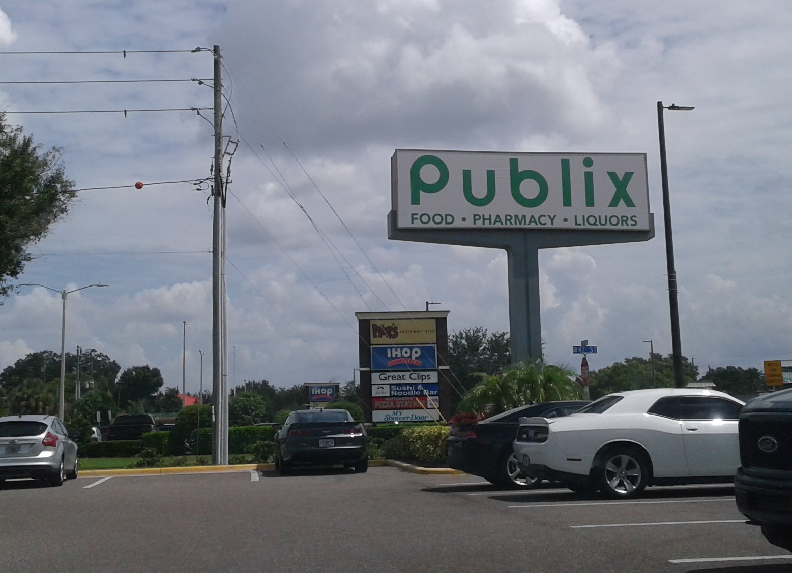
7580 49th Street North, Pinellas Park, FL - Park Plaza
| Today's post is a presentation of Pinellas County retail |
Moving approximately 1,000 feet west from where we left off last time, we find ourselves at the MD Oriental Supermarket of Pinellas Park. As I mentioned when we toured the Publixsons across the street, the building we see here was Publix's original home in Pinellas Park for just shy of 50 years. After all that time in the same building, you can imagine Publix was anxious to grow into something newer and a little more in line with the company's modern standards, so across the street Publix went when the opportunity arose. After getting situated in the former Albertsons in 2010, another Floridian supermarket chain tried to make a fresh start in this newly-vacated Publix box - Sweetbay Supermarket, who hoped to use this new location as a platform for the Sweetbay stores of the future. Sadly, as we all learned, the early 2010's were the beginning of the end for Sweetbay. Sweetbay's parent company, Delhaize America, announced their departure from Florida in 2013, selling all the remaining Sweetbay stores to BI-LO Holdings (the precursor to Southeastern Grocers, parent company of Winn-Dixie). The new Pinellas Park Sweetbay barely had the time to prove itself before it began its closing sale, ending up as one of the stores closed outright by Delhaize in early 2013 just before the sale to BI-LO Holdings. As we'll see in a little bit, Sweetbay's legacy somewhat lives on in MD Oriental Supermarket, but before we get to the what is, let's spend a little time learning about the what was, going back to the beginning with the original tenant in this space, Publix store #81:
 |
| Photo courtesy of ferrett111 on flickr |
I happened to come across a few photos of Publix #81 during its final years on flickr, thanks to photographers ferret111, Otherstream, and cereal.box.top who will be giving us a quick glimpse at what this old Publix was like. Originally opening on August 2, 1962 as a Wing Store, Publix was the grocery anchor to Park Plaza, one of the first major shopping centers to be built in Pinellas Park, a growing northern suburb of St. Petersburg. Woolworth, W.T. Grant, and Eckerd rounded up the remaining anchor tenants in the plaza, a healthy mix of stores for the early 1960's. In the late 1980's, the original Wing Store was starting to become a bit small and dated, so Publix expanded the store to the left, nearly doubling it in size. That late 1980's remodel was when the facade was reconfigured into what we see in the photo above, with its single vestibule that most late 1980's newbuild Publix stores would receive. That 1980's remodel was also when this store received a set of tile murals too:
 |
| Photo courtesy of ferrett111 on flickr |
To the left of the vestibule was this massive tile mural of the typical cornucopia and wine scene, one of Pati Mills' more standardized mural designs for Publix. The cornucopia and wine murals would also date this store's expansion more toward the mid-1980's than late-1980's, as Pati Mills began to choose more region-specific mural designs for her artwork toward the end of the decade.
 |
| Photo courtesy of ferrett111 on flickr |
Off on the right side of the exterior was this smaller tile mural, featuring more wine and a bowl of fruit. Sadly, both tile murals did not survive the conversion of this building into a Sweetbay, so thankfully ferret111 thought to get a photo of these before Sweetbay ripped them out.
 |
| Photo courtesy of Otherstream on flickr |
The 1980's expansion was the last intensive remodel this store received, with all later remodels being much cheaper decor swaps. I'd have to imagine this store was remodeled to Wavy Pastel in the early-mid 1990's, with this store receiving one final remodel in the early 2000's to give this store Classy Market 1.0:
 |
| Photo courtesy of cereal.box.top on flickr, and located by GeorgiaPubDude |
Within the depths of the internet, a few interior photos of old store #81 exist, this first one giving us a look across the store's front end. I'd have to assume that the customer service desk was located in the corner behind me like a typical early 1980's Publix, with the above photo taken from the service desk looking out toward the check lanes. Beyond the check lanes we see a wine alcove, although it's hard to tell what else was over there along the left wall (with that part of the store being the 1980's addition space).
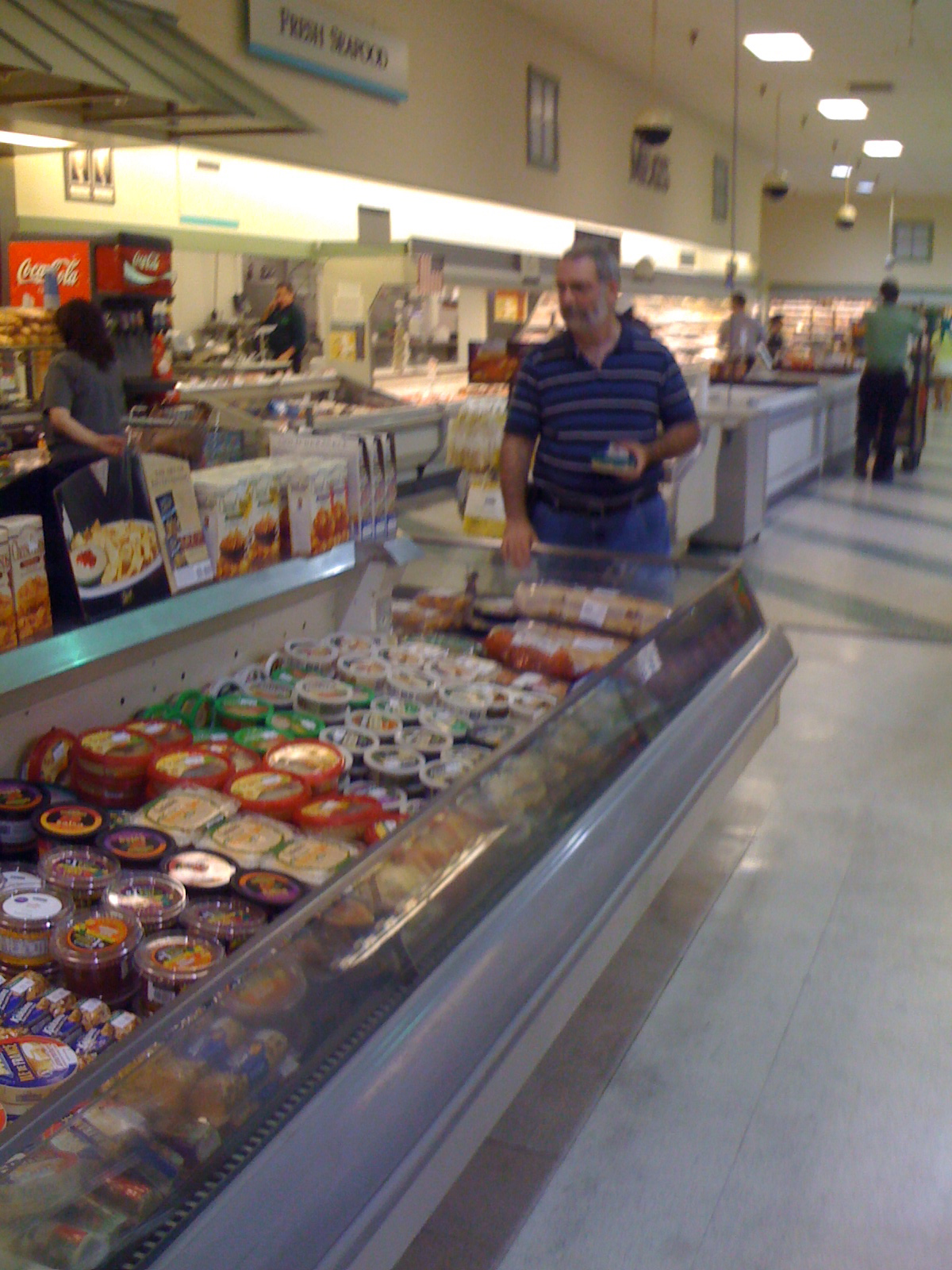
Zipping along in our office chair to the back of the store, this next photo was the only other interior photo I could find showing off the store's Classy Market 1.0 decor. Above, we see the store's back wall in the meat and seafood department. That photo was taken in the store's expansion space, as we can see the transition between the expansion's while floor tile and the original striped Wing Store terrazzo. This being an expansion store, I'm not really sure how the layout of this building was set up, as Publix expansions would lead to some unorthodox layouts at times. Meat and Seafood was in its usual spot on the back wall, and I'm thinking the expansion could have looked similar to this one, as Publix probably rebuilt all the service departments in the new expansion area for a grand aisle down the left side of the store.
While it might not show the walls, here's a look at #81's floor, where we can see the store's original 1962 terrazzo floor, still looking good in the late 2000's. Much like the tile mural, Sweetbay didn't want 50-year-old terrazzo in their new store, however unlike the murals, I'd bet you that original terrazzo is still there underneath the faux-concrete linoleum Sweetbay installed. In addition to the floor covering, GeorgiaPubDude also found this photo looking into #81's bathroom, showcasing the old wall tile pattern too.
 |
| Photo courtesy of Otherstream on flickr |
Zipping along in our office chair to the back of the store, this next photo was the only other interior photo I could find showing off the store's Classy Market 1.0 decor. Above, we see the store's back wall in the meat and seafood department. That photo was taken in the store's expansion space, as we can see the transition between the expansion's while floor tile and the original striped Wing Store terrazzo. This being an expansion store, I'm not really sure how the layout of this building was set up, as Publix expansions would lead to some unorthodox layouts at times. Meat and Seafood was in its usual spot on the back wall, and I'm thinking the expansion could have looked similar to this one, as Publix probably rebuilt all the service departments in the new expansion area for a grand aisle down the left side of the store.
 |
| Photo courtesy of Otherstream on flickr |
While it might not show the walls, here's a look at #81's floor, where we can see the store's original 1962 terrazzo floor, still looking good in the late 2000's. Much like the tile mural, Sweetbay didn't want 50-year-old terrazzo in their new store, however unlike the murals, I'd bet you that original terrazzo is still there underneath the faux-concrete linoleum Sweetbay installed. In addition to the floor covering, GeorgiaPubDude also found this photo looking into #81's bathroom, showcasing the old wall tile pattern too.
 |
| Photo courtesy of Tamara S. on foursquare |
Following Publix's move across the street, Sweetbay wasted no time and swiftly began remodeling this building into their new prototype, with the announcement of Sweetbay's arrival happening only 3 months after Publix's move. The new Pinellas Park Sweetbay was one of three new Sweetbay prototypes opened in a former Publix shell, joining stores in Cape Coral and Palm Harbor. Interestingly, the old Publix buildings Sweetbay took over in Cape Coral and Palm Harbor were also buildings left behind when Publix relocated to a former Albertsons nearby, so I don't know if this was a package deal of Publix leases Sweetbay bought, of if it was just a coincidence at a time when Sweetbay was looking for the opportunity to expand and try out their new prototype.
 |
| Photo courtesy of Amber L. on foursquare |
The new Pinellas Park Sweetbay opened in early 2011, interestingly, as Pinellas Park's first and only Sweetbay store. Unless Kash n' Karry had a really old store in Pinellas Park many years ago, the 2011 opening of this store marked the first time Pinellas Park ever had a presence from either brand, which is interesting since Pinellas County was a good market for Kash n' Karry and Sweetbay, and Pinellas Park isn't one of the county's tinier towns either, with a population of over 50,000. Locals were quite excited for having a new grocery option in town, and Sweetbay seemed pretty eager to show off their new prototype too. Sweetbay gutted and rebuilt the old Publix, the new store opening with a new floorplan and the super rare Sweetbay 2.0 decor. We got a nice look at the Sweetbay 2.0 decor in the chain's very last newbuild store in The Villages a while back, and the decor in here was exactly the same. Only Sweetbay's last 4 new stores to open got the Sweetbay 2.0 decor, along with two additional remodels from the early 2010's, bringing Sweetbay 2.0's total store count to 6 of the chain's 105 stores that operated before Delahize began to wind down operations in 2013. I really liked the aesthetic of Sweetbay 2.0 and where Delhaize was trying to go with the chain, and it's sad the reinvigorated Sweetbay design barely went anywhere.

And speaking of stores that barely went anywhere, Pinellas Park's Sweetbay was one of them. After only 2 years in business, Delhaize included this store as one of 33 that would close by February 2013, a closure wave that occurred only a month before Delhaize announced that the remaining 72 Sweetbay stores would be sold to BI-LO Holdings. Come early 2013, this building was vacant again. The building would remain empty for another 2 years, before local Asian grocery chain MD Oriental Markets announced this former Sweetbay would become the chain's 3rd (and largest) store in 2015.

This new store was a big step for the MD Oriental chain, as the company's first two locations (both in Tampa) were about half the size of this one. MD Oriental took the bones of the old Sweetbay and added their own touches to the place, with a little sprinkling of Sweetbay remnants for good measure. MD Oriental's new store has proven to be a success, and is currently the largest Oriental grocer in Pinellas County. MD Oriental is constantly raved about by locals online too, especially for its selection of meats and hot foods. Sweetbay remnants non-withstanding, I agree with the locals that this was a fun store to walk around, as the selection of Asian brands was really extensive, and I even came home with a few different snacks to try.

From the outside, we see that MD Oriental didn't do anything to the store's exterior since moving in besides swapping out the signs - even the building's paint scheme is original to Sweetbay. Sweetbay left the basic exterior structure from Publix behind (if you compare the before and after photos it's pretty obvious), but reconfigured the entryway, added a liquor store, and dressed up the facade to look more like the typical Sweetbay design.

Publix's 1980's vestibule structure was kept by Sweetbay, although Sweetbay moved the entrance to a single set of sliding doors along the front wall, changing the design from Publix's set of doors on each side of the vestibule. The vestibule was converted into a large interior cart storage area...

…which to this day is still filled with Sweetbay's carts and signage! With that sign still prominently on the wall, hopefully MD Oriental is still upholding Sweetbay's low price promise. While MD Oriental did swap out Sweetbay's decor for a new one, MD Oriental didn't remove every last trace of Sweetbay from this building, leaving behind some interesting remnants like this sign (which was printed with the Sweetbay 2.0 font scheme). The low price promise sign is hanging where Publix's right side doors would have been, and is also our sign of good things to come...
That being said, let's head into the main store to see a little more:

Stepping inside, you encounter the check lanes. The entrance spills out into the "grand aisle" of service departments, which line the left side of the building. The natural layout of this store takes you in a clockwise rotation, beginning with the grand aisle and ending in produce. However, I ended up walking around this store beginning in produce and ending in the "grand aisle", so we'll be touring this store backwards from how MD Oriental and Sweetbay intended. However, the way we'll be walking through this store was the intended path of how Publix had this place set up, so I guess I'm just so used to Publix's right-aligned layouts I subconsciously began my tour over here!
The interior layout we'll be seeing in here is basically the same as how Sweetbay left the building, with only a few minor changes. Sweetbay's layout in this store was a bit unorthodox compared to similar Sweetbay newbuilds of the time, probably one of the constraints of trying to convert an expanded 1960's-era Publix building. This store is almost a mirror of Sweetbay's usual layout, however produce was the only department that wasn't mirrored with everything else - it stayed in the same spot in the front right corner where it would have always been, with all the other service departments flipped to the left side of the building.

MD Oriental swapped out the wall decor from Sweetbay 2.0 to a nicely designed custom package of their own. The main department names are in in Chinese, with English subtitles and complimentary stock photos. Those wooden trellis features hanging from the ceiling are a leftover element from Sweetbay 2.0.

Not only were the trellises a leftover from Sweetbay, but the fixtures were too. I figured the fixtures were left over after I began seeing examples like this throughout the store:

WOW! - Sweetbay's promotional signage was still being used by MD Oriental! It's one thing walking into an independent supermarket and seeing reused fixtures, as those get left behind all the time, but seeing the old promo signs was quite interesting! A lot of these signs were quite worn from being used again and again since being made back in in the 2012-2013 era, but if you were left behind perfectly good promo signs from the former tenant, why not make the most of the situation and reuse them?

We'll be seeing a few more examples of surviving Sweetbay signage like that before the end of this tour, but for now, let's keep the pace and move along to the next department: frozen foods.

The right-most aisle and a half of this store is home to frozen foods, with frozen foods occupying unnumbered aisles 13 and 12.

A little bit of frozen foods spills out onto the back wall, with the back wall transitioning into frozen and pre-packaged meats and seafood following that cut-through for the stockroom door.

After frozen foods is this double-wise aisle, numbered as aisle 11, with the remaining frozen foods coolers on the other side of those pallets in what should be aisle 12. The pallets in the middle of this aisle were assorted promotional and sale items, with bulk bags of rice completing our selection to my right.

Moving into more of the grocery aisles, we find ourselves in the dry grocery section, with these next few aisles home to assorted snack foods, candy, noodles, spices, and so on. MD Oriental places overstock goods on the top shelves, making these aisles feel taller than they really are.

I like trying different snack foods, so I spent a little bit of time roaming these aisle for some new things to try. One of the more interesting flavors of potato chips I found was this one - Hot and Sour Lemon Braised Chicken Feet. While the chip flavoring probably didn't contain any actual chicken feet (probably just some kind of chicken flavoring), I wasn't feeling super adventurous this day, so I opted for a seasoned steak flavored potato chip instead to bring home with me (which was pretty good - Lays should bring that flavor to the US).

The aisle markers in this store were a really neat custom design with two staggered panels, the upper panel featuring product categories in English, with the same (I'd imagine) categories in Chinese on the lower panel. The number on the bottom of the aisle marker is accompanied with its Chinese equivalent as well.

In the middle of one of the grocery aisles was another display table with its original promo signage, but leftover promo signage wasn't just limited to display tables...

…this back endcap still had all of its original signage from Sweetbay in-tact too! While you don't see the color purple in a lot of supermarket decor, Delhaize used it quite a bit in Kash n' Karry's final decor package from the late 1990's and early 2000's, as well as in Sweetbay. Like green is to Publix, Sweetbay adopted purple as their corporate color, and as you've seen with the old promo signage, Sweetbay liked to use purple wherever they could!

Like we saw in that interior photo from Publix, the back wall was home to their meat and seafood coolers, and that was carried over into Sweetbay and MD Oriental too. Publix's meat and seafood service counter was roughly located in the area to my left, with Sweetbay moving the service counter closer to the back left corner of the store.

Aisle 2 was home to a really broad assortment of general merchandise - I see some stools, cleaning supplies, and dishes, among other items, with aisle 3 (which I didn't get a photo of) containing assorted kitchen tools and knickknacks as well.

Getting closer to the back left corner, the back wall opens into an alcove, where we find additional meat coolers and the meat service counter itself.

MD Oriental's signage graces the upper portion of the wall in the meat alcove, with Sweetbay's old category signs lining the top of the cooler.

Sweetbay's old meat and seafood service counter was walled off with additional cases for packaged meats, with MD Oriental converting the former deli space next door into their new meat and seafood service counter. While the signage and paint is new, the curved overhang and design of the old counter is leftover from the Sweetbay 2.0 design. That pattern on the wall behind the meat sign almost looks original too, as it's the same shade of red that Sweetbay used, but Sweetbay would have had the wall painted plain red behind the sign (like you see at that link), and not with the sunshine pattern there now.

Here's another look at the old meat and seafood service counter as seen from aisle 1, a short aisle just off the grand aisle that was home to beer and wine.

Moving into the back left corner of the building, we find MD Oriental's seafood service counter in Sweetbay's former deli department. The butcher and fishmonger station was in the corner where an abundance of fresh fish lying on ice, with the even fresher fish swimming around in those tanks to my left.

From the front of the building, here's an overview of the store's grand aisle. While the decor was swapped out, the bones of Sweetbay 2.0 are still very prominent in the design of these departments. We've already discussed the meat and seafood departments and the former deli, so next up in the middle of the left side wall is the bakery, which is also located in Sweetbay's former bakery space.

MD Oriental has a really big baked goods operation here, with a full in-store bakery for cakes as well as Asian pastries and breads. While I was here, I bought a durian roll, which was a sweet roll with a durian cream filling. I'd never had durian before, and I have to say, even though durian gets a bad rap for its stench, it tastes much better than it smells. One of these days I'll have to try plain durian to compare.

One of this store's biggest claims to fame is its hot foods bar, which locals say has some of the best Asian food in the area according to reviews. Had I not visited this store just after it opened for the day when there was nothing out yet, I would have tried some, but I guess I'll have to find an excuse to come back to Pinellas Park and try it another time. The hot foods bar is located in Sweetbay's old pharmacy space, giving the hot foods a prominent location near the front of the store. Sweetbay's old liquor store was that windowed area next to the hot foods bar. MD Oriental ripped down the liquor wall and converted the liquor store into a dining area, a great reuse for that otherwise dead space too.

Here's another look at the hot foods bar and the dining area, as seen from the front end. The former liquor store the dining area occupies was installed new by Sweetbay, sacrificing a small portion of Publix's former salesfloor to install that.

Our final interior photo looks across the store's front end, which consists of 5 check lanes. Even this early in the morning, the store was still attracting quite the crowd, so I'm sure this place gets pretty busy in the afternoons.

Back outside, here's a look at the former Sweetbay liquor store space from the front walkway. The Liquor store is located where the giant cornucopia mural was that we saw at the beginning of this post, the mural sacrificed to carve out the windows and doors for the new liquor store. When MD Oriental converted the liquor store into a dining area, they closed off the exterior entrance, covering the door with some decals of food photos, with similar decals placed on the windows above. Straight ahead of me, that window on the side of the vestibule would have been the left side doors into Publix.

While this seems like a strangely framed photo of the exterior to end this post with, there was a reason for the strange angle - I didn't take this photo to capture the facade, I took it to capture that cart return! The advertisement over the cart return is another remnant from Sweetbay, reminding us that our cart still has work to do, so please return it here! MD Oriental slapped a sticker over Sweetbay's logo, but otherwise left another fairly obvious Sweetbay remnant out there in the wild for us to see.
While we may have been lacking on Publix remnants at this store, I did manage to scrape up a few "sweet" relics in relation to Sweetbay's short tenure in this building. With these Sweetbay 2.0 prototypes being so rare, it was nice to take another look at what one of these stores was like, and I may have another Sweetbay 2.0 related surprise up my sleeve as well for another time. Not only Sweetbay 2.0, but I have some other interesting Kash n' Karry and Sweetbay-related content in my archives for another time as well, and while we'll see more of those two fallen Floridian supermarket chains in the future, it's back to my screenname-sake chain next time, with more former Floridian Albertsons fun coming at you in two weeks.
I'll see everybody then, and until the next post,
The Albertsons Florida Blogger


