

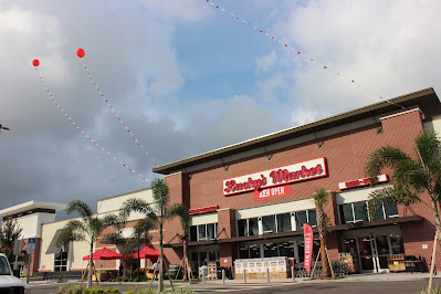
Lucky's Market #32 / Hitchcock's Green Market
6765 22nd Avenue North, St. Petersburg, FL - Tyrone Square Mall
So what happens when your luck runs out twice? You get Hitchcock's Green Market, that's what. Picking up not too far from where we left off last time, we find ourselves at St. Petersburg's Tyrone Square Mall for the latest installment in my "Life After Lucky's" series. Unfortunately, unlike most of the other installments we've seen thus far, today's doesn't have a happy ending. Hitchcock's Green Market, the store we'll be touring today, was a complete flop, lasting only two years as part of an odd foray into the natural foods segment by a chain that's primarily concentrated in small towns in North Central Florida. That being said, this was one of the stranger Lucky's conversions I've explored over the last few years, so let's dive into this supermarket anomaly with a little bit of background on this site, before we jump into the details of the strange Lucky's knockoff standing before us today:
 |
| Photo courtesy of Lucky's Market |
The plot of land on which Hitchcock's Green Market stood began its life in retail back in 1968, when Sears built a large freestanding store at this site. Only 4 years after the Sears store opened its doors, the Edward J. DeBartolo Corporation (the developer behind many of Florida's enclosed malls) constructed Tyrone Square Mall, a new enclosed shopping center that would be attached to the existing Sears building. In addition to the existing Sears, the new mall would feature three additional anchors including JCPenney, Maas Brothers, and Robinsons of Florida. Sears remained at Tyrone Square until it was included in one of Sears Holding's famous closing rounds of the 2010's, the round in question occurring in late 2016. The Tyrone Square Sears officially closed for good in January 2017, with the mall's current owners, Simon Property Group, already having redevelopment plans in place to follow the closure of Sears. To replace Sears, the old department store building would be demolished and replaced with 4 new junior anchors, including Dick's Sporting Goods, Petsmart, Five Below, and the Tampa Bay area's very first Lucky's Market. Lucky's opened in St. Petersburg in June 2018 to a huge buzz, like most of Lucky's new store openings in Florida. The photo above (which I took from the store's old Google Maps photos page) shows the new St. Petersburg Lucky's Market shortly after it opened, the seemingly indestructible leader in natural food sales in Florida ready to grow, grow, grow...

…until, well, you know what happened. Come January 2020, the seemingly unstoppable Lucky's was brought to its knees after its primary investor, Kroger, scrapped its involvement in the company. The pulling of Kroger's investment was the end of Lucky's Market as we knew it, the company financially crippled, forcing Lucky's to close most of its stores and declare bankruptcy. The St. Petersburg Lucky's Market closed alongside almost all of the other Floridian Lucky's Market stores in February 2020, bringing to an end the story of one of the craziest supermarket expansion efforts Florida had seen in years.

At bankruptcy auction, the former St. Petersburg Lucky's Market store was purchased by a surprising buyer - Alachua, FL based Hitchcock's Markets. I have a post coming up in a few months where we'll go into much more detail about Hitchcock's Markets and its history, but in short, Hitchcock's is currently a chain of 11 stores primarily clustered around the Gainesville area (with one odd outlier in Indiantown, FL, a small town west of Stuart in Martin County along Florida's Atlantic Coast). Hitchcock's is a chain that has always focused on operating stores in smaller towns without a lot of other grocery options, hence the chain's longevity and relative stability in our very Publix-centric grocery scene. That being the case, I have no idea why Hitchcock's decided to buy this former Lucky's in the middle of Florida's 5th largest city, which Publix rules hands-down. Hitchcock's did go through an ownership change in 2019, so my guess is the new ownership (which was trying to expand the chain at the time) wanted to try something new and see if Hitchcock's could find a system that appealed to city shoppers via Lucky's format. Well, sadly, they didn't.

According to a really good article from the Tampa Bay Times about the new Hitchcock's Green Market store, one of the things that appealed to Hitchcock's when looking through the locations Lucky's was shedding was that "the St. Pete Lucky’s performed well sales wise, which is what attracted Hitchcock’s to bid on it." While the store may have done well for Lucky's, it must have begun to slip under Hitchcock's. Hitchcock's opened this store on July 10, 2020 to a crowd of 300 waiting for the doors to open. Hitchcock's tried to make the most of their new store by copying as much as they could from Lucky's - offering similar products, similar services (like the cafe, sushi, and sip and stroll), and even a similar atmosphere and decor. Stepping inside, you were essentially walking into a low-budget version of Lucky's. It was an interesting attempt, I'll give Hitchcock's that, but running a natural foods store in a big city was just a bit of a stretch for this small-town grocery chain. This small-town chain got chewed up by the big city, and Hitchcock's learned the hard way what happens when you play with the big boys in Floridian grocery.

Hitchcock's Green Market closed in June 2022, just shy of its 2nd anniversary. An official reason for the store's closure wasn't given, although from what I saw here during my visit (which happened about halfway through this store's life), the store didn't seem very busy, and the product selection didn't seem all that great (especially in the fresh departments, which a lot of space in this store was dedicated to). Something about the store seemed very off when I was here, like the store was struggling. I even thought to myself I was surprised this place was still in business while I was here, with the sparseness of the products and dead vibe I was getting.

The old rusty carts weren't helping set the scene much as I was walking in, and definitely went along with the small-town low-budget independent store feel over the big city natural foods store vibe.

Stepping inside, it's not the strong beverage you chose for your sip and stroll playing with your mind, you are seeing that right - Lucky's lives! Turning to the right after stepping inside, we see the cafe, which is practically untouched from how Lucky's left it. The menu board appears to be the only thing over here Hitchcock's modified, otherwise all the remaining signage and furniture are direct holdovers from Lucky's. The large table in the center of the photo was custom designed for this store by Lucky's, and had a special St. Petersburg theme to it. Every Lucky's store got one of these themed tables for its cafe, a staple of the cafe decor. That being said, I of course forgot to walk over and get a better picture of the table. I didn't even think about the table when I was here, actually, as looking at this photo while writing this is what made me remember it was there. If you zoom in on the above photo, it appears the picture in the middle of the table was of the downtown skyline, with "St. Petersburg, FL" printed in the red rectangles on each end. Even though I slacked a bit here, I did get a good photo of the table at the former Winter Park Lucky's if you want to see a better example.

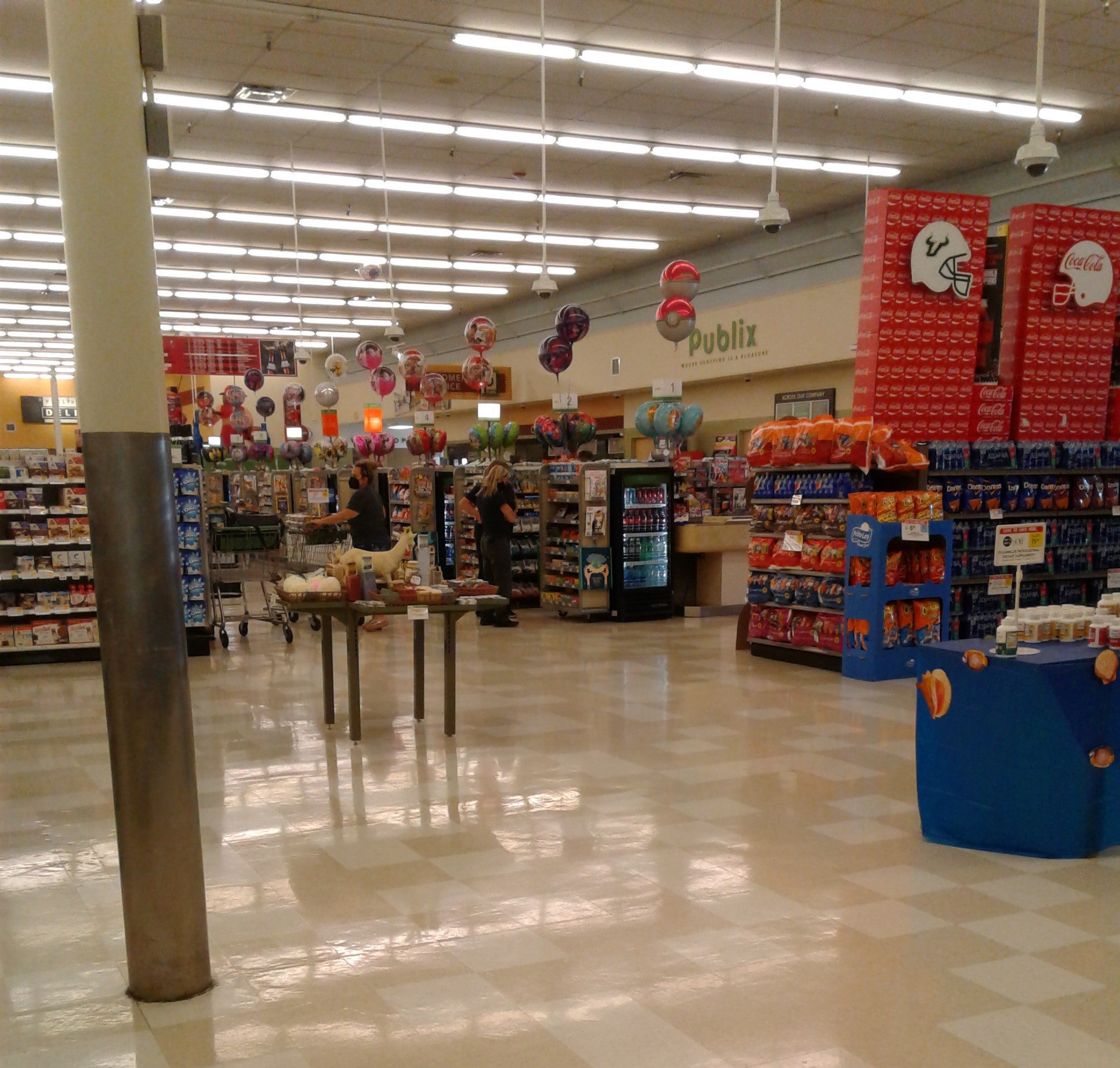
Turning around from the cafe, we walk past the check lanes for a look at the produce department, where we well begin our tour. Unlike the cafe we just saw, the produce department, while it does reuse most everything from Lucky's fixture-wise, actually has a new wall sign. When Lucky's was here, that faux-wood (at least I think it's faux-wood) panel on the wall would have contained Lucky's famous "Food Glorious Food" sign, which usually substituted for an official produce sign. While Hitchcock's did reuse a lot of Lucky's old signage, they also added some new signs of their own that heavily mimicked Lucky's old decor, like we see here in produce. If you didn't know any better you'd probably think this produce sign was carried over from Lucky's, as Hitchcock's did a really good job matching Lucky's style with all the signs in the store.

At the front of the produce department was the juice bar. Neither Lucky's nor Hitchcock's ever used the juice bar as a fully staffed counter where one could order juice drinks (like Earth Fare did), as it instead served as a station where an employee would prepare the various fresh squeezed orange juices, infused fruit waters, etc. sold in the produce department every day. I think Hitchcock's only used this station to make fresh-squeezed citrus juices (orange, grapefruit) from what I saw, which were kept in ice-filled containers in front of the counter.

Hitchcock's reuse of all the fixtures and much of the decor helped speed up this store's reopening, with the gap between Hitchcock's purchase of the store in March 2020 and its reopening the following July being 4 months. Even with that fast turnaround, Hitchcock's Green Market ended up being the second re-tenanted Lucky's to open, missing out on the honor of being first by Seabra Foods in Orlando, which held its grand opening one day prior to Hitchcock's Green Market on July 9, 2020.

Hitchcock's had a really nice produce department in this store, probably one of the strongest departments they had in here. From reading other reviews online, it seems like this store also had a decent following for its meats too. I didn't look too closely at the meats while I was here (as buying meat three hours away from home doesn't do me any good), but from what I read Hitchcock's carried a lot of cuts that were hard to find elsewhere in the area.

That sign in the corner looks like something straight out of Lucky's, but yet again, that's another Hitchcock's knockoff. While Hitchcock's older stores are pretty blah when it comes to decor, the current owners did a really good job with whoever designed the decor for the company's newer stores. I visited another Hitchcock's that opened around the same time as this store, and it had a really neat, professionally designed custom decor package that intertwined a lot of local color into it. We'll tour that store eventually, but we need to visit one of Hitchcock's legacy stores first to get the full picture of this chain.

While not as prolific here, Hitchcock's did try to intertwine some local flare into the signage here. Much like the last sign we saw, another Florida reference was slipped into the main produce sign, and what better way to do so than with a giant orange? Oranges are the state fruit of Florida after all, with orange juice being our official beverage and the orange blossom being our state flower. We love oranges so much here, we even put them on our license plates too!

Behind these carts of freight someone left out, we can see down the left side wall of the store, looking toward frozen foods (where we'll be heading shortly).
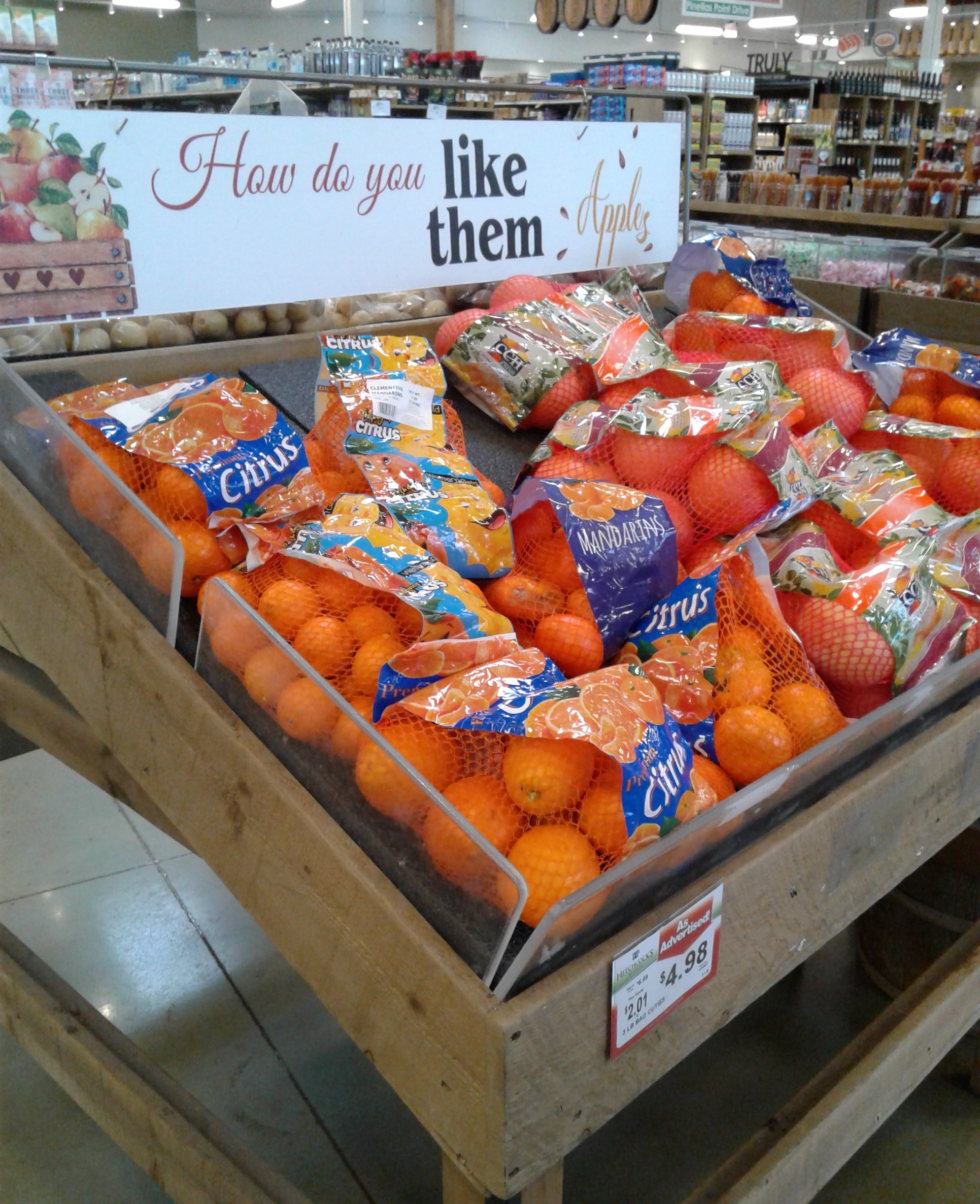
How do you like them apples? I don't know, these apples taste a lot like oranges to me! (And people say there's no comparing the two!) Oh, those kooky Floridians and their oranges...
Anyway, another way Hitchcock's tried to copy Lucky's vibe was with these quirky signs containing various jokes and puns, another Lucky's staple (see here and here for some examples). There were a number of these signs throughout the produce department, a few more of which can be seen in the next photo (such as "You look radish-ing today", the rather clever "Grape deals before your berry eyes", the somewhat lackluster "You used to call me on my celery phone", and the always classic "It's party thyme.")

If Hitchcock's carried some of these punny signs over to more of their stores, they could have given Ollie's a run for their money!

Including the lone aisle of frozen foods, this store had 7 aisles for groceries, the same number of aisles Lucky's had. Even though this store was called "Hitchcock's Green Market", most of the dry grocery selection was the usual grocery store fare, skewing more heavily toward traditional supermarket brands with a few natural/organic options thrown in. Like Lucky's, the service and fresh departments are what most of the emphasis was on at Hitchcock's Green Market, which had more full-service features than just about all of Hitchcock's other stores (most of which lack all service departments outside of a tiny deli and meat counter). We'll see more of the grocery aisles shortly, but first, frozen foods:

A lone aisle of frozen foods occupies the first grocery aisle, providing shoppers with a condensed variety of frozen staples.

What's interesting about the Frozen Foods sign on the wall is that the sign itself appears to be original to Lucky's, but Hitchcock's put a new design on the letters to make them look like ice cubes (instead of the original plain red color from Lucky's). Red is too warm of a color for a frozen foods department, symbolizing fire and all that, so I guess ice makes more sense here!

Turning the corner out of Frozen Foods, we find dairy located along the back wall behind the grocery aisles. While convincing, yet again, we find the dairy signage was installed by Hitchcock's, and not the original dairy signage installed by Lucky's. I actually think Hitchcock's dairy sign looks better back here than Lucky's did, as it takes up more of the blank wall space than the original did.

Turning the corner into aisle 2, we find our usual dry grocery stuff (canned tuna, pickles, etc., etc.)

From produce, here's a look across the front of the store, looking back toward where we entered.

The aisle markers seen in here are the standard issue ones for newer Hitchcock's stores, and as a fun local touch, they include the names of local roads on the bottom (something supermarkets seem to be doing a lot these days, especially smaller, locally-owned stores - although Safeway's three Florida stores had the same feature).

Hitchcock's primarily carries Supervalu's Essential Everyday brand as their house brand, as Hitchcock's is a longtime Supervalu partner (with some of the chain's older stores being branded as "Hitchcock's Supervalu Foods"). Interestingly, Hitchcock's does carry their own brand of jams, jellies, and other jarred fruit, pictured here, which I found intriguing. I know there are a lot of small locally-owned manufacturers of jams and jellies out there, so Hitchcock's probably partnered with one of them to make these products, adding to the locally-made theme Lucky's was also known for.

Pasadena Avenue (aka aisle 6) brings us to the small selection of cleaners, paper products, and other non-food items sold by Hitchcock's Green Market.

Bulk foods occupy the front of the store between produce and the check lanes. Hitchcock's kept the original footprint of Lucky's bulk department, which was quite large (about 3 full aisles worth), and I'm quite impressed a small-budget store that doesn't sell bulk foods at any of its other locations managed to keep this department going as-is for so long. However, while the original size of the bulk department was kept, its original sign from Lucky's was not.

The last signed grocery aisle, Pinellas Point Drive aisle 7, was home to the classic combo of chips and beer. While beer was located here in the aisle, if we turn the corner...

…the beer sign magically transforms into one for the wine department! How neat is that? (What this store lacked product pizazz, it made up for with the decor - Lucky's old beer and wine sign certainly wasn't as interesting as this one!). The display of chips blocks it, but wine lines the side of the last (unnumbered) grocery aisle, with the meat coolers between that and the service counters.

I like pork butts and I cannot lie, these punny signs are clever you can't deny! (I think you people dread the thought of me walking into a store with too many puns on the wall by now, and I've never even posted about an Ollie's yet!) Now that both you, the reader, and myself have that song stuck in our heads now, we'll turn our attention to the sushi bar behind the aforementioned meat cooler. Originally, that counter was co-branded as the sushi and ramen bar when Lucky's was here, however Hitchcock's scaled that back just a bit, converting the island into solely a sushi counter. Hitchcock's swapped out the signing due to the change, but they did leave behind that Kroger-esque wooden "basket sign" decoration piece from Lucky's (so maybe Kroger did have some subtle influences on Lucky's decor?).
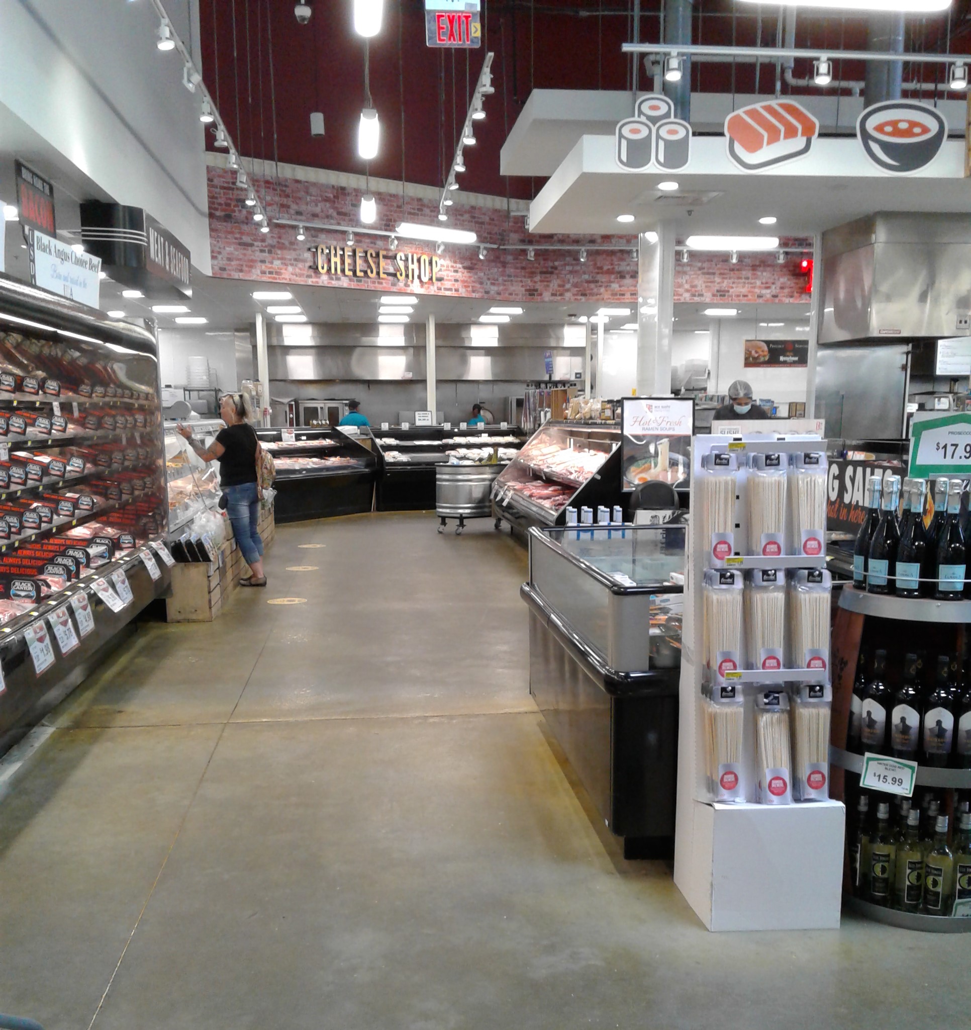
Behind the sushi island is the back wall, home to more meat coolers, with the service meat and seafood counter straight ahead before the Cheese Shop.

Since we saw the side of it before, here's a look at the front of the sushi counter, with its accompanying sign. In front of the counter was the olive bar (to my left) and a partially empty salad bar (to my right), which were a bit sad looking when I was here. The counters still have Lucky's original graphics on them, with Hitchcock's stickers covering the old Lucky's logos on both counters.

The "Meat & Seafood", "Cheese Shop", and "The Kitchen" signs are all original signs from Lucky's. While prepared foods were supposed to be a large aspect of this store, it was this part of the store that felt the most lackluster to me. As I mentioned before, Hitchcock's doesn't do a lot of prepared foods in their other stores, as slower, small-scale, small-town stores typically don't do the volume to justify a massive prepared food experience like we see here. Hitchcock's was a bit out of their comfort zone with this area, so a lot of what we see here was very experimental for the chain, and when I was here, it was pretty clear they were struggling with all this.

The Kitchen, which also served as the store's deli counter, can be seen up close here. In addition to the traditional deli cold cuts, Hitchcock's was also running a sandwich counter and a pizza kitchen here. However, I didn't see either of the latter two for sale when I was here, as I would have tried a slice of Hitchcock's pizza just to see if it tasted just like Lucky's pizza did (as Lucky's made some of the best pizzas I've ever had). Hitchcock's had a lot of deli salads to choose from though, with a tiny hot food bar as well.

From the front of The Kitchen, here's a look back toward the grocery aisles. If I remember right, that lone barbecue grill was part of a raffle the store was holding, with some random tiki torches next to it for a little backyard inspiration.

The very corner of the kitchen was home to the bakery, with the apothecary in the alcove next to it.

Hitchcock's replaced Lucky's original bakery sign with one replicated in the same vein, with the bakery displays lining the main aisle in front of the apothecary alcove.
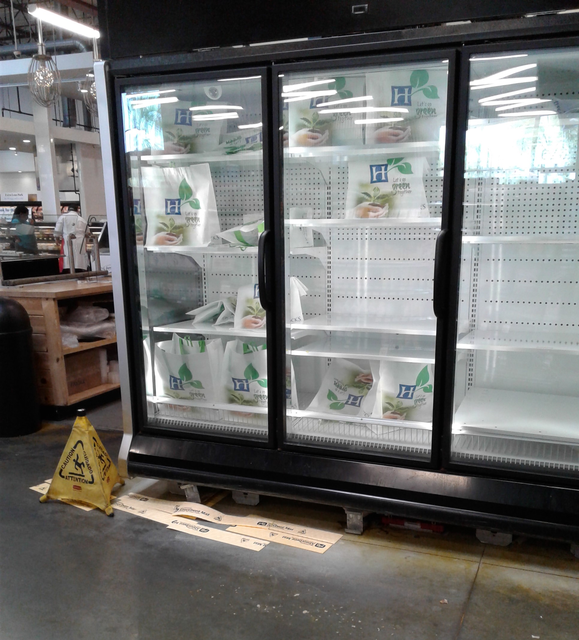
While I started this tour over in produce and grocery, the better put-together parts of the store, my actual visit here began over in prepared foods, which was how I began to piece together this store was a bit sad around the edges. An empty, leaking cooler partially stuffed with canvas bags to make it look somewhat full wasn't the best first impression for me, and must have been a sign of this store's eventual fate less than a year after my visit.

Also shoved in this odd corner between the bakery and the apothecary was this small cooler. Hitchcock's wasn't using this cooler (the old mochi ice cream cooler) for anything, so it was just left here to fill up some empty space (with Lucky's logo still on it - my main reason for taking a picture of it).

As you probably expect, Hitchcock's apothecary department was a bit lackluster. While there were some fancy soaps for sale on that display table, most of this area was dedicated to regular health and beauty items, with some coolers of chilled drinks filling space along the back wall under the department sign ("Dedicated to your health and happiness" - I guess that means I should grab a Diet Coke from the cooler instead!) The Apothecary sign is a carryover from Lucky's, with Hitchcock's just putting a sticker over the spot where Lucky's logo used to be.

Returning to the front of the store, we can see a few of the check lanes come into view. The check stands themselves are a holdover from Lucky's, although the lane lights were installed new by Hitchcock's, as those are Hitchcock's standard issue lights used in their newer stores.

While I admire the attempt Hitchcock's made at trying to mimic Lucky's, I think this store was a bit too much to chew for Hitchcock's. That really came across in the prepared food and service departments, which certainly weren't running at full capacity, and made the store seem like it was much emptier than it should have been. Of all the former Lucky's stores I've been to, Hitchcock's Green Market was the best replication of Lucky's I've seen though. While Publix, Winn-Dixie, Seabra Foods, etc. all tried to copy some elements of Lucky's in their converted stores, Hitchcock's was the only chain I saw that tried to replicate the entire experience. With a little more money and experience maybe Hitchcock's could have made this store work, but in the end, I don't think this store was a good fit for the chain. However, I have to give honorable mention to the decor designer for this store, as the replication of Lucky's style was really good, and even better than Lucky's original decor in many places!

Back outside, here's a look from the front of Hitchcock's Green Market toward the mall entrance. The big glass entrance was added as part of the redevelopment of the Sears store that once stood here, as that would have been Sears' mall entrance back in the day. I didn't go inside Tyrone Square while I was here, but if you're curious to see what the inside is like, here's the mall's Google Maps photo album.

From what I can tell, the former Lucky's Market and Hitchcock's Green Market space is still sitting empty as of January 2023. Tyrone Square is a healthy mall, so there shouldn't be any issue in finding somebody interested in this space. Another supermarket to fill this void will probably be a bit of a stretch though, as all the big names are accounted for nearby (Publix, Winn-Dixie, and Aldi, and Sprouts is in the process of opening a new store up the road from here in the old Kmart building). However, the nearby Publix is a whole half-mile away from here, so I guess that could be just enough buffer room between stores for them, especially considering this scene across town!
As sad as it is to see Hitchcock's fail here, hopefully something new comes along to fill this space. I'm glad I was able to visit this store when I did, as this was probably the most interesting of the "Life after Lucky's" conversions I've visited. I still have more former Lucky's stores to share with all of you in the future too, but that will have to wait for now, as next time we're back with more Albertsons for your reading entertainment (no guarantee on less puns though!).
I'll see everyone in two weeks! So until the next post,
The Albertsons Florida Blogger


