

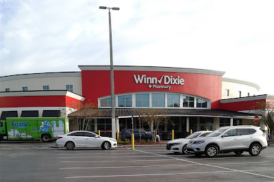
Kash n' Karry #1916 / Sweetbay Supermarket #1916 / Winn-Dixie #2503
27301 Wesley Chapel Boulevard, Wesley Chapel, FL - Town Centre at Wesley Chapel
Last time on AFB we saw what Winn-Dixie could do with an old Albertsons building, so today we're going to take a look at a different kind of Winn-Dixie conversion. Today's conversion will showcase a Winn-Dixie in an old Kash n' Karry/Sweetbay building, which in the grand scheme of things, isn't terribly uncommon, being that Winn-Dixie purchased Sweetbay's 72 remaining stores in 2013. Really, seeing a Winn-Dixie in an old Kash n' Karry/Sweetbay building is about as common as seeing a Publix in an old Albertsons, however, seeing a Publix in an old Kash n' Karry is just as rare as finding a Winn-Dixie in an old Albertsons! I guess in that way, everything evens out! Anyway, while we've seen "Sweet-Dixies" (as I like to call them) in the past, this particular location is quite special. The store we'll be touring today showcases a unique prototype designed by Kash n' Karry in the late 1990's, a design that's been dubbed "the round prototype". While Kash n' Karry managed to open 9 of these round prototype stores around Florida at the turn of the new millennium, the store we'll be touring today is the very last to retain its original unique round interior design. We'll more of the interior in just a moment, but first, here's a little background on this unusual supermarket layout:
 |
| A round prototype Kash n' Karry in Tampa (Bruce B. Downs?) - photo courtesy of the developer's website |
Ever since the company's leveraged buyout from Lucky Stores in 1988, Kash n' Karry had struggled financially. As a means to improve sales, Kash n' Karry tried various new store designs, many of which were quite futuristic for the time (like the early 1990's design you can see at that link). While those new stores were nice, Kash n' Karry was still crippled by debt, and was not able to compete effectively against rising star Publix, an established Winn-Dixie that was rapidly rolling out the Marketplace format, and Albertsons. In 1994, Kash n' Karry declared bankruptcy amidst all this pressure, although the company did attempt to restructure. However, two years later in 1996, Kash n' Karry was purchased by Food Lion as an attempt by Delhaize to prop up that company's struggling Florida division, hoping that the purchase of an existing Floridian chain would help give the company insight into how to run stores here. Delhaize rolled out a new modern prototype for Kash n' Karry following their purchase, however, Delhaize felt there was still room for improvement. Come 1999, the round prototype was born.
.jpg) |
| Front end of the Bruce B. Downs round prototype Kash n' Karry in Tampa |
The innovative new round design, as touted by Delhaize, was supposed to be a supermarket "experiment", attempting to "make efforts to appeal to bargain hunters" with the unusual new design. In addition to bargain hunters, the new design also had shoppers on a time crunch in mind. As such, the new round prototypes put the service departments in an island right inside the front door, so a hurried shopper on the way home from work could grab some dinner from the deli, be through the check lanes and out in a matter of minutes. Per Delhaize from that same article: "The round design is an attempt to create a seamless shopping experience in which departments flow into one another to help speed shoppers on their way, according to an architect who worked on the store. "The vocabulary of circular architecture, found in airports and train stations, is fast," said Juan Romero, president of Tampa-based Architecture Plus International, which assisted in designing the store". Traditional supermarket design usually tried to get shoppers to linger in the store so they buy more, or force shoppers to walk through a large chunk of the store to get to the service departments (such as putting the deli along the back wall). The round prototype was a huge diversion from that, and the layout really is like no other supermarket I've ever seen before.


.jpg)


The very first round prototype Kash n' Karry opened in Clermont in November 1999, with two more following suit in Punta Gorda and Tampa in early 2000. For Kash n' Karry's last few years before the transformation into Sweetbay, the round prototype was used alongside Delhaize's traditional design, the round stores being the "deluxe" option from what I can tell. The round format was officially retired in 2004 when the conversion to Sweetbay was announced, with new-build Sweetbay stores taking on a totally different design from anything built during the Kash n' Karry days. Since Kash n' Karry stuck with the round design for 5 years building a total of 9 of these stores, they must have had some success with the format, as if it was a total flop it probably would have been killed off after the first few were built. In addition to the 9 of these built by Kash n' Karry, Delhaize decided to build a prototype Food Lion in Jacksonville using the same round design in 2002, the only round prototype that was ever built for Food Lion or any of Delhaize's other brands. While Delhaize never fully adopted Kash n' Karry's round design for Food Lion beyond that one store, Food Lion did adopt a modified round design that was used for new Food Lion stores in the early 2000's (and used a decor that looked a lot like Publix's Classy Market 2.0).
.jpg)

Of the 9 of these round stores built by Kash n' Karry, 2 were closed outright in 2004 when the company pulled out of Eastern and Central Florida. The remaining 7 made it to the Sweetbay days, however 6 out of those 7 were closed outright by Sweetbay in a closure round in February 2013, shortly before the sale of the remaining stores to Winn-Dixie was announced. That meant Winn-Dixie would only inherit one of these unique stores, that being this location in Wesley Chapel. Outside of changes to the decor, the interior layout of this store is 100% original to Kash n' Karry, our very last look at what a round supermarket is all about.

Interestingly enough, Winn-Dixie actually operates out of 2 former round format Kash n' Karry buildings. However, that other location, located in Viera, Brevard County, came into Winn-Dixie's possession in a very roundabout way, and as such has been heavily modified from its original layout (but the really neat clerestory windows do survive inside). However, unlike the Viera Winn-Dixie, this store is the real deal!

One of the best parts of these round prototype stores (outside of the unusual layout) is the heavy use of windows. Modern supermarket buildings (at least around here) tend to lack windows and natural light, however these stores emphasize it. All the windows plus the clerestory makes for a grand atrium inside, and that's exactly what the designers intended too:
"The focal point of the 49,000-square-foot unit is the 35-foot tall atrium area at the front of the store. This is also where the deli and bakery are located, and where shoppers can pick up a quick meal, walk over to the three self-scanning checkout lanes, and be out the door."

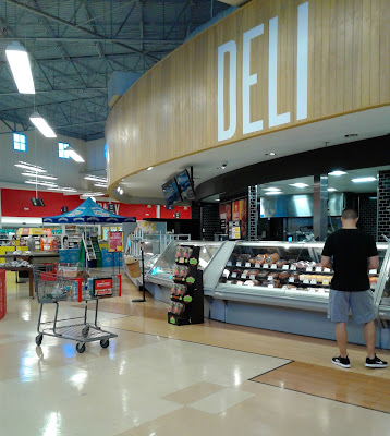
Stepping inside the right side entryway, Winn-Dixie greets us into our local store, as you know, it's all about those first impressions...

…and my first impression of this store was, "wow, this place is really cool!" I'd been wanting to visit this store for years, as I was always intrigued by the round layout design, as how often do you see a round supermarket salesfloor?

Also, like was mentioned in that article, the deli counter is front and center after walking through the front doors, located in an island smack in the middle of the salesfloor. The bakery is also located in this island too, just off to the right (which we'll see before long).

The entire front of the building fans out from the deli/bakery island, with access to the grocery aisles and the rest of the store only possible by going to either the left or right to walk around the island. I certainly can't say I've seen a layout like this at any other grocery store before!

The curves, the natural light, and the high ceiling really do make for an impressive sight. Someone who reviewed this store in the St. Petersburg Times also had a similar first impression: "What I saw at the Kash n' Karry on State Route 54 just west of Interstate 75 caught me by surprise. The front wall is almost entirely glass, with dividers that make it look like window panes. Smaller windows that resemble skylights line the top of the round shaped wall and allow sunlight to shine in. Just inside and to the right is a suggestion box atop a round table with a linen tablecloth. More round, cloth-covered tables with flowers sit in front of the deli and bakery areas. The store's circular design gives shoppers a panoramic view of the offerings on the aisles. Parts of the floor are hardwood."

Since that quote mentioned the flooring, I should comment that the flooring you see in here is original to when this store opened as a Kash n' Karry in 2000 - the exact floor being commented on in that quote. The flooring survived this store's transition to Sweetbay Supermarket in the mid-2000's, and also Winn-Dixie's Down Down remodel in 2019. Kash n' Karry's peach and white tile pattern clashes a bit with Down Down's stark red look, but I've seen worse flooring clashes with Down Down. The flooring looks a bit off with the modern Winn-Dixie decor, but I wouldn't say it looks terrible.

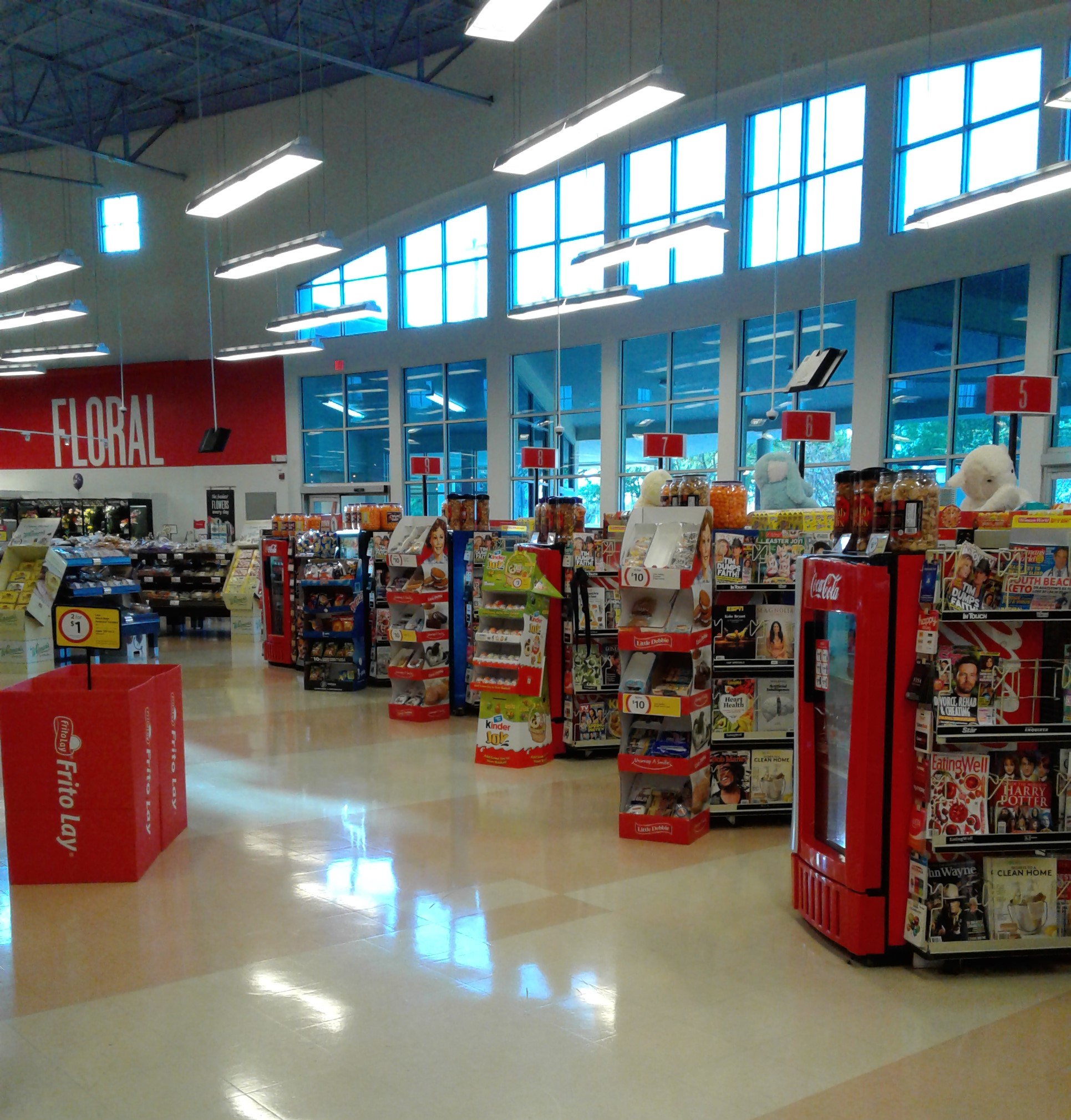
Moving further toward produce, here's a look back at the large picture window at the front of the store. Kash n' Karry wanted this store to have the feel of an "open air market", which the high ceiling of the round section and all the natural light was supposed to mimic.

While I've never been to a round farmer's market before, Kash n' Karry did a good job of making this part of the store feel bright and spacious. Special lighting was also installed to give the produce department a warm glow, however, those original lights were replaced with the rectangular panels we see now at some point during the Sweetbay era, with Winn-Dixie adding in all the new spotlights during the Down Down remodel in 2019.

The floral department is located immediately to the right of the entrance doors, with produce "rounding" out the remainder of the wall space beyond that.

Even though these round stores were a specially designed prototype, they all still used the same Purple and Teal decor introduced by Delhaize in 1996, the same decor that was used until the debut of Sweetbay in 2004. We saw a somewhat well preserved version of that decor in a converted Food Lion out by Orlando a while back (if you want a refresher of what it looked like), this store just getting a more deluxe version of that same package. I actually found an original interior photo of this store in one of the newspaper articles I dug up as well, and you can make out some of the pieces of the original decor here:
.jpg)
It's not the greatest photo in the world, but you can make out some original features (like the outline of the deli sign and the original lights). The above photo was also taken at a similar vantage point to the last photo taken by me, and I thought putting it here would make for a good comparison of what the produce department looked like then and now. The article where I found that photo also had this to say about the produce department as well: "But the store's most noticeable feature is its produce. Vegetables and fruits, some of them exotic, fill rows of baskets. You can even buy sugar cane by the stalk...[and] there are 15 varieties of mild and hot peppers. "It's all about the food," said [Camille] Branch-Turley, who says the chain focuses primarily on perishables and unique food. "It's not enough to be able to get an apple here," she said. "You can get an apple, and it's going to taste great."

Kash n' Karry was really pushing these special round prototype stores to look and feel high-end, but still offer groceries at a good value to shoppers as a way to stand out from Publix, Winn-Dixie, and Albertsons. When asked how Kash n' Karry could sustain running such a fancy store in such a manner, a Kash n' Karry spokesman said each of these stores cost $2 million to build, which (at the time) was only a small increase price from building a standard grocery box (and that small discrepancy in price stemming from the use of curved steel in the roof framing). Therefore, even though the store felt fancier, it could be run using a much similar pricing structure to a normal Kash n' Karry, and prices at the new stores "would not be affected".

The overall success of the round Kash n' Karry will probably remain a mystery. While it seemed promising that 9 of these stores opened over a 5 year span, all the way until the total rebranding of Kash n' Karry as Sweetbay, Sweetbay totally ditched this design for a more traditional approach with the new stores opened under that brand. I've also never seen any other grocery store try a round floorplan either, and only one of these stores survives today with the round floorplan design. Was this concept just a flop? Too futuristic and out there? Too little to late to save the sinking Kash n' Karry even if it was showing signs of merit? I don't know, but like this store, all these questions are making me spin in circles!

From produce, here's a look from the round grand foyer into the grocery aisles, which occupy the back of the building behind the service island.

Before we focus on the back of the store, here's a look at the bakery counter, which occupies the service island to the right of the deli. From here, "the store's bakery and its sweet smells [are] front and center".

This store also had a "cafe with hardwood floors [to accommodate] customers who want to eat on site" when it first opened. I want to say that cafe was formerly located just to my right, where a cooler now blocks off part of the service island. The floors right in front of the island are the only instances of wood (or "wood inspired") floors in the building, and that was the only unoccupied part of the island, so signs seem to point to that spot being home to the old cafe (which I can't imagine was more than just a small pocket with some tables in it).

We'll return to the grand foyer in a little bit, but let's continue our rotation around this store by checking out the grocery aisles:

Unlike a lot of grocery stores which create a "grand aisle" off to one of the sides of the building, this store took all that and made it front and center, with the less-interesting dry goods placed behind it, hiding all of this from view at first when you walk into the store.

Unlike the grandiose front of the store, the building loses a lot of its spectacle back here, where the design conforms more to what you'd expect from a regular grocery store. It would have been fun if all the grocery aisles curved too, making the store a complete circle, but that probably would have made things really funky!

Chilled juices occupy the coolers lining the side of aisle 1, which is this double-wide aisle that's also home to "Natural & Organic" foods in the front half, with cases of water in the back half.

While the back of the store feels more "normal" compared to the front, the round theme was maintained through the whole store, with all the corners of the salesfloor being rounded off like the one we see above. It's a small touch, but it keeps the feel alive back here.

With all the other service departments in the grand foyer, the meat and seafood counter was placed on the back wall all in its lonesome. Still, the meat counter was given a sweeping, rounded front to keep with the overall round theme of the store, and breaking up the monotony of the back wall.

From aisle 2, we can see the ceiling height transition from the back of the store to the rounded front. The way the two halves of the store were designed really makes the front and the back of the store feel like two separate spaces.

Behind the service island, we find the front actionway for the grocery aisles. The front actionway occupies the last little sliver of the store with the high ceiling, the grocery aisles branching out into the lower height section.

The service departments in this store really steal the show, as the grocery aisles feel like something out of any other supermarket. However, I do have to give Winn-Dixie a lot of credit for how neatly stocked and faced the soda aisle is - what we see here is Publix-worthy!

Looking toward the back of the building isn't very exciting, but when we spin around 180 degrees, at least we get to see part of the round ceiling in the distance.

The meat and seafood service counter is roughly centered along the store's back wall, with the meat coolers extending off to the left of the counter.

The rising morning sun shines down on all the breakfast foods offered here in aisle 6.

Winn-Dixie used the back wall of the service department island as a home for seasonal merchandise, with snack foods further down to fill up the remaining space along that wall.


Beyond the meat counter, we see the dairy department in the back left corner of the building. Instead of transitioning into a sharp corner, you can see how the back wall subtly curves itself around, as this building was designed to lack sharp corners along the perimeter.

Even though this is the only round prototype Kash n' Karry to retain its original layout, of the other 8 of these buildings built, I'm happy to say 7 of the 8 other buildings still exist and still manage to utilize the grand structure left behind by Kash n' Karry. These buildings make for one impressive Goodwill, a church that God can look right into, and a DMV that can certainly make a trip to the DMV a lot less dreadful! (However, round layout or not, the DMV will still find ways to run you around in circles regardless!) As I mentioned before, Winn-Dixie occupies another one of these buildings (but with much heavier alterations than we see here), Publix inherited another (although it looks like that building's clerestory was removed at some point), and an Asian grocery store in the process of taking over another one of these buildings in Tampa, so I'm curious to see what they do to the place. The seventh round store became home to a classic car museum, and the building made for a really cool museum too, but sadly the museum closed in the last year or so and the building is empty again. As for the eighth round store, well, the funky round building just wasn't good enough for Sprouts, who bulldozed it for a very plain modern Sprouts store.

I feel it was a bit of a waste that Sprouts demolished a perfectly good 20-year-old building, as it's been proven that even with the funky design, these buildings can be subdivided and reused. However, the fact that 8 out of 9 of these stores still stand and still retain most of the original structural elements is pretty good. Even the bonus round store - the one prototype built for Food Lion in Jacksonville - still stands, and is one of the very few interesting Walmart Neighborhood Markets you'll ever shop at! While Walmart gutted the interior, even they kept the spirit of the round layout in-tact inside. If Walmart could tastefully repurpose one of these buildings, there's no reason how Sprouts couldn't!

The last few grocery aisles before we get to frozen foods are home to the wine and beer department, which takes up half of aisle 14 and all of aisle 15.

It's probably for the best that Winn-Dixie never installed a WD's Taproom in this store, as the alcohol will make you dizzy on its own, without a round floorplan added to the mix!

The last three aisles of this store (numbers 16, 17, and 18) are home to frozen foods. While three aisles sounds like a lot of space to dedicate to frozen foods, the aisles aren't super long, so the selection isn't any bigger than you'd find in a standard Winn-Dixie.

Here's one last look across the back of the store, looking from frozen foods back toward the meat and seafood counter.

In aisle 17, the grand curved clerestory comes back into view again.

Ice cream to my left, and overflow from dairy to my right as we enter the store's last aisle, aisle 18.

Aisle 18 runs along the building's left wall, and spills out into the pharmacy department:

The pharmacy counter itself is in the front left corner of the building, with health and beauty products in a few short aisles that run perpendicular to the grocery aisles behind me.

The aisles in the health and beauty department were quite straight, even though they were in the curved part of the store. It appears Winn-Dixie straightened out these aisles during the store's Down Down remodel, as this photo from when Sweetbay was still here shows the aisles in a more curved formation. I wish I could have seen this store prior to its Down Down remodel. While Winn-Dixie didn't change a whole lot, and Sweetbay's decor wasn't the original decor either, I think it would have been more fun to see this building with even more vestiges of early 2000's Delhaize present (rather than early 2000's Delahize with a lot of red on the walls).

In 1999, Kash n' Karry converted all of its in-store pharmacies into franchises of The Medicine Shoppe, so this store would have opened with its pharmacy counter run by The Medicine Shoppe (and one of the old photos I posted toward the beginning of the post also showed 'The Medicine Shoppe' branding on the exterior too). At some point that franchise deal was abolished, as Sweetbay went back to running its own pharmacies in-house, and Winn-Dixie has kept the pharmacy at this store operational to this day.

From the pharmacy, we return to the grand front foyer and all of its curved glory.

The customer service counter is located next to the pharmacy, in front of the curved row of check lanes.
The check lanes fan themselves across the front of the store, eventually leading you back to the wall of windows, within which you find the exit.

For fun, here's a look at the front end when Sweetbay was still open. As you can see in that photo, all the check stands in here today are still the original ones from Kash n' Karry, just repainted gray. Even though the Down Down remodel changed some things around, some small original pieces got to stay. Had this store waited until the Winn Win era to remodel, I guarantee you the old Kash n' Karry floors would have been ripped out and the check lanes replaced, as those two changes have been fairly standard practice for Winn-Dixie lately. While new shiny white tile floors and modern check lanes would probably dress this store up a bit, we certainly could have ended up with much worse results!

Back outside, I have to say that was a really neat store, and certainly worth the drive to visit, as how many people can say they've been to a round grocery store? It would have been fun if this design managed to take off beyond 9 stores, but I guess it's difficult trying to stuff a round store into a traditionally square industry.

On the right side of the building is the attached liquor store, located off a curved walkway along the front of the store. While the main store was all about being round, the liquor store was actually pretty normal inside as far as its layout goes.

After a number of years of curiosity and intrigue, I was finally able to solve the mysteries of the round Kash n' Karry with my visit to this store, and cross another grocery store visit off my wish list. The vast majority of the stores I visited during the first half of this retail road trip day related to Kash n' Karry and Sweetbay, and I saw some good stuff relating to those chains that morning before transitioning back into more Albertsons related fare come the afternoon. That being said, transitioning back into more Albertsons related fare is exactly what we'll be doing in two weeks on the blog, rounding the corner to our next destination!
So until the next post,
The Albertsons Florida Blogger