

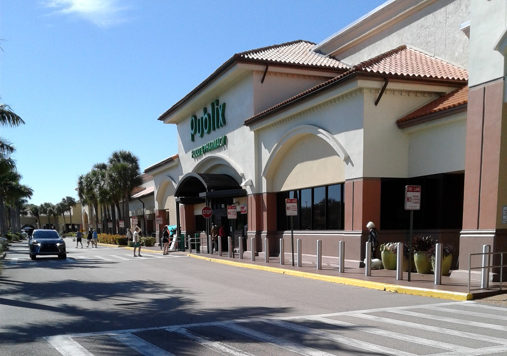
Publix #172
4601 9th Street North, Naples, FL - Neapolitan Way Shopping Center
A Classy Collaboration: A Companion to This Week's My Florida Retail post by The Sing Oil Blogger - Yes folks, you heard that right - you get to see two posts by two different Southeastern retail bloggers about the same store on the same day! Madness I tell you, and I'll explain the reason for the madness later in this post, so sit back and enjoy the tour!
Ah, 2004 - a much simpler time when OutKast and Usher were topping the charts, Friends and Frasier were coming to an end after spending over a decade on NBC, and the only election most people cared about was if Pedro would become the new class president (an election that Florida couldn't mess up!). By the time 2004 came around, Publix was trying to brace the company for the new millennium. After a few years of experimentation, a totally new look for the company would be rolling out in full force come 2004. Moving away from the era of pastels, the signature design of the 1990's, Publix was looking to embrace the new trends of earth tones, a warm feeling, and a classy shopping experience. Publix would embrace this design concept in various forms for the majority of the first two decades of the 21st Century, beginning with the design's first iteration, "Classy Market 1.0". Classy Market 1.0 existed in various forms from roughly 2001-2007, though its first few years in existence were very prototypical. By 2004 the design for Classy Market 1.0 was perfected, rolling out in newbuilds and remodels throughout the chain. However, Publix being Publix, the Classy Market decor package had a number of evolutions during its 20 year run, as Publix made sure their designs stayed fresh and modern. Publix is a chain that likes to keep stores on-point and on-trend, so as the years went on, the older variants of Classy Market eventually fell out of flavor, getting remodeled into newer versions of the decor. While a number of chains may still have a vestige of the 1980's or 1990's sticking around for one reason or another, a time capsule into the chain's past, we're not so lucky with Publix. Remodel-happy Publix is very good about keeping stores modern, so amazingly, Publix's oldest remaining decor package left in an active store today only hails from the early 2000's (and it's quite shocking a decor that old even remains). Publix typically likes to remodel stores every 5-6 years, however, the store we'll be touring today has escaped a remodel for nearly 20 years. We'll go more into the reason for why that is in a moment, but for today, we're going to take a look at and appreciate the relic that is the very last Classy Market 1.0 Publix. So as they would have said back in 2004, let's get it started in here:

Until recently, I was under the impression that Classy Market 1.0 was totally gone, with the last remaining holdouts being removed from the company by 2018 or so (with store #371 being one of those later holdouts). However, about two years ago, someone left a comment on the blog stating that Publix #172 still had Classy Market 1.0 in the present. At the time though, the newest photos on Google were from 2018, so it was still a bit of a mystery as to whether that tip was true or not. Finally in late 2021, a contributor sent me a handful of photos from Publix #172 showing Classy Market 1.0 in all of its glory, confirming the unthinkable - a Publix that hadn't been remodeled in nearly 20 years. After getting that confirmation I knew I had to make the drive out to Naples to see this place. Finally, on a very cold morning this past January, my opportunity arose, and here we are: Publix #172.
 |
| I guess if a Bentley or Rolls Royce is out of the budget upon your move to Naples, a metallic pink Mercedes will have to suffice! |
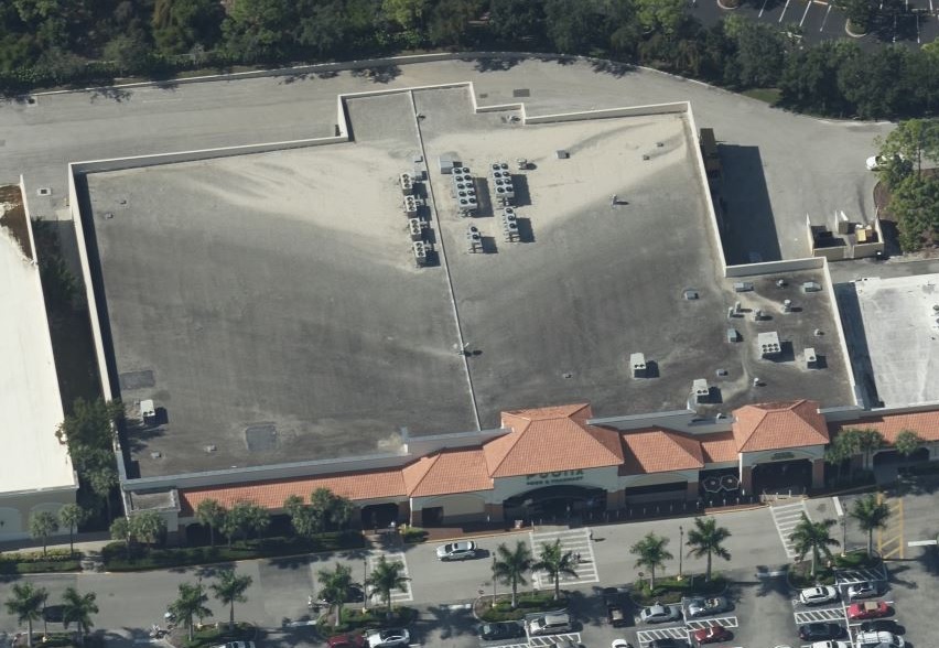
Publix #172 opened on August 28, 1986, and is currently the oldest operating Publix store left in Naples (and all of Collier County, too). The store #172 is a recycled number, originally used by an unrelated store that operated from 1972 to 1985 many miles north of here in New Port Richey. As I've mentioned in the past, Publix had a bad habit of reusing store numbers until the early 1990's, creating lots of oddities in the numbering sequence of the older stores. Considering how "vintage" this store is compared to most other Publix locations out there, it should be no surprise that it has active replacement plans in the works (which was yet another motivator for me to make the drive out here sooner rather than later). About the only way a Publix with an older decor package can survive as long as this one has is because Publix wants to replace it. Currently, plans call for a tear-down and rebuild of store #172, with a modern 49M replacing what we see here now. However, Publix's plans seem to keep hitting a snag, as (per The Sing Oil Blogger upon his visit to this store) those plans have been delayed indefinitely yet again. No matter what happens though, either Publix will get their way and this store will be demolished and rebuilt, or Publix won't get their way, and the store will instead be remodeled to Evergreen. So really, no matter what the outcome is, Classy Market 1.0 is living on borrowed time.

Stepping inside, we begin our interior tour with this horrifically blurry shot of the vestibule (this was the only photo I took of the vestibule, so sadly this will have to suffice, but the rest of my photos turned out much nicer!). Being a late 1980's build, this is one of Publix's "single vestibule" stores, with the single windowed hallway connecting the two sets of doors. From the vestibule you enter the store behind the check lanes, and then get funneled into the weekly BOGO section.

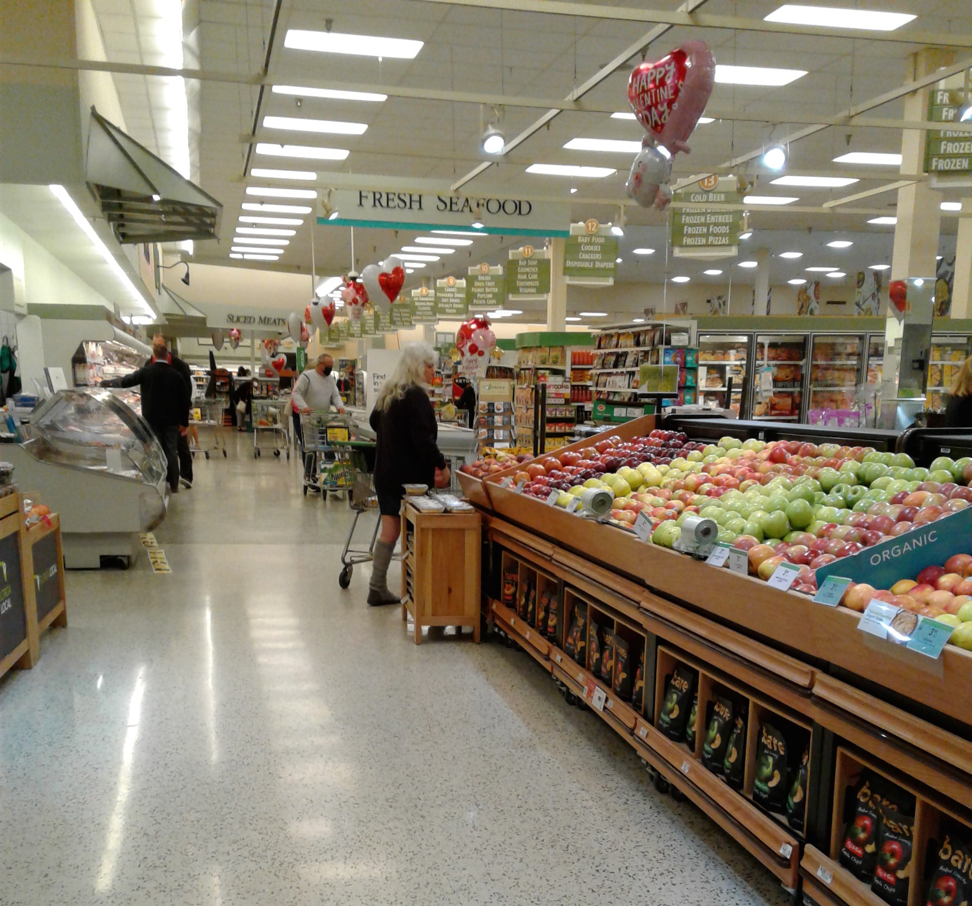
Now is where the fun begins! Entering the store itself, we wander beyond the check lanes to find the greeting card nook to my right along the front wall, with the service desk and the BOGO tables to the left of that. Besides all that, and even though all the Valentine's Day balloons weren't sharing the love by blocking some of the signs on me, we get our first glimpse of this store's Classy Market 1.0 decor. Between all the balloons, we can also see the window to the right of the "Service" sign, which looks out over the salesfloor from the mezzanine breakroom above it.

Turning the corner into dairy, we get a better feel of the Classy Market 1.0 ambience. One of the staple decorations in the Classy Market 1.0 decor were the faux windows and awnings, which we get a sampling of on the walls of the dairy department. Classy Market 1.0 also used a light-colored earth tone palate, with pale greens and yellows being the staple colors of this decor package. The earlier versions of Classy Market 1.0 used serif lettering for the department signs, another one of the unique features of this decor. Later Classy Market 1.0 stores would end up getting a sans-serif font for the department signs (using the same font carried through to Classy Market 2.0, 2.5, and 3.0), but besides the font change, the rest of the decor design stayed the same.

If memory serves me right, the last time I saw the serif version of Classy Market 1.0 in person would have been in 2014, so my experience here in Naples really brought me back to a time I didn't think I'd get to relive again!

Looking into the store's back right corner, here's a close-up shot of the window and awning decorations used prominently in this decor. There's just something really classy looking about this decor and the way it all comes together, hence why I began calling this package (and in turn, its later variants) "Classy Market".

Above the dairy coolers in the back right corner were some old posters, designed using the same font as the rest of the decor. The three posters explain (from left to right) the Publix Checkout Promise (If during checkout the scanned price of an item, excluding alcohol and tobacco products, exceeds the shelf price or advertised price, we will give you one of that item free), the Publix Guarantee (We will never knowingly disappoint you. If for any reason your purchase does not give you complete satisfaction, the full purchase price will be cheerfully refunded immediately upon request), and the Publix Carryout Service (Helping you out with your groceries is just one of the extra services we are happy to offer you. No tipping, please.). While later decor packages don't prominently display these services on large posters like this, Publix still lives by all the things mentioned on these signs.
Spinning around 180 degrees from our last photo, here's a look across the back wall, where we find the deli alcove.

The current Publix Deli logo (along with the accompanying logo for the bakery) made its debut with Classy Market 1.0, replacing the previous Wavy Pastel-esque logos for both departments (two links there).

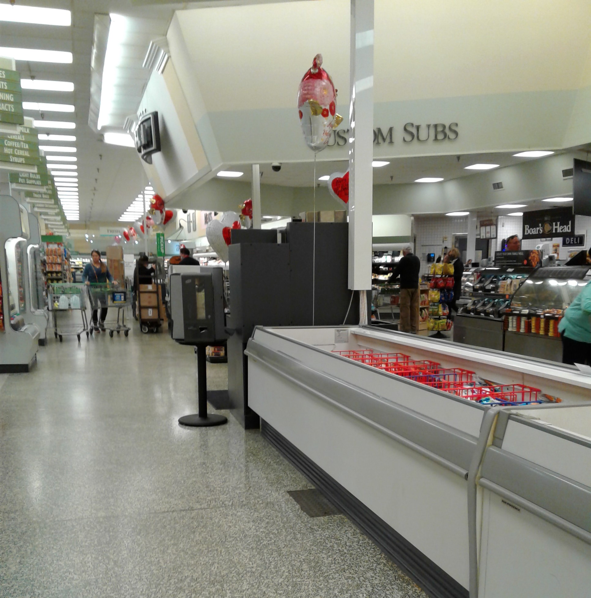
In addition to the main deli signage on the front of the jut-out, additional signage was installed on each side too. The side closest to the dairy aisle advertised the "Custom Subs", with the other side (which we'll see in a moment) advertises "Sliced Meats".

Like most older Publix stores with delis of this design, the main deli counter with the sliced meats resides in the middle, with the fried chicken/Pub Sub counter off to the right of that.
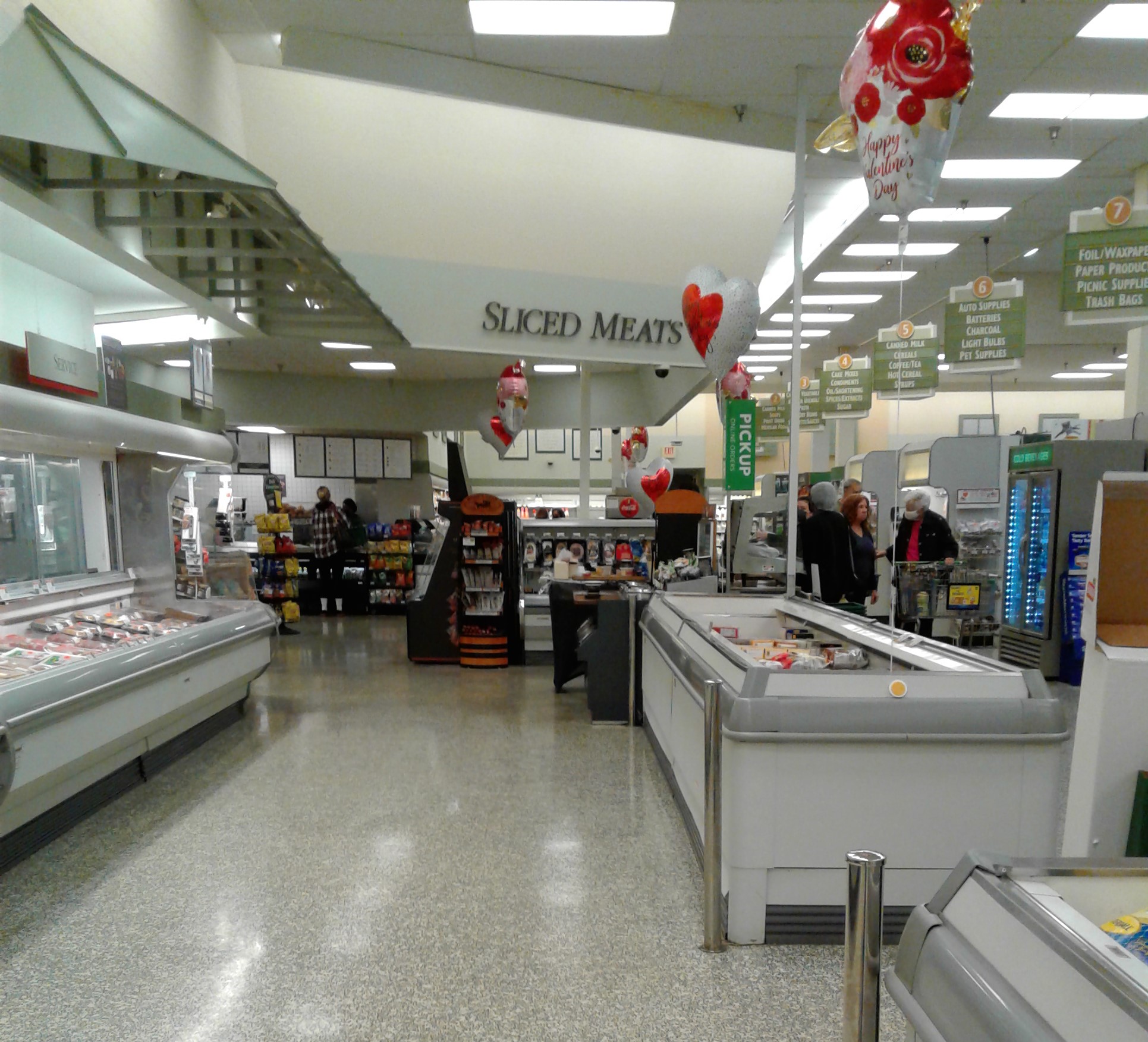
Here's the deli as seen from the other side of the back aisle. The meat department is the next department we find along the back wall following the deli, but we'll see more of the meat department in just a moment.

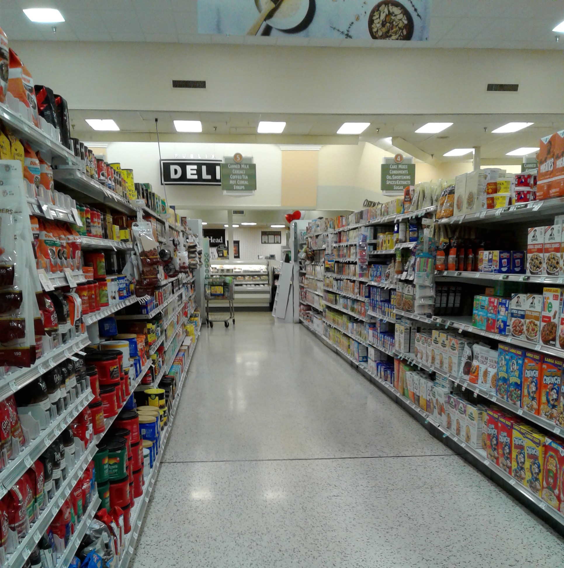
Entering the grocery aisles, we find the standard 1980's setup with the raised ceiling over the center aisles.
As I was researching Publix #172 for today's post, I stumbled across an interesting article from this store's past. In May 2007, Publix announced they would be converting this store into one of the original Greenwise Market prototypes, announced just a few months before the opening of the first original Greenwise in Palm Beach Gardens in September 2007. In preparation for the conversion, Publix #172's pharmacy (which had only opened in 1998, most likely during the Wavy Pastel remodel) was to be shut down on June 16, 2007, with the conversion process to Greenwise happening over the 18 months to follow. However, after the opening of the first three Greenwise stores in Palm Beach Gardens, Boca Raton, and Tampa in late 2007, Publix began to lose faith in the concept, canceling all plans for future Greenwise Market locations, including #172's conversion. Publix's decision to open their first "hybrid store" prototype (Greenwise's replacement) only a few miles up the road probably helped with canceling the plans for this store's Greenwise conversion too. What stinks about all that was Publix #172 lost its pharmacy for no reason in the end, and to this day the store still lacks a pharmacy (although #172's planned replacement is supposed to bring back the pharmacy counter). However, if Publix did carry through with the Greenwise conversion in late 2007, Classy Market 1.0 would have died out around 2018, as this store would have been heavily remodeled to look like this.

I feel the aborted Greenwise conversion just adds to the oddities of this store overall. Publix's intent certainly wasn't for this store to go so long without a remodel, but it seems like their plans for the future of this store can never progress as intended.

Returning to the front of the store, here's a look across the front end. I have some better pictures of it coming up later, but I'd like to note this is one of very few Publix stores left that still retains its Wavy Pastel-era decorative metal structure over the front check lanes. While these metal structures survived a number of remodels, most of them were wiped away come the Classy Market 3.0/Sienna remodels, meaning you won't find one of these often in 2022. However, while the metal awning survived all these years, interestingly, the original CM 1.0 check lane cubes didn't - the cubes we see here are the CM 3.0/Sienna variant.
Considering this store got the Wavy Pastel-era metal structure over the front check lanes, most likely this store's decor lineage started with the 1980's shiny metallic design, followed by Wavy Pastel, then Classy Market 1.0. Since the now-closed pharmacy was added around 1998 (per Florida's pharmacy license database), I'd imagine the Wavy Pastel remodel happened around that same time too. I haven't been able to narrow down the timeframe for the Classy Market 1.0 remodel, but since the serif version was used, the remodel would have most likely happened around the 2004-2005 timeframe, only a few years before the aborted Greenwise conversion would have begun.

Returning to the back of the store, here's a nice overview of the meat department. The meat department sign is accented by a pop of pale pink, as well as more of the decorative window and spotlight props.

If you were to ask me to describe the general effect of Classy Market 1.0 into a few words "subdued and refined" would be my answer. The later Classy Market packages were much bolder and stronger in their design and color scheme. While the later packages clearly morphed their way out of this one, Classy Market 1.0 managed to maintain a much different feel overall than its later variants, the pale color scheme really helping to differentiate Classy Market 1.0 from its descendants.

I really seemed to like photographing the meat department, didn't I? I feel this part of the store really captured the entire essence of Classy Market 1.0, with the colors, props, and crown molding all present in this one scene.

As I mentioned earlier, I visited this store on one of the coldest days of the year, which is why you're seeing people wearing their puffy winter coats throughout all these photos (we sometimes dust those things off for a day or two in Florida!). Driving out here to Naples, the thermometer in my car dropped as low as 34 degrees Fahrenheit, and the grass on the side of the road in the more rural areas I drove through was covered in a layer of frost. It was a rather surreal sight, actually, and not your typical Floridian weather! However, seeing this store was worth waking up early on this chilly morning.

Between the check lanes and the bakery is a small wine nook, and presumably where this store's pharmacy used to be until it was shut down in 2007. Had I known about the pharmacy closure when I was here I would have poked around the wine department more for clues to its prior existence (such as scars on the terrazzo where walls were removed).

Only a few more grocery aisles to go before we make it to the left side of the store and frozen foods. Here's a quick look down the rather busy chip aisle.

Health and beauty products could be found in aisle 11.

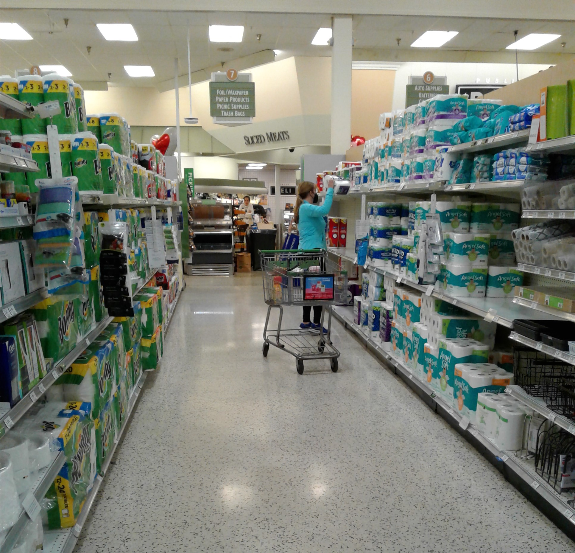
The last two grocery aisles (numbers 13 and 14) are home to frozen foods, with a small chunk of aisle 13 also reserved for the cold beer. All of the original Classy Market 1.0 category markers survived above the coolers too, although it's not really surprising Publix decided to keep the matching category markers through the years for consistency (unlike Winn-Dixie's older stores, which sometimes have a mish-mash of category markers from all different eras).

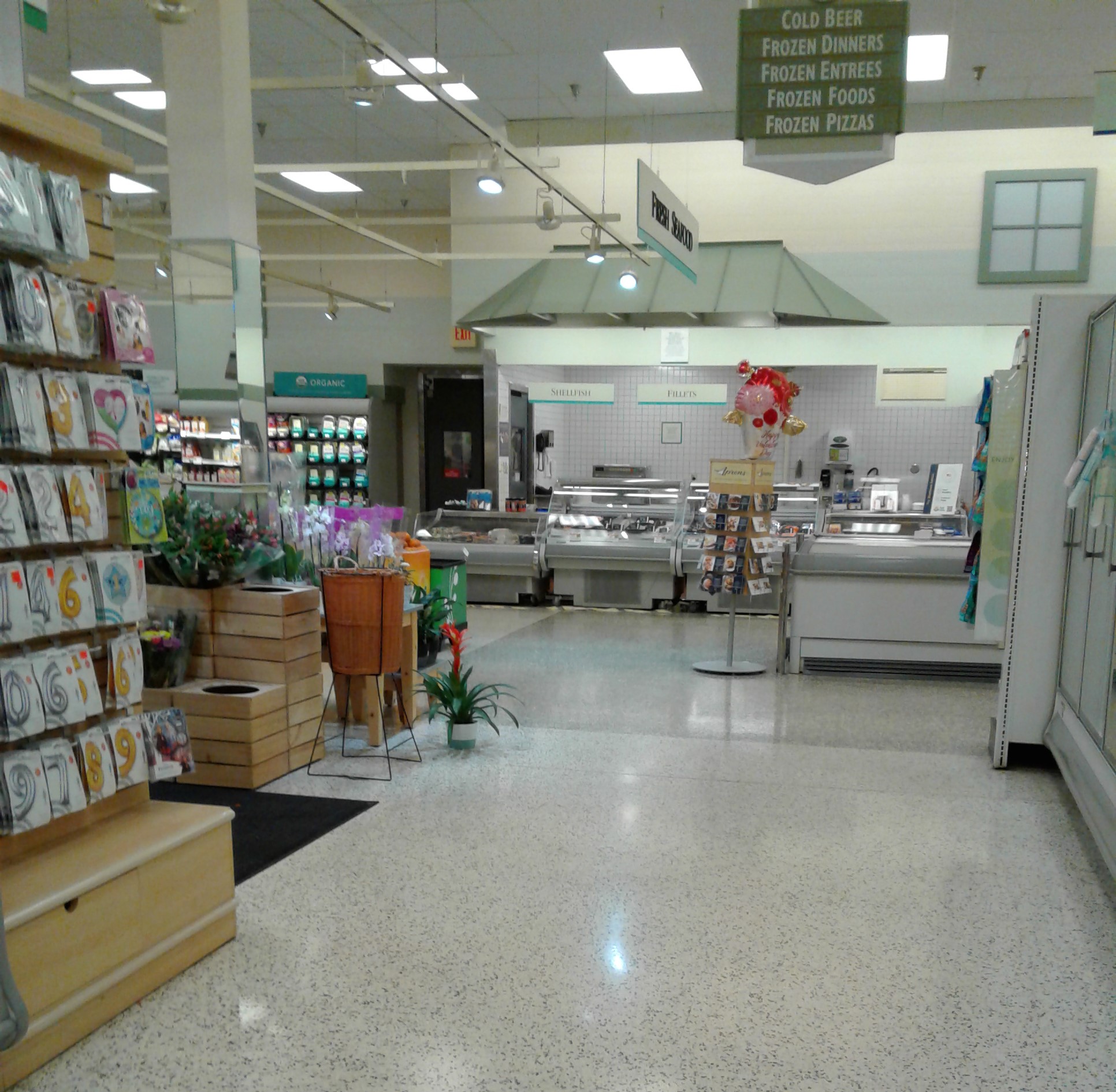
From the end of aisle 13, we see the seafood counter straight ahead, with floral to my left.

Instead of having an actual wall sign, the seafood counter was given this hanging sign instead, with a decorative awning placed above the counter itself. A bit of an odd choice, as other Classy Market 1.0 stores had an actual wall-mounted seafood sign.
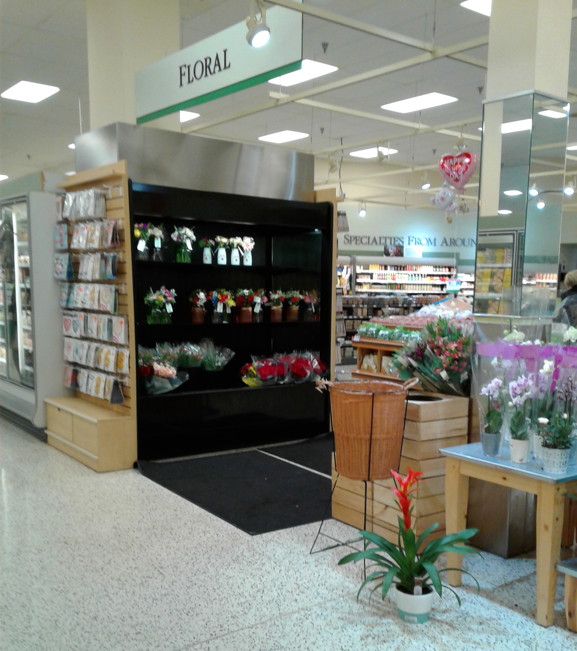
Opposite the seafood counter is the floral department, which somewhat floated in the middle of the back aisle in between the two frozen food aisles. In these older Publix stores I've seen floral located both here as well as on the wall where the orange juice is in the background - I don't know the reasoning for the placements, as I've seen both 1980's and 1990's stores with both arrangements.

The back left corner of the store is home to produce. In addition to the old wall decor, the spotlight grid hanging above the produce department is another older Publix feature that's almost non-existent these days, with most of those getting ripped out in later remodels.

The "Specialties From Around the World" sign (or some variant of that phrase) was another produce department staple from Classy Market 1.0. Interestingly, one of the other variants of this sign managed to survive a remodel at one of my local Publix stores when it remodeled to Classy Market 3.0 a number of years ago - a crazy little relic there, but being on the wall of the prep room probably helped it escape getting removed.

Publix has to be one of very few chains that can keep a nearly 20 year old decor package looking nice and somewhat modern. While pastels may not be the hip color palate of today, the decor has been maintained, and looks just as good as it did the day the Classy Market 1.0 remodel finished.
From produce, here's one last overview of the back of the store.

Working our way up front as we near the end of our tour, we'll take aisle 14 back for a look at the Frozen Foods wall sign.

The front left corner of the store is home to the bakery (as seen here), and as typical of these older Publix stores, freezers for ice cream line the two walls of the bakery alcove not occupied by the main bakery counter.

Also like in produce, the spotlight grid over the bakery is another nearly dead Publix design feature from years ago.

Here's a quick look at the bakery counter itself. What I find odd about this particular scene is the tile pattern above the bakery counter is actually the tile pattern from Classy Market 2.5. The "Breads" and "Desserts" signs are the correct Classy Market 1.0 designs, but the newer tile is throwing me off. From what I understand, Classy Market 1.0 used plain white tiles in the bakery, unless this pattern is older than I thought? I don't know, but this store's oddities are really stacking up!

Leaving the bakery, here are a few photos of the front end as we prepared to leave this relic of a Publix...

While this Publix wasn't as crazy crowded as its sister store 3 miles to the north, it was still bringing in a decent crowd, however this store felt much calmer overall, which I liked better.

Thank you for shopping at the world's most outdated Publix, with one last glimpse at Classy Market 1.0 as we return outside...

To the right of the Publix building is this abandoned storefront, which previously housed a Hallmark store and more recently a short-lived pet shop. As part of Publix's plans for a new store, this store front would be demolished along with the Publix next door in order to allow enough room for the larger store.

Since this space is going to be coming down with the Publix before long (if all goes as planned), it wasn't up for lease, and is just sitting here waiting for its date with the wrecking ball.

Hopefully you guys enjoyed my virtual tour of this extremely outdated Publix as much as I enjoyed visiting it in person. What's crazy is at this point, Classy Market 1.0 looks like it might outlive Classy Market 2.0, as Publix's last Classy Market 2.0 store is expected to close for its rebuild in September 2022. We'll get to see the last Classy Market 2.0 store on the blog before long, but it probably won't be until after it closes if that September date does hold true.

In addition to Publix, a Walgreens serves as the junior anchor to the Neapolitan Way Shopping Center. Since strip center Walgreens stores aren't super common anymore, I took a quick picture of this one for posterity. I did peek through the windows of this Walgreens, and the inside was the typical modern Walgreens fare, so this store has seen more updates recently than its supermarket counterpart behind me!

Classy Market was everything, everything that Publix wanted
It was meant to be, supposed to be, but they lost it
All of the memories so close to me just fade away
All this time Publix was pretending
So much for this post's happy ending
That popular song from 2004 couldn't have put it any better, even if a weird old Publix decor package wasn't necessarily what Avril Lavigne was going for with that song. Classy Market 1.0 is living on borrowed time, as Publix will get their way and modernize this store somehow before long, so we just have to enjoy this fluke of Publix past while we can. I wish I had a happier way of ending this post, but we all know Publix - the outdated will not stay outdated for long!
I hope everyone enjoyed my little tour of the world's most outdated Publix, the most modern outdated supermarket you'll ever see! In addition to my coverage of this store, you can also check out today's additional coverage of this store on MFR by my pal The Sing Oil Blogger for a different perspective, and it will be interesting to see what you guys think after reading two posts about the same store but written by two different people. I think this is the first time anything like this has been done in the retail community, so the two of us are interested in seeing what you guys think! (Either it will be an interesting new perspective, or you guys will be saying to yourself, "AFB, why'd you have to go and make things so complicated?")! 😄
Anyway, that's all I have to say about today's store (and all the references to pop-punk hits from the early 2000's that I plan to make), so be sure to come back in two weeks for some more coverage of former Floridian Albertsons stores.
So until the next post,
The Albertsons Florida Blogger


