

Albertsons #4312 / Publix #1322
3900 66th Street North, St. Petersburg, FL
Hello everyone and welcome to another new year of AFB! A new year means some new adventures, and what better place to start off the year than Pinellas County? The birthplace of Albertsons' Florida division, Pinellas County was a stronghold for the chain all the way until the end, when Publix finally bought the company's three experimental Safeway stores in 2018 (including a location a few miles north of here in Largo). Boasting 16 Albertsons stores at one time - all 16 of which operated simultaneously, mind you, from 1996 to 2008 - Pinellas County had the most Albertsons stores of any Floridian county (beating out the runner-up, Broward County, by one store, and Broward had a number of Albertsons stores that closed early on too, so all 15 of those never operated simultaneously). I think it's safe to say Pinellas County was Albertsons' best market in Florida, with all those long-lived stores concentrated in one area. The performance of those stores is also reflected in the statistic that 15 of Pinellas' 16 former Albertsons stores were bought by Publix. Publix purchased many of Albertsons' better performing locations throughout Florida in their various deals throughout the years, Publix's gains coming from the weakness of Albertsons in the late 2000's. With all those stores Publix bought, Pinellas County is also home to the highest concentration of Publixsons stores too, and we'll be touring yet another one of those today as we explore former Albertsons #4312 in St. Petersburg:

Albertsons #4312 opened as the third Albertsons store in St. Petersburg, built to serve the western extents of town near the small enclave of Kenneth City. Opening in 1976, this location was built in the typical Skaggs-Albertsons design of the time, operating as Skaggs-Albertsons until the breakup of the partnership a year later in 1977. In 1977, Albertsons took full control of the Floridian stores, changing the landscape of Floridian supermarkets with their large store size and pioneering Food & Drug combination. According to a documentary about Publix I watched a while back, it mentioned that Publix's decision in the late 1980's to build larger stores with an in-store pharmacy was a direct response to Albertsons' growth and success throughout the state. So remember - Albertsons actually played a role in shaping the Publix of today. As much as Albertsons might regret enabling Publix to modernize and copy some of their ideas now, if it weren't for Albertsons entering Florida, Publix would probably be a much different store today.

The best view I was able to get of this store while Albertsons was still here was this awkward shot looking at the corner of the building from a 2007 Google Street View image. During Albertsons' 32 years in this location, the building was never modified too far from its original styling. A late 1990's remodel brought about an expanded and relocated liquor store, a new pharmacy, and the removal of some of the front windows, but otherwise, much of the original Skaggs-era exterior design was preserved.

Publix purchased Albertsons #4312 as part of their deal to buy 49 Floridian Albertsons locations in 2008. Publix's deal to buy those stores from Albertsons closed in September 2008, with this store reopening as Publix #1322 on November 20, 2008 - an approximately 2 month turnaround. As you can see in the image above (which is Publix's official photo of this store on the company's website), not much was done to this place in the initial conversion, which would be expected from such a fast reopening process. I imagine this store got a light remodel with some new flooring and a quick decor swap from Albertsons' Blue and Green Awnings decor to Classy Market 2.0.

However, that image on Publix's website we just saw is horribly outdated, as in mid-2011, Publix decided to dump a lot of money into this store. After three years, the time had come for this building's true "Publixification". In addition to a somewhat thorough remodel to Classy Market 2.5 on the inside, Publix dressed up this store's exterior to make it look a bit more modern compared to the rather plain exterior Albertsons left behind. It wasn't very common for Publix to heavily re-do the exteriors of one of these Albertsons buildings they inherited, with most exterior modifications being minimal, if any.

The modifications Publix made to the exterior were all cosmetic, with the doors and the liquor store all staying in the same places where Albertsons had left those. The bones of the original Skaggs-Albertsons facade are still here, but dressed up a bit with the modern gray paneling and faux-stone accents.

Publix dressed up the facade to make the doors on the right side of the building looks like the main entrance, with the awning and logo all aligned on this side. That being the case, we'll enter from this side of the building, so let's go inside and see what the interior is all about:

As of the time of my visit (and as of January 2023, per Google Images), this store still retained its 2011-installed Classy Market 2.5 decor. Even with this store going on 12 years since its last remodel, it still looks really good, which we'll see more of as we continue our tour.
Anyway, our first interior photo looks across the front of the building toward customer service and the check lanes. Unlike many Publix stores remodeled to Classy Market 2.5, the customer service desk still resides in its original home along the front wall from the Albertsons days, rather than being moved to an island next to the check lanes like Publix had a tendency to do in remodels from this era.

I visited this store shortly after the Tampa Bay Buccaneers had their recent Super Bowl win, so there were plenty of displays and products front and center in the store displaying pride for the home team (and a neat neon sign too!).

Captain Fear would approve of these snacks for ye landlubbers to enjoy!

As you'd expect from a 1970's Albertsons store, the deli is located in the front right corner of the building, immediately to the right of the doors. Publix has the deli set up with the main cold cut counter to my right along the building's front wall, with the hot foods and Pub Sub station straight ahead along the side wall.

Here's a closer look at the main deli counter, as well as its accompanying signage on the wall above.

Beyond the deli, we look out into the store's grand aisle. The bakery is to my right, with floral and produce straight ahead.

The bakery was always located here along the right side wall next to the deli, however, Publix rebuilt the bakery during the 2011 remodel to conform it to the typical Publix design of the time. When Albertsons was here, the bakery would have been flush with the rest of the side wall, the curved lower ceiling a new addition by Publix.

I thought this view made for an interesting perspective, looking out toward produce from the under the bakery awning.

The lighting did something funny with this photo, but otherwise, it gives us a good overview of the width of the building and the center grocery aisles.

The bakery had a few tables of product spread out into the grand aisle to fill up space, but otherwise this store didn't feel too oversized for Publix's taste. These 1970's Albertsons stores usually came in around 55,000 square feet in size, which is almost the same size as Publix's most common large-format stores (which are around 54,000 square feet). That being said, these buildings typically don't feel as spaced-out or underutilized like we've seen in some of the larger, 60,000+ square feet later-built Albertsons buildings Publix inherited.

Here's a nice overview of the bakery and the deli in relation to each other.

Walking back a bit, here's a similar perspective to the last one we saw, but taken from further into the produce department. From this angle we get a nice look at the floral island and its signage as well.

Produce occupies the back right corner of the building, with the produce and chilled juice coolers surrounding the displays of fruits and veggies in the center.

While Publix's Classy Market 2.5 remodel was fairly extensive, they did leave behind one small trace of Albertsons in that remodel - the crown molding. We've seen that molding before in other Publixsons stores, a tell-tale reminder that Albertsons' Blue and Green Awnings decor once graced these walls. That Blue and Green Awnings crown molding was a common piece for Publix to leave behind in these store's original remodels to Classy Market 2.0, as well as later Classy Market 2.5 remodels. I don't recall seeing the molding survive a Classy Market 3.0/Sienna remodel or later though, so when this store eventually remodels to Evergreen (and hopefully not be selected for option B), the molding will probably be removed.

Here's a close-up of our Classy Market 2.5 department sign, with our Albertsons decor remnant molding gracing it from behind. According to some research by The Sing Oil Blogger, it turns out that Publix's official internal name for Classy Market 2.5 was "Bamboo". I believe that name derives from the fact the department signs were mounted to a decorative bamboo wood panel (or at the very least, that would be the explanation that makes the most sense, anyway). From what we've learned recently from the research done by The Sing Oil Blogger and GeorgiaPubDude, Publix seems to derive their official decor package (or "interior environments", as Publix likes to call them) names from a random element of the decor's construction - paint colors being a common choice for the package's official name (Classy Market 1.0's official name of "Kiwi" and Classy Market 2.0's "Invigorate" being derived that way). Classy Market 3.0's "Sienna" was named after a type of tile used on the walls, however, all of us are still baffled about what element Publix chose in coming up with the name of the current (not very green) Evergreen decor!

Leaving the grand aisle, here's a look across the store's back wall. The meat coolers are the first thing we encounter back here, with their original CM 2.5 category markers still hanging from above. If you look closely at the old crown molding, you'll notice a break in it about halfway down the back wall. This was done because the window from the upstairs offices got in the way.

Moving further down the back wall, the meat and seafood service counter begins to come into view, as well as each of those department's respective signs. We'll get a closer look at the service counter in a little bit, so for now, let's snake through some of the grocery aisles as we work our way across the rest of the store:

Some nice wide grocery aisles can be found here, like the canned food and crackers aisle seen above.

Like most other 1970's and 1980's Albertsons stores Publix inherited, this location also has the dual front actionway setup, with short aisles of non-foods and health and beauty items in front of the main numbered grocery aisles.

While Publix replaced the floors in this store prior to its reopening in 2008, one thing Publix skimped on in both the original transition remodel and the more thorough 2011 remodel were the lights. The fluorescent tube lights you see above are an Albertsons holdover, as Publix prefers classier recessed fluorescent lights in their stores built with a drop ceiling. If Publix replaced the lighting, they would have installed their usual square lights, that linked example coming from former Albertsons #4332. The replacement of the lights really affects the feel of the store, as the ambience with the slightly dimmer square lights make the store feel more Publix-like, while the original tube lights give off a stronger (and brighter) Albertsons feel.

Poking out from one of the main aisles, here's a look into one of the short aisles at the front of the store. This particular aisle is home to beach toys, towels, and other beach accessories (we're not too far from popular Madeira Beach here), with an fancy endcap of dishware next to all that.

So as long as the dish doesn't run away with the pool noodle, we'll return our attention back to the grocery aisles, as we work our way back to the meat and seafood counter.

The meat sign was placed immediately over the opening that lets shoppers look back into the butcher room, this store's only example of a "stacked" variant of the Classy Market 2.5 signage. The seafood sign was placed further down the wall, over the dedicated Seafood service counter.

The further to the left we go in this store, the narrower the aisles got, oddly enough. However, aisle 5 in the photo above isn't as bad as what I saw in aisle 6:

Aisle 6 was really narrow! I don't know how this happened in such a large store, as Publix is usually pretty good about keeping wide aisles in all their stores (regardless of its lineage). Maybe someone messed up the spacing between the grand aisle and the original placement of Albertsons' coolers, and this is what we were left with? I don't know, but of all the aisles to end up as the claustrophobic one, I guess beer and wine wasn't a bad choice, as a little bit of this stuff and you'll think the walls are closing in on you anyway.

Returning to the back wall, here's a better look at the meat and seafood signage as we get closer to those respective counters. Meats takes center stage here...

…with seafood (and more of our Blue and Green Awnings trim) being the star of this shot. Publix did a good job of making that old trim fit in with the decor, although like we saw at former Albertsons #4413 in Fort Myers, Publix can be clever with incorporating relics from the building's predecessor into their own decor.

Plenty of paper products prepped for purchase by Publix in aisle 9...

…and poking precariously from our new perch at the end of the aisle, a plethora of personal care products are presented in the peripheral.

Preparing to part from my penchant for the letter "p", here's a quick look at the front end from one of the short front aisles. We'll get to see more of this area toward the end of the post though.

Looking toward the pharmacy in the front left corner of the building, both Captain Fear and that lady are staring me down. Glares aside, the pharmacy is still in its original configuration from when Albertsons left, as the old trim is still in place throughout this area. Albertsons moved the pharmacy to this corner from the back of the store during a late 1990's remodel, closing off the building's old side entrance in favor of an expanded liquor store and a larger pharmacy space.

Health and beauty products occupy the front aisles closest to the pharmacy counter, with more grocery items behind.

Chips and snacks for sale here in aisle 11...

…although next door in aisle 12 we find baby care items and the remainder of health and beauty.

Aisles 13 and 14 are the last two aisles of this store. Aisle 13 is home to half of the store's frozen foods, with aisle 14 containing the rest. Like aisle 6, aisle 13 is pretty narrow, however the poles in the middle of aisle 13 make things a little more challenging when two carts try to pass by.

Here's one final look across the store's back wall before we enter aisle 14, the last aisle in the building.

Dairy occupies the back left corner of the store, with the dairy coolers transitioning into frozen foods coolers about halfway down the aisle, which we can see in this next photo:

The wall colors and category markers switch color from yellow to blue where the transition from dairy to frozen occurs. It was a nice little detail how Publix managed to match the color of the category markers match the color of the wall paint too. However, one of the more interesting parts of the frozen food decor in this store would be the banners over the coolers to my left. Those banners (which say "frozen" on the panels) were Publix's primary way of designating the frozen food department in the Classy Market 2.0 decor. While primarily associated with Classy Market 2.0, early Classy Market 2.5 installs also used those banners, which also confirms this store's 2011 remodel date (as CM 2.5 made its debut in 2010). Since this store went from Classy Market 2.0 to 2.5, these were probably Publix's original banners installed when the store opened in late 2008, just left to carry over in the remodel (as in 2011, these would have still been in use with the new decor anyway).

Rounding the corner from the last aisle, here's a closer look at the pharmacy counter. While Publix added new tile to the counter in the CM 2.5 remodel, much of this department was left as it was from the Albertsons days. A small room was also added over here for Publix's BayCare Telehealth examinations, although that was most likely carved out of existing office or backroom space left behind by Albertsons.
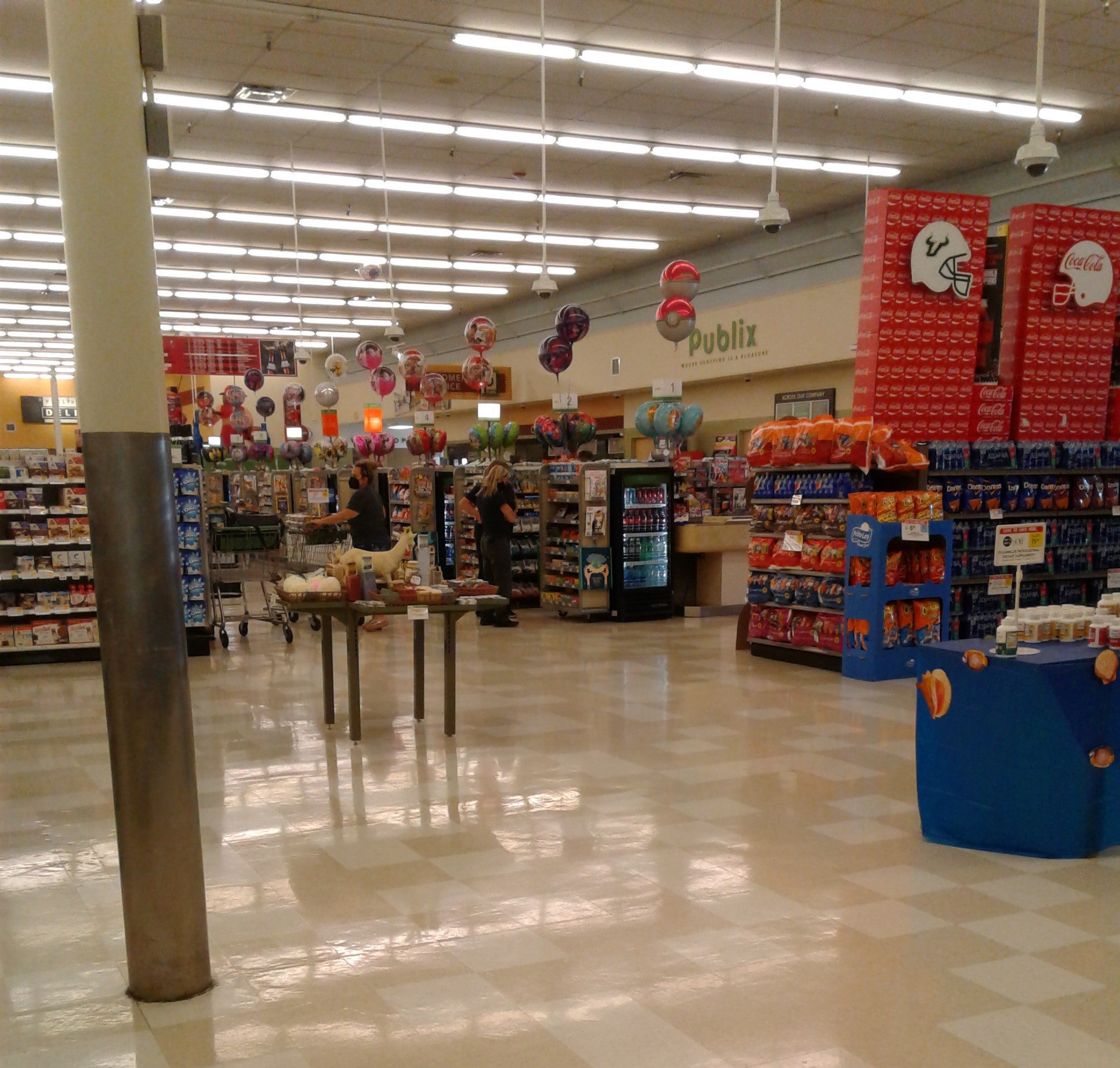
Looking the other direction from the last photo, here's an overview of the store's front end.

Before we jump too much deeper into the front end, here's one final look across the inner front actionway, as seen from the pharmacy side of the store.

If I remember right, this store had 10 check lanes (counting the two express ones), a decent number for Publix.

Of course, I couldn't pass up an opportunity to photograph one of the (rapidly declining in number) historic photo collages common with Publix's Classy Market 2.0 and 2.5 decor.

Overall, this was a pretty nice Publixsons. It didn't feel too outdated or depressing inside, and besides that odd aisle spacing, Publix seemed to have a grip on all the space they inherited from Albertsons.

Passing through the check lanes, here's a better look at the customer service desk along the store's front wall. I didn't get a good photo of it, but the alcove immediately to my left (which Publix was using as the home for a few kiosks) appears to have been home to either the former video rental center or the old in-store bank branch from the Albertsons days.

One last look at the photo collage, and it's time to pass through those doors and head outside once again:

From the parking lot, it's now time for one last look toward the entrance as we begin to shift our attention toward the liquor store:

The liquor store is located at the front left corner of the building, moving here from around the corner during the Blue and Green Awnings remodel in the late 1990's.

In order to increase floor space in these 1970's buildings, Albertsons would often build a new liquor store attached to the side of the building, or in some cases where that wasn't possible, move the liquor store to its own building out in the parking lot. This store happened to have the third case, where the liquor store was just carved out of the building's front left corner, the building's original footprint not changing at all.

Turning the corner, we can see the scars from where the liquor store used to be.

On the left side of the building, it's extremely obvious where the old side entrance and original liquor store used to be. The plain stucco panels from where the original doors were located stand out quite a bit from the sections of original 1970's river rock that remain over here, just painted over in gray now.

The side entrance was the larger patch to the right, with the old liquor store entrance to the left. Other than those patches (and the paint color), this side of the building still looks very much like it did when Albertsons first built this store in 1976.
So that's all I have for our main tour, so let's wrap up this post with some satellite imagery, beginning with some Bird's Eye aerial views courtesy of Bing Maps:

Front

Right Side

Back

Left Side
And now for the historic aerial images, courtesy of Google Earth and historicaerials.com:

Former Albertsons #4312 - 2021

Former Albertsons #4312 - 2010 - The building before Publix made their exterior modifications

Albertsons #4312 - 2008

Albertsons #4312 - 2002

Albertsons #4312 - 1998 - Based off those trailers on the side of the building (the bottom of the image), it appears the store was in the middle of its Blue and Green Awnings remodel when this image was taken.

Albertsons #4312 - 1994 - The building in its original form

Albertsons #4312 - 1984

Future Albertsons #4312 - 1969 - A few small buildings on this corner were removed to make way for the new Albertsons store.

With one final look at the exterior, that's all I have to say about former Albertsons #4312. We'll stay in the area for our next post to look at an interesting bonus store, a somewhat timely subject too. What that store is will be revealed next time, so be sure to come back in two weeks for that post!
So until next time,
The Albertsons Florida Blogger


